![]()
![]()
![]()
Some like it hot, others sweet, and still others like flavors with subtle bitter or sour overtones. Everyone's palette is different, and this is true of the Web, too.
I'll start out with sweet, with that famous colorful candy known as M&Ms. The M&M's Web site is a delight, with charming use of voice, an important element in creating a Web site's personality.
Mixology is a fine art, as is creating consistent HTML. I'll introduce the idea of HTML style conventions while you sip on your favorite beverage from the Cocktail, an enjoyable and relaxing Web site from the folks at the Wired Network. After a drink,
the Border Grill serves up some of the most delicious food in the West, and I'll look at the concept of consistent design.
If you like music while you work or eat, the Blue Note Restaurant has just the ticket. Marvelous jazz from some of the world's best players can be enjoyed as I show you how to add color and pizzazz to Web sites by using the bgcolor argument within
tables.
The Irish brew up the best stout, and the Guinness site is a bubbly brew most fit to sip while examining the use of graphic treatments to solve the font dilemma on the Web. From Ireland, this gastronomical surf lands in France, where the GIF
Transparency is studied at Penelope's Restaurant.
For the decaffeinated among you, 7 UP's site is a refreshing look at community sponsorships, showing Web designers how to offer philanthropy along with a product. For those who like their caffeine unadulterated, Wilde Rose Coffee Company brews up a fine
cup, as well as an excellent example of how to effectively scan, size, and treat photos and graphics.
Mama's Kitchen is pasta perfection, and Web designers can get their complex carbohydrates while learning the not-so-complex but important background color/background image tricks that help keep loading visually smooth and quick.
For those who want the joy without the calories, Virtual Reality is the perfect solution. Enjoy a tour of alt.coffee's VRML, have your computer fixed, and find out where to get more information on VRML all at one sitting!
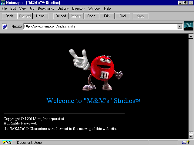
Figure 8.1. M&M's splash page.
Melts in your mouth—not on your keyboard! This site is designed and maintained by InterActive 8, Inc. ( www.interactive8.com), with the guidance of the marketing gurus from M&M's/Mars. It is a kick,
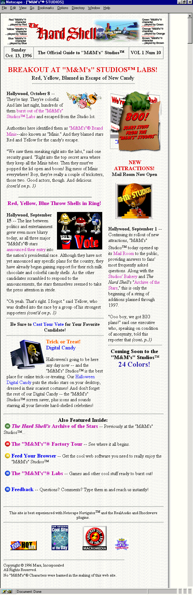
opening with an animated M&M character criticizing my screen, telling me it's filthy and dusty! Move to the "official" site guide for more fun and Web site details. Done in a newspaper style, this area is aptly named "The Hard
Shell." (See Figure 8.2.)
There is so much humor here, and literal animations aside, the most impressive aspect of the site is how animated it is. It has a lively, palpable presence, which makes it fun to visit and completely exemplifies how important strong voice is in creating
smashing Web sites.
This is the tone you take with your audience. It can make or break the effectiveness of a site. The first step is to identify who your audience is, so you can speak to them in the appropriate language. Sometimes it's going to be safe to be in-your-face,
all-out crazy and funny; other times your audience will require a professional, even-paced tone.
M&M's is obviously a case where fun goes hand-in-hand with the product. The authors of this Web site not only understood the audience, but understood the necessity to make the voice strong and witty, with no apologies.
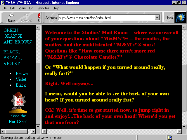
I like to play a little game when deciding what tone to take with certain audiences. The game involves taking some text for the site and writing it in different voices. Here's the text from the mail room (see Figure 8.3):
Welcome to the Studios' Mail Room—where we answer all of your questions about "M&M's"—the candies, the studios, and the multitalented "M&M's" stars! Questions like "How come there aren't more red
"M&M's" Chocolate Candies?"
Or "What would happen if you turned around really, really fast?"
Right. Well, anyway...
I mean, would you be able to see the back of your own head? If you turned around really fast?
OK! Well, it's time to get started now, so jump right in and enjoy!...The back of your own head! Where'd you get that one from?
Now I'm going to write this in a drier, more corporate tone:
The Studio mail room provides customer service for queries regarding our M&M's products, facilities, and employees. One example of a commonly asked question is "Why doesn't your company produce more red M&M's?"
Please use our convenient forms to submit your questions, and we will be with you as soon as possible.
Now, I'll write it in a more personal voice:
Thank you for visiting our mail room. We hope you will feel comfortable here. It is our goal at M&M's to provide you with the best service available. To this end, we'd like you to use our forms, and we promise a personal response as quickly as
possible!
There are no limits to the types of questions you can ask. We encourage you to be creative, direct—whatever you need, we are here to deliver.
We hope you've enjoyed your visit to our Web site, and please let us know if there is ever anything we can do for you—our most valued visitor.
And, finally, I'll write it in a cybersurf voice:
Hey cybersurfers! We totally dig e-mail, so why don't you fill out our most-excellent feedback forms, and send 'em on. And just WHY don't we produce more red M&M's? Haven't you heard that red is dead and blue is cool? Get with it, dude. Maybe you
spent too much time spinning around or looking at the back of yer head. This site rocks, and the whole Webverse knows it.
Remember these few handy steps:
Yes, playing with voice can be fun. It is an excellent exercise in exploring ideas and coming up with creative approaches to the ideas within a Web site.
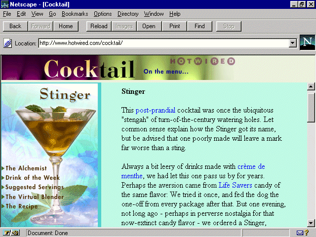
Figure 8.4. Cocktail's home on Hotwired.
Hotwired, the online extension of the popular Wired magazine, has long been known for its high-style and uniquely expressive Web site. Enjoy a highball in the Hotwired cocktail lounge, where the recipe calls for history, cocktail protocol, links
of interest, and variations on your mixed-drink theme.
Always eloquent, ever humorous, the site is both delightful to read and view. Designed with classy graphics that are a bit easier on the eyes than other Hotwired sections, the emphasis here is, as the site itself claims, on "an uninhibited
celebration of potent potables."
The Web designers at Hotwired have kept to a tradition of having fun with technology while keeping pace with the importance of good, clean, HTML code. When browsing through the site, however, I noticed a few odd technique calls and the occasional code
oversight. It got me to thinking how style on the Web means much more than what you see on the outside; it's what's on the inside that counts as well.
Each design group will naturally fall into a rhythm of coding that is most appropriate for its needs. It's good to set style conventions for your company. But, why the reason to set conventions? It's akin to dressing for success: You'll win a potential
employer over to your side with a neat, precise appearance and presentation, as well as quality experience.
The challenge begins when you walk through the virtual door and you start checking your HTML code from browser to browser and find dramatic inconsistencies with the way code is handled. To extend the metaphor, a neat presentation is going to be
appropriate regardless of who you are interviewing with, whether that's a concern or not. With browsers, it is inconsistent. Netscape used to be very forgiving, but now it's not; Internet Explorer, however, is now forgiving. Lynx, the common Web text
interface, isn't forgiving at all. In other words, if my code is inconsistent, so might be the way my pages are being viewed.
So, developing a set of standards keeps the critics impressed, and those of us deciding whether you're the best candidate for the job will know you took the extra time to look good as well.
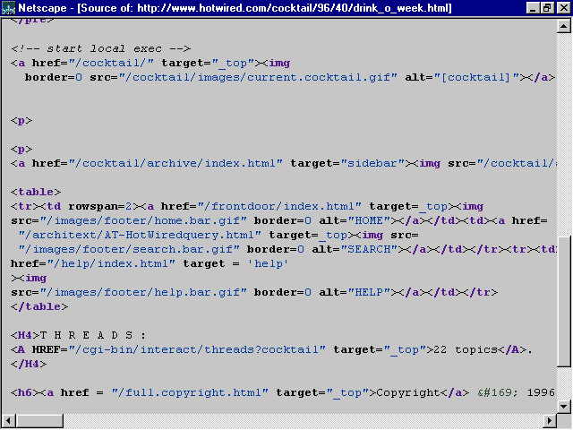
Now take a look at the code from Cocktail in Figure 8.5.
Figure 8.5. Code from Cocktail's home page.
Now, I'll break down parts of the code to see some of the style conventions Hotwired is employing, and where things might be done differently. Bear in mind, with one notable exception that I'll point out later, that just because I would do things
this way—well, it doesn't mean that's the right way. It means only that it's my way.
My teachers have impressed upon me the importance of organization, consistency, and, of course, style. So, even though my suggestions might not be an issue of right or wrong—and I can be pretty sloppy myself on rushed days—the point is that
it's nice to know that there are people out there who still believe that neatness counts.
Here's an example of how Hotwired coded the site:
<html>

<head>

<title>Cocktail</title>

</head>

<frameset frameborder=no border=0 rows="58,*">

<frame src="/cocktail/96/40/cock.html" marginwidth=0 framespacing=0

noresize scrolling="no" name="header">

<frameset frameborder=no border=0 cols="205,*">

<frame marginwidth=0 marginheight=2 src="/cocktail/96/40/drink_main.html"

noresize scrolling="no" name="main">

<frame marginwidth=0 src="/cocktail/96/40/drink_o_week.html" name="sidebar">

</frameset>

</frameset>

<noframes>
Okay, everything in the preceding section of code is pretty straightforward: no problems that I see, and plenty of arguments where needed. Suddenly that consistency changes with the following tag:
<body bgcolor=#90A5AB>
Here's a tag that potentially has a lot of information that could be argued. And, although it's not wrong to leave it out, my preference is to include as many arguments to the tag as possible. The reason for this is to avoid allowing a browser to
set a default for you. By setting many arguments, you tell the browser exactly what to do, without any questions, as seen in the following example:
<body bgcolor=#90A5ABU text=#000000 link=#000FF0 vlink=#FF0000 alink=#FFFFFF>

<!-- start local exec -->

<!-- no ad banner on this page -->

<!-- end local exec -->
What you see in the preceding code is "comment tagging," and it can be a very powerful application—particularly when more than one person works on a piece of code for a given project. Comment tagging can be used throughout a page of HTML
in order to create guides for the coder. For example, if I am scrolling through a piece of code to get to a particular destination, consistent comment tagging will act as a guide—I'll know where I am within the page.
Another strong use of comment tagging is when creating templates for a client who will be making his or her own changes to a page. To create a comment—in essence, a guide—for the client, you create a comment tag, which is always held within
the following tag:
<!-- -- >
Then add the comment, like this:
<!-- begin monthly text change -->
The client can then place the updated text here, between the comment tags.
<!-- end monthly text change -->
Continuing with the discussion, you come to this piece of code:
<a href="/cocktail/aboutus/index.html"><IMG border=0 WIDTH=480

HEIGHT=50 SRC="/cocktail/96/40/stuff/cock.gif"

alt="[Cocktail: On the menu]"></a>
What you see here is the <a href> tag surrounding an <img> tag, which is how an image is made "hot," or linkable. Everything here is done well. I like the use of multiple arguments for the image data, such as the border, width,
height, and alt arguments. Each of these are examined in detail in various sections of the book. Please refer to Appendix A for specific chapter locations.
Then you come to a curious style call, the <p> placed at the beginning of a paragraph. I find this very awkward, but again, it's style, not law:
<p>Early on in his experimentation, Mr. Chell merely called this drink the

Caesar. But one afternoon he had an Englishman sample his work. After hearing

the man exclaim, "Walter, that's a damn good bloody Caesar," Mr. Chell extended

the name to Bloody Caesar. It may be a direct quote, but we still don't buy the

story. Besides, adding the

word "bloody" only confuses the Caesar with its competition,

and we have enough trouble getting this drink at <a href="/cgi-

bin/back.cgi/cocktail/links/nondivebar.html?/cocktail/96/40/index4a.html

">bars</a> more than two states south of the

Canadian border.
The <p>, or paragraph tag, is one of the HTML exceptions to the rules. Unlike most common tags, which require an open <> and a closed </>, the <p> tag stands alone. Although it looks like an opening tag, it argues an
action that takes place after it without necessitating a close tag. A paragraph tag forces a line break plus adds a line after the break, offering a visual space for placement between paragraphs or objects.
In this case, the <p> tag has been placed in front of the new paragraph, which does the same thing as if you placed it at the end of the preceding paragraph. This is how I would have placed the tags:
Early on in his experimentation, Mr. Chell merely called this drink the Caesar.

But one afternoon he had an Englishman sample his work. After hearing the man

exclaim, "Walter, that's a damn good bloody Caesar," Mr. Chell extended the name

to Bloody Caesar. It may be a direct quote, but we still don't buy the story.

Besides, adding the word "bloody"

only confuses the Caesar with its competition,

and we have enough trouble getting this drink at <a href="/cgi-

bin/back.cgi/cocktail/links/nondivebar.html?/cocktail/96/40/index4a.html">

bars</a> more than two states south of the

Canadian border.

<p>

According to well-documented legend, Mr. Chell spent three months developing

the Caesar recipe. From what we gather, mashing fresh clams into what Mr.

Chell optimistically called "nectar" is no easy task. But his thinking

demanded that the drink complement a menu of Italian foods made with vongole,

tomato sauce, and clams. He rationalized that if it's

good to eat, it's good to drink.

<p>
This performs the same function, but the advantage, at least for my logic, is that I know that after every paragraph I'm going to find that <p>, and if I don't, I need to place it. That it sits on a line by itself is a critical part of my coding
style because it is easy to see and quickly changed or added, without disturbing the body of text. Furthermore, it creates consistency. Examine the following:
<pre>

</pre>

<dl><dd>

<!-- start local exec -->

<p>

<p>

<a href="/cocktail/archive/index.html" target="sidebar">

<img src="/cocktail/archive/previous.gif" alt="[Previous

Cocktails]" border=0></a><p>
Note all the paragraph tags. There are three of them, but I wouldn't have noticed the third too easily. I'm also not too convinced that the use of two <p> tags to force extra space is any better or different from using the <pre> </pre>
tags that do the same thing. Again, these are style calls, and people go with what works best for their particular environment and tastes. My choice for this passage would be the following:
<p>

<dl>

<dd>

<!-- start local exec -->

<p>

<a href="/cocktail/archive/index.html" target="sidebar">

<img src="/cocktail/archive/previous.gif" alt="[Previous

Cocktails]" border=0></a>

<p>
As you can see, I'm flushing as many tags as possible to the left margin, where my eye will naturally fall while scrolling code down to examine, edit, and update.
The major point necessary to make is that coders should decide what rules function for the type of work they do. The need that I see for consistency is essential in aiding coders to increase productivity, lower strain on the eyes and mind, and create
neat and clean HTML documents.
The outstanding no-no found on the first visit to this page—no </body> tag. The wary code-watchers at Hotwired caught it shortly thereafter, much to their credit. An important HTML rule, exceptions aside, and something Granny
taught: what you open, close!
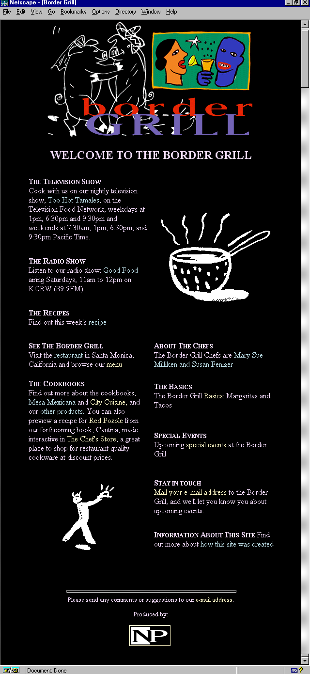
Figure 8.6. Border Grill's classy home page.
I absolutely adore the design of the Border Grill's main page. It's classy, the graphics are fun and witty, the layout intelligent, the content choices interesting—the entire look and feel suggests that I'm going to be treated to this style
throughout.
But then I click on a link, and I'm taken to a page that could be all the things the main page is but falls short. Each subsequent link is the same, great graphics, strong content, but something is lost.
That something is visual continuity. Although the graphics remain high-caliber, the layout suddenly changes to a more simple look and feel. Where I found graphics as a consistent, smooth, and continuous part of the main page, I now see them laid
squarely on top of a variety of background colors (see Figure 8.7), and sometimes even grid-locked within a table frame. Where I enjoyed a more sophisticated, tabled layout, giving the eye plenty of "white" space to rest, relax, and enjoy, text
now goes from edge-to-edge, with no use of margins.
Figure 8.7. Inconsistent design on The Border Grill.
The challenge, then, is to take all the superior elements that are here and smooth out some of the design inconsistencies, moving this site from sizzling to seriously sizzling. The graphics and content are undeniably great! So why not put the pieces of
the puzzle together a little differently? Here are a few tips that the designers might think about for the site, and that Web designers in general can think about when reaching for continuity within their own designs.
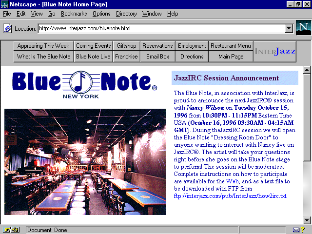
Figure 8.8. Blue Note on InterJazz, the Internet's premier Jazz site.
Noted not only as one of the top-rated jazz clubs in the world, but as a fabulous restaurant as well, the Blue Note has great presence on the Web. It features information about its various activities, upcoming concerts, new clubs opening worldwide, gift
shop information, live, interactive chats with featured artists, and, of course, a menu!
There are a few clever uses of design within this otherwise utilitarian site that make it quite interesting. One that especially caught my eye is the nice use of splashed colors throughout the site, enhancing text without relying on a graphic to do so.
The technique used to create these splashes was made popular with an Internet Explorer extension, with Netscape following quickly behind with the implementation of background color options for table cells. This has allowed for the creation of colored
fields defined and controlled by the designer.
It's a simple, logical feature. The HTML coder need only argue the background color he or she wants in a given field with standard color syntax. Note in Figure 8.8 the blue field to the right? It looks like a graphic header, yes? Well, it's a colorized
table data field. Here's the syntax:
<tr><td valign=top width=50% bgcolor="BDD8FF"><font color="#400040">

<font size=3><strong>JazzIRC Session Announc1

cement</strong></font></font></td></tr>
Notice the bgcolor="BDD8FF"? That's the command that forces the color. You can now add this feature to any table data tag and compatible browsers will interpret it. It's a helpful way to add color and reduce load-time.
A few notes on the code here:
It's a good idea to remember the pound (#) sign in front of color commands. For example, it's more stable to code with the pound sign (bgcolor="#BDD8FF") than without (bgcolor="BDD8FF").
Note that the pound sign appears in the next color argument. This is inconsistent—remember the style lesson? This is a prime example of why it can be so important.
There is a double font tag that is not necessary. Font arguments can be enclosed in a single tag. An improvement would be
<font color="#400040" size="3"> text here </font>
Please be sure to check Appendix C for a handy hexadecimal chart with the safe palette colors.
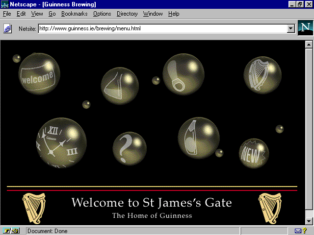
Figure 8.9. Shocked bubbles on Guinness.
From the makers of the finest stout about comes this sturdy Web site, straight from the heart of Ireland. There are fun things here: a multimedia tour (done with Shockwave) of how the beer is brewed, a virtual stumble through the Green Isle herself, and
a pub-like, hip hangout done in stark black and white. Some nice, if inconsistent graphic design on the site, and an especially attractive use of graphics that make good use of fonts. (See Figure 8.10.)
Figure 8.10. Fonts and graphics on Guinness.
Fonts are a Web designer's challenge. Graphic artists spend formidable amounts of time learning and appreciating the fine art of fonts, and the Web really has yet to honor this in a complete way. HTML, and browsers, are giving designers more control
over font faces, sizes, and colors, but it is still quite limited. So, in order to gain control over fonts and their relationship to design, Web graphic artists use images.
There are two major font families, serif and sans serif. Serif fonts have horizontal strokes on the letters, sans serif fonts have no such marks:
This is courier, a serif font
This is arial, a sans serif font
Interestingly, studies show that serif fonts are the choice for bodies of text (probably because the lines of type tend to create horizon bands and make locating your place on a page easy). Sans serif fonts are thought to be good for headers,
short bursts of text, and signs because they are easy to recognize. Because Web graphics are typically small, sans serif fonts are common on graphic headers.
Another important piece of font readability is a technique called antialiasing. This is basically the shading of pixels around the edges of a font character. The end result is a smoother and less jagged font face.
For a variety of techniques used for font control, please see Appendix A in this book, which references where various font tips can be found.
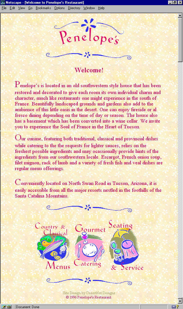
Figure 8.11. Oh, so very French Penelope's.
This oh-so-very French restaurant pleases the eye with yellow floral wallpaper and Matisse-like navigation. It's an unusual Web site, very feminine, and a fine example of the continuity I discussed earlier. Designer Laura Valentino created the look that
captures the sense of the country French feel of this restored house nestled in the very un-French mesquite beds along Arizona's Tanque Verde River.
In order to obtain the graphic continuity of the site, the use of transparent GIFs came into play. Transparency is akin to painting an image in clear adhesive tape. When placed on a stucco wall, the image appears to be painted on the stucco rather than
on a piece of tape, as the clear parts allow the texture to come through.
Transparency becomes necessary whenever you have a graphic image that needs to be placed over a texture and still allow that texture to come through—right up to the edges of the graphic. This technique became available with the GIF89 specification,
and GIF is still the only type of graphic image that can be made transparent.
To make a transparency, it's helpful to have a tool such as LView Pro, a marvelous, compact graphics management program that you can find on the CD-ROM.
Begin with an image that requires transparency. In Figure 8.12, there's a header placed on a textured background. Notice the white block around the banner design? Transparency will get rid of that white field. To do so, follow these steps:
Figure 8.12. Header graphic with no transparency.
Figure 8.13. Same header with transparency.
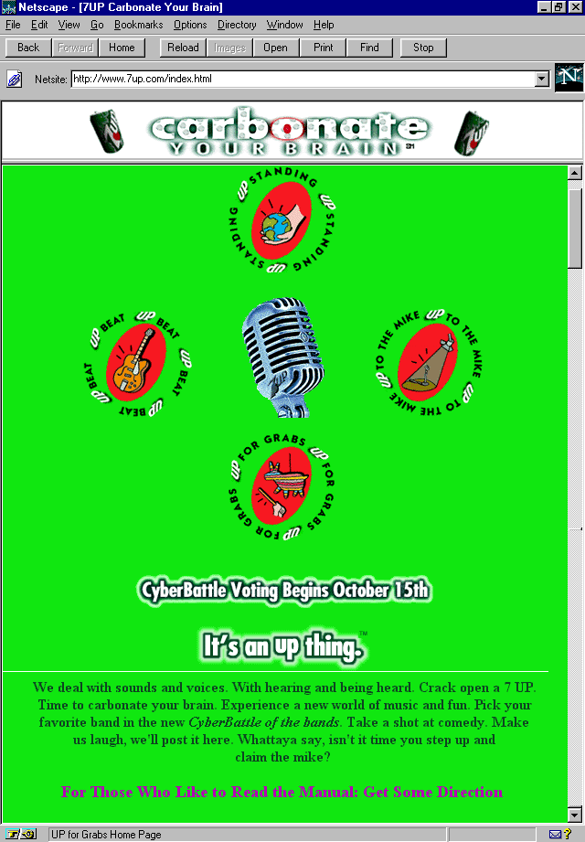
Figure 8.14. 7 UP's chartreuse home page.
The Un-cola is alive and well and bubbling away in chartreuse on the Net. This rather bright Web site has a lot of fun with clever 7 UP can animations and other "up" themes. But what stands out most about this Web site is its definitive lack
of commercialism. You're neither taught about the product, nor are you exposed to hard-sell of any kind. 7 UP is a product that, like Kleenex or Xerox, has integrated into our experience as a familiar name for light sodas. Surely, this is part of the
reason for the lack of self-promotion on the site. But that alone doesn't keep other major media promoters away from the hypersell.
It's a choice, part of the Un-cola way of life, and it's a wise lesson for commercial Web designers to take home. The idea of Web-based advertising relies on what I've always called the "point-of-presence," rather than a point-of-sales model.
Presence is about creating image, awareness, and a palpable sense of a given product or company's existence. It's much more than a "here's my product, buy it" opportunity. What better place to do this than on the Web? And what better way to
ensure that people come back to your Web site by providing them with something that is useable, interesting, and helpful?
7 UP has dedicated each area to some special interest, including the support of alternative music, with a "cyberbattle of the bands" event; an opportunity for visitors to the site to speak their mind about any and every little thing; a
community interest area; and (my favorite) a job pool page with offers of internships and employment opportunities, as well as links to other employment-related Web sites.
But you don't have to have your own stock listing to be a philanthropist. In fact, almost everyone has some community or goal-oriented interest. Whether it's working with a church or synagogue on community activities, feeding the homeless, donating
money to Public Television, or simply looking after your neighbor, there's something unique you have to contribute to others.
Let's enjoy this new model of media as demonstrated by the 7 UP Web site, and work to make it a way of being. Yes, there is always the objective of selling a product, that's fine. In a capitalist culture, that's part of what one has to do in
order to survive, and there's nothing wrong with striving to be good at it. But that does not preclude or negate what a person or organization can give back to his community.
Clients are inevitably the same. Find out what it is they are involved and interested in, and use that as a part of their product or organization's presence on the Web. It's a great way to embrace the idealistic, humanistic, and technologic aspects of
this technology, while making money at the same time!
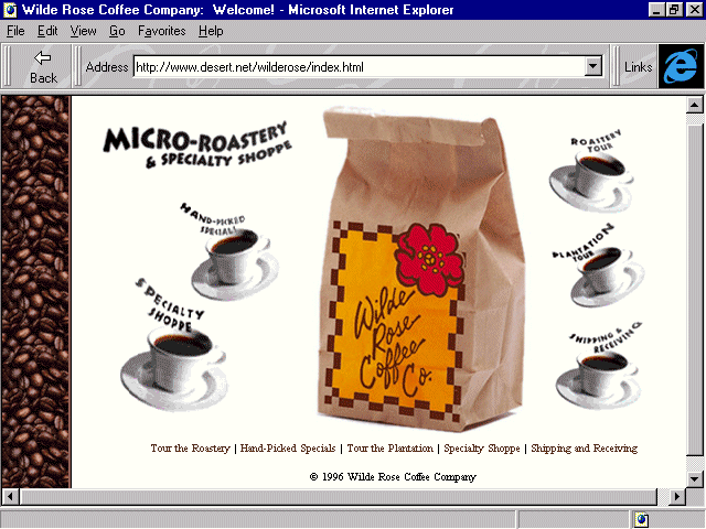
Figure 8.15. Wilde Rose's home page.
What computer geek doesn't love coffee? Not too many that I know. It seems that computers and coffee somehow go together—something about being wired, I suppose. In fact, it is said that Microsoft programmers don't say something is "cool"
or "excellent," instead, they say "it's caffeinated, man."
Well, I'm caffeinated, too! I'm a coffee lover. I take it hot or cold, very strong, with a splash of whole milk. 2% or less is like adding water. Half and half is pure fat. I add no sugar. For me, that's part of coffee's delight, its bitter yet earthy
reminder of what consciousness is truly like.
Wilde Rose is what is being referred to as a "micro-roastery." Along the lines of micro-brewed beers that have become so popular in recent years, micro-roasteries are usually small businesses that serve up big flavor. In this case, the Rose's
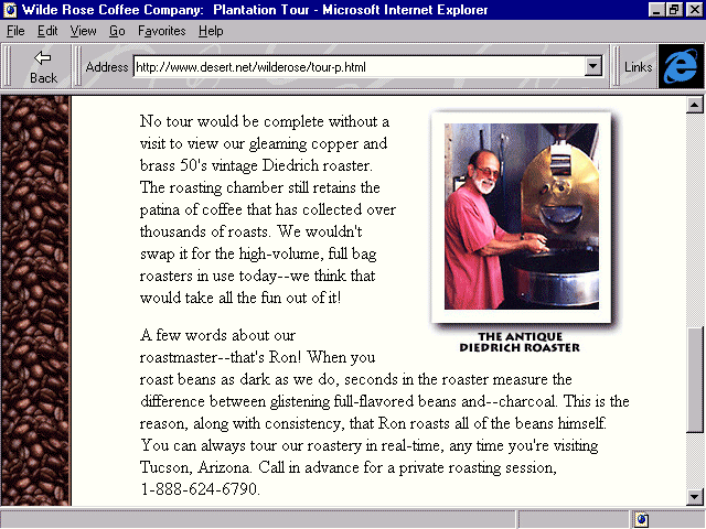
roast their famous dark coffee in an antique roaster, as you see in Figure 8.16.
Figure 8.16. Roastmaster Ron Rose at the Antique Diedrich Roaster.
Take a good look at that photo. It's clear, it's colorful, and it has its own identity within the page without being separate from the design. The way that photos are usually treated on the Web are second on the "what's awful" list with the
way images are treated being the first.
Poor quality, lack of understanding of the simple rules that create quality but small file-sized images, and complete neglect of the awareness of design treatments each lead to the general belief that images can't be done well in restricted bandwidth
conditions. Not so, as you see here with Wilde Rose. The total size of this image is 9KB.
I like to remember how to process images with the following series of words: start, scan, size, select, and save.
Always keep those five S's in mind when producing images, and you'll ensure a very high quality and consistency of image production for your sites.
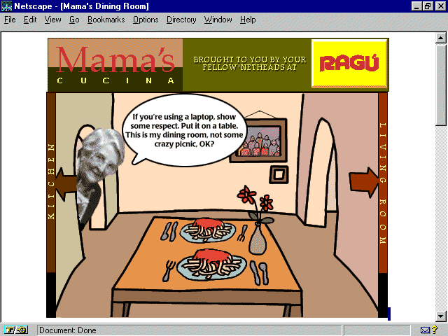
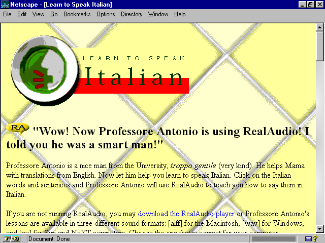
Figure 8.17. Ragu: Mama's Cucina.
Mama Mia, this site is delizioso, meraviglioso, and fantastico! Mama offers up recipes, goodies, glossaries, and plenty of pasta. There's even a section where you can learn special Italian phrases from Professore Antonio, such as what to say to your
husband in romantic moments, or how to praise Mama at her next feast.
Mama has chosen a kitchen-tile background (see Figure 8.18) with plates for navigational icons and header elements. It's kitschy, if you'll pardon the pun, but humorous and enjoyable. Although I love Mama's warmth and Professore Antonio's humor, I
didn't like the way the background popped in rather dramatically after the text.
Figure 8.18. Tiled background on Mama's kitchen.
There are two tricks that will help pace a page's load-time, making sure page elements load as smoothly as possible. By loading a background color behind a background image, you can avoid that unsightly visual "pop." By arguing your width and
height tags in images, you can be sure that your HTML is recommending that your browser prepare for specific image sizes.
When selecting to use a background image, as Mama did with the tile background italy.gif, you can also find a color within the image that can be matched to a safe palette color. Apply this color in the <body> tag, arguing for both the loading of a
color and a background image.
The following is the body tag from Mama's kitchen:
<BODY BACKGROUND="../images/bkgnds/italy.gif">
The following is the body tag with an added argument to load a safe palette color:
<body bgcolor="#FFFF9c" background="../images/bkgnds/italy.gif">
The preceding tag now commands the background color, a pale yellow, to also load. Colors are going to load faster than a graphic. Why? Well, colors are managed by the browser and the individual computer. Unlike images, they are not dependent on
retrieving data from the server. Therefore, the color will load first, and then the background image. This creates a much smoother transition.
Another extension of load-time pacing is to find the width and height of your images and argue them. This prepares the browser to size a field for the image, holding its place until the image information is received by the browser. This helps smooth out
page loading as well.
The following is the image tag from Mama's kitchen:
<IMG ALIGN=bottom SRC="../images/icons/learn-italian.gif" ALT="Learn Italian">
The following is the image tag with width and height arguments:
<img src="../images/icons/learn-italian.gif" align=bottom alt="Learn Italian"

 width=360 height=158>
Scouts among you have probably noticed that I've changed the order of a few items. Again, this relates back to style, and my own preferences. In the preceding code example, having the align=bottom before the SRC argument is not necessarily wrong,
I just prefer to argue my image first, and then its various attributes.
For complete references regarding image control, check Appendix A. Safe palette colors and their hexadecimal equivalent can be found in Appendix C.
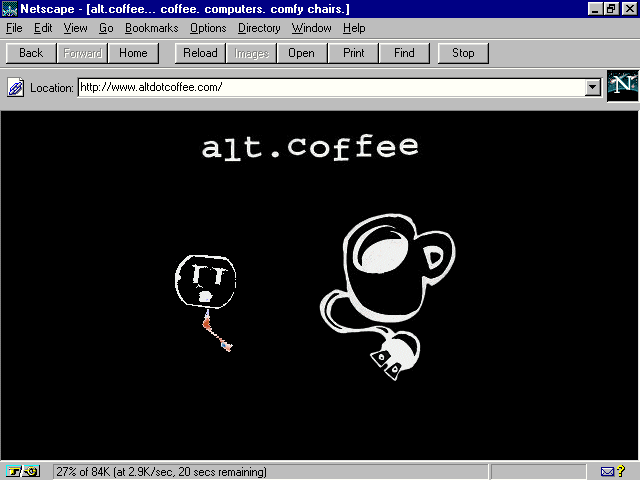
Figure 8.19. alt.coffee's home page.
Did I say coffee and computers were inseparable? Well, to support my thesis, I suggest a surf over to alt.coffee. This Web site won't sell you any food or java per se, but it is a pure expression of what one of New York City's more unique coffee houses
offers up—both on and off the Web.
Back in the '50s, the East Village was known for Beat. Jack Kerouac could be found drinking beer in its bars, and poets, musicians, students, and curious types snapped to new rhythms in its smoky coffee houses, inspired by espresso and au lait.
alt.coffee is no throwback, although New Beat musicians play their jazz-inspired surf techno music while the children (I shudder to think that even the grandchildren) of those '50s Beats drink even better coffee and hang in front of computer terminals
powered by a smoking T1 pipe—in other words, a really fast connection to the Net.
The Web site is as hip as those making the scene. It's well designed, with great graphics, nice use of frames, some Java (of course), and a really cool Virtual Reality Modeling Language (VRML) area. In fact, VRML is so popular with those most on the
edge that the New York City VRML Special Interest group makes alt.coffee its home on a regular basis.
VRML is the language of virtual worlds. It is, according to one of its founding fathers, Mark Pesce, "...a three-dimensional equivalent of HTML." VRML is an evolving programming language that combines logic and objects to create a virtual
object you can, through a special browser, move up, down, side to side, spin around, move in closer, and explore, all with simple mouse movements.
Currently VRML is in its second draft, and is evolving through participation of its authors and fans. VRML's primary present use on the Web is artistic or experimental in nature. That it is interactive—it requires the viewer to actively engage with
it—is a definitive strength. Moreover, VRML allows links to be embedded within the code. So, if you're spinning through a virtual room and encounter a link, you can click on it and go to an attached Web technology. The potential future for VRML lies
in the creation of games, fantasy environments, and scientific modeling, as well as some uncharted possibilities for the commercial realm.
A great deal of information on VRML is available, both on the Web and in books. It's not something that can be taught in a short overview, but for those Web designers with a little bit of time and a good deal of curiosity, VRML is undeniably an exciting
language to check out.
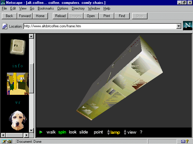
Figure 8.20 shows alt.coffee's VRML. Because the VRML atmosphere is very visually rich and its interactive elements are highly compelling, Web designers can use it to showcase both products and environments. alt.coffee's example is a virtual coffee
house, allowing the visitor to get a feel for the atmosphere of the real place via a virtual, imaginative creation.
Figure 8.20. VRML on alt.coffee.
If you're like me, you love to eat, drink, and be merry. One way to keep an irascible Web critic from making snide comments about otherwise beautiful sites is to make sure she's had her recommended daily dose of coffee. Other ways include
Imagination is the name of the Web design game, and nowhere is imagination more spontaneous than with children. The following chapter looks at various Web design techniques using the greatest kids' sites on the Internet.
![]()
![]()
![]()
![]()