Computer resources on the Web are very extensive. There could be entire books dedicated to the interesting content and often fine design that sites in this category express. For the purposes of this book, I've chosen sites that will be of specific help
to the Web designer. These sites offer important content resources for you and the work you perform, as well as practical tips and tricks for the practical design issues at hand.
The hub of the learning network here begins with C|NET. This site is peerless in the breadth and scope of content it creates, both on and off the Web. C|NET has a full staff of writers and journalists who develop the day-to-day content. An examination
of some of the finer points of copy writing for the Web will be discussed. The Microsoft Network (msn.) is an aggressive contender in today's market, with bright design that captures a niche market with custom processes. The creation of a
"jumping-off" place for a Web site proves to be an extremely effective model for attracting—and keeping—specific individuals and communities involved with a Web site.
msn. is followed by a discussion of its more conservative yet very extensive parent, Microsoft. The Microsoft site has gone through several incarnations of look and feel, currently settling on an effective top bar navigation, a technique that designers
might want to consider for their own creations. A trick to getting beyond the bandwidth, or "pipe" problems, is offered up by HotWired, one of the Web's first and most popular technology-based 'zines.
Are you ready for the future? I am! Recently, a plug-in application called FutureSplash was unleashed on the Web, and this remarkable, user-friendly development tool helps designers create dynamic animations and navigation sets with ease. A visit to
FutureSplash's home site, FutureWave, provides a contemplation of this interesting and effective technology.
Intel has a nice site, although looking under its virtual skirt I found a way to save a few kilobytes by trimming the fat off of the HTML code. If you're looking for something on the Web, there are a wide range of search engines. Lycos will demonstrate
the JavaScript Remote Control or Launch Pad style of navigation.
Traveling the big pipe, the next relay is UKweb, where customer service is a primary goal and mailto: links are never overlooked. Next up is the Web Developer's Virtual Library, an extremely useful site for Web designers that needs a facelift. Using
some of the techniques in this book, I make recommendations on ways of making that done. Finally, the Internet World Web site gives the data on everything Internet, with a clever use of the alt tag that gives rise to a discussion on the ways this HTML
argument can and should be used.
Optimize your drive, dial that modem, and spark up that browser, it's time to network!
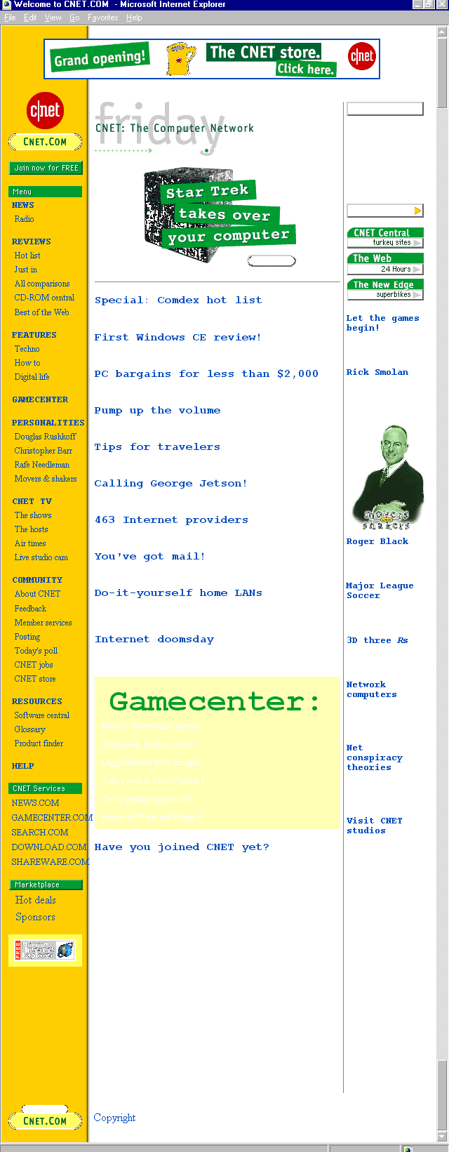
Figure 6.1. C|NET's home page.
What doesn't C|NET have? I've found it challenging to come up with an answer to that seemingly easy question. With television shows, a Real Audio radio station, and a seemingly endless selection of online resources, C|NET has every right to call itself
the computer network. It is my favorite daily resources for up-to-the-day information on issues affecting every aspect of communications technology and beyond.
C|NET's site design isn't shabby, either. The site is clean, bright, and well-organized without being over-bearing. The yellow and green color scheme is more than familiar to millions of Web visitors. C|NET embraces, but does not overuse, current
technologies such as Java applets, Real Audio, and cascading style sheets. It also incorporates important features such as RSACi Ratings. The consolidation of these sophisticated elements (see Appendix A for references within the
book) places C|NET in the running for a Best Web Site Ever commendation.
There is no glimmer, glamour, or commercialism. Instead, C|NET combines intelligent and functional design with remarkable content. The content is the meat of the matter, in fact, and it will come as no surprise that content is driven by a staff of very
talented journalists and writers who have learned some critical points of writing for the Web medium.
A description I've drawn from an unusual contributor— the rock band Pink Floyd, in a song called "Us and Them," can be used as a metaphor for Web writing style: a "short, sharp, shock." Precision is paramount, voice is often
vociferous, and knowing your audience as well is a global commandment for online writers. These three elements, combined with the fine eye of the editor, make up the mix that will result in successful content creation.
Precision writing means no extra words or ideas should exist on a Web site or in a Web-based article than are absolutely necessary. Consider the fact that a visitor's attention span is condensed on the Web, most are not surfing around looking for
general ideas. The typical surfer (if there really is such a thing) is either looking for very specific information or entertainment. In either case, the "short, sharp, shock" method stands firm, with precision mostly being reflected in the
"short" part of the concept.
Ask yourself the simple who, what, where, when, and why question that every good journalist will apply to a job. Answer each, and then throw away what isn't essential. Flesh out what is important; condense what isn't.
Keep information as stream-lined as possible. The best way to do this is to concentrate each idea into a single sentence. You can build from there, adding or changing as needed to make the information appealing.
Follow this fictitious example as an exercise in precision:
Who? Bertrand's Books
What? An independent bookseller in Tucson, Arizona, carrying a broad variety of used books, and some new books, with a very strong Science Fiction and Fantasy section. The Web site features a database of hard-to-find titles and a pseudonym
directory.
When? Hours of operation are Monday through Saturday, and Sunday by appointment. The Web site will allow for feedback forms and ordering can be done 7 days a week, 24 hours a day.
Where? Tucson, Arizona, and the World Wide Web.
How? Come into the store, call our 1-800 number, visit the Web site.
With this information, you can now write an introductory paragraph. Here are two examples, one that is too general, and then one that is precise.
Notice that a lot of extraneous details are pulled, and the most pertinent ideas for the Web site remain. Once you've reached this stage, you are ready to add the "shock." This is the voice, the punch, vivacity, verve, and hook that will keep
the user interested.
In simple terms, voice is the personality of writing style. Just as there are many personalities, there are many voices. You can have a neutral voice, which is often useful for the dissemination of straight-forward, serious data. Come a little closer
and I'll tell you all about the seductive voice, used to entice you to play with my alluring product. Wax up yer surfboard and ride the waves, because the hip and trendy voice is often the way. Other voices might include the sassy, the academic, the
philosophical, and the childlike.
Voice must be selectively chosen. An academic approach usually works for information you want to be taken seriously, and a hip and trendy voice for products you'd like to sell to a trendy audience. However, students of media are often taught that
juxtaposition of voice can be an effective tool. In other words, making a computer product sexy, or a lingerie ad intelligent, can often be more powerful than the expected presentation.
Here's the Bertrand's Books example written in a sexy voice:
Your fantasy comes true at Bertrand's. We join you with that rare object of your desire, the hottest, hardest-to-find fantasy and fiction around. Is your love shy or sly? Check our pseudonym directory and find out just who's been hiding behind that
nomme-de-plume. Still frustrated? Call or e-mail us, anytime.
As you see, I've joined precision with voice to create a fun and appealing paragraph that gives the important information but does so with appeal. Try it out yourself! Apply different voices to this, or your own example, and see what works best. For
further discussion on voice, check in Chapter Eight, "Sites with Spice: Food and Beverage on the Web," where the importance of this technique is looked at a little more closely.
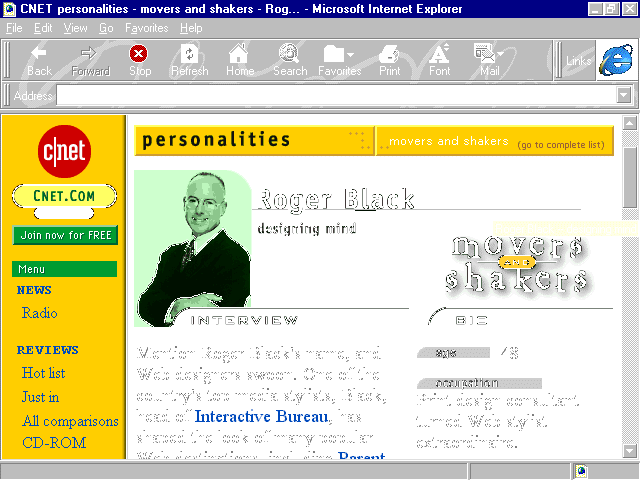
C|NET's use of voice is very strong. Appealing to a mass audience, they keep their columns short and sharp. The more trendy voices are used sparingly, and then only in areas where the audience is more distinct.
The C|NET site is an excellent example of content geared at a broad-range audience. The information is presented quite neutrally, with certain editorial areas, (see Figure 6.2), creating appeal for specific audiences.
Figure 6.2. A C|NET editorial page.
For the Web designer creating a site for a specific product, business, or organization, how content is presented is going to rely largely upon who is accessing the material, or who you want to access the material.
Defining the audience is really the first thing to do in any given content scenario. However, I wanted to teach the fundamentals of precision and voice first, to demonstrate how they are intimately related to this knowledge. I placed defining the
audience last in this discussion so you would have a sense of how important it is. Without a sense of your specific public, the type of information that must be included or cut, and the voice you choose, can literally be your best friend or worst enemy.
Say that the intent of the Bertrand's site is only to draw a local audience to the physical store. Pushing online databases is then a mistake. Instead, you'll want to focus on the information that will help bring locals in. This might include what's in
stock, store hours, directions, and a phone number. If the Bertrand's intended audience is very conservative, a sexy presentation is out-of-line; a more appealing voice might be an academic or philosophical one.
Always consider your audience, both the current and desired public of the future. There is no greater failing of a content creator than to forget this most basic of rules. After you are confident that the understanding is in place, you can then apply
the techniques of precision and voice, expanding your content from there.
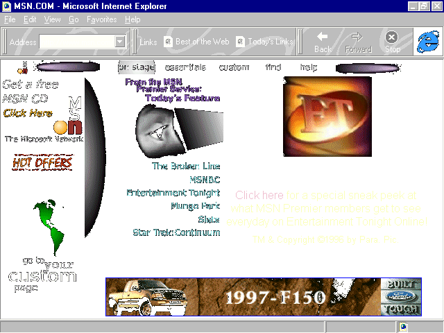
Figure 6.3. MSN's home page on the Net.
Microsoft has a lot of personal reasons for pushing the envelope on content, technology, and online communications. Critics have called the software giant "the evil empire" because of its constant push to dominate every technology it focuses
on, whether it does it well or not.
My experience, having worked with Microsoft for a number of years, is that the drive for dominance is met equally with a deep passion for technology and community. This is well represented by the Microsoft Network, which began as a proprietary platform,
member-driven service that sought to build a bridge from a commercial environment into the Internet. It is now moving toward a completely different model, one that is unlike anything I've seen on the Web, and one that is filled with idealism and
individuality.
With both proprietary and dramatic information behind the member firewall, and plenty of fun on the free-ranges of the public Internet, msn. is doing a great deal to push the edges of technology, always remembering the individual.
A profound example of this on the free-range, full access site is found with the customization process that msn. offers. In essence, msn. has created a potent and powerful marketing tool by offering their Web address as a personalized starting point for
Web surfers.
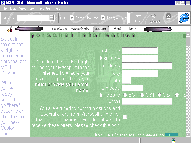
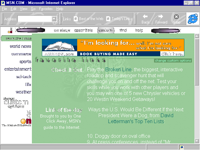
Using CGI scripts, msn. allows visitors to create a completely customized, fill-in-the-blank page (see Figure 6.4), including daily news, stock quotes, sports, entertainment, science and technology information, and whatever else you'd like to fit into
your particular lifestyle needs. My browsers all open to my custom page, (see Figure 6.5), and my day typically starts off with a strong cup of coffee and a surf—all from the msn. home page!
Figure 6.4. Filling out custom features for msn.
Imagine if your Web site used such an intelligent method of giving people this custom service! The major advantage of this type of model for Web site developers involves the advertising base market. With large numbers of visitors, a Web site can fund
itself and, in fact, make money by selling high-priced advertising. Other advantages include the opportunity to use the attention to fuel content and push technology, as well as sell other products and ideas you might have to an attentive public.
All of this is embraced by Microsoft Network's free-range capability to provide both great content and personal service. There are numerous ways that independent designers can make sites function in this fashion, but the highest and
most effective is to find a niche market. Brock Meeks of Wired magazine once told me that he thought that the Web was "the niche market of niche markets."
This observation can't go unheeded. What market can you provide the best information? Is it a local, regional, national, or international body? Is it for women only? For parents? For book writers, doll collectors, hunting enthusiasts? There are
literally thousands of special-interest communities that will respond to well-developed, thought-out, "jumping-off" sites that cater to very specific needs. Web designers can benefit from the large-scale model and success of msn.'s custom
services by simply applying the concept of narrowing down content to appeal to a certain audience.
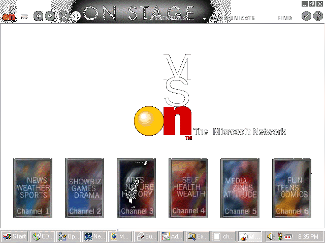
Perhaps the most exciting events at msn. are happening for the members of the network. The Microsoft Network is serving up a wide range of high-style entertainment, information, and community, all of which serve as a jumping-off point for members who
enjoy the comfort of a gated community. (See Chapter 10.) It also provides a personal tour guide that brings the chaos of the Internet into a more ordered perspective by leading members to daily events and highlighted Web sites.
This leading is done by drawing from the more familiar paradigm of television, but with an interactive twist thrown in. msn., in its newest incarnation, offers up channels (see Figure 6.6) where "shows" take place. These shows are a
combination of proprietary and independent Web site productions that fit into definitive niche models such as online magazines or adventures. These productions appeal to children and teens, or specific topical interests such as news, health, culture,
travel, and so on. These shows are actually interactive multimedia that engage and involve the audience with ambitious design, as well as offering specific community issues that involve individual shows.
Figure 6.6. On the member side: channels on msn.
This show model does not exist elsewhere, and speaks to a very important aspect of what Web sites currently need to remember: New media is interactive media, and the Web is evolving toward a fully integrated multimedia model. The unifying theme between
the free-range and the proprietary msn. content is the personalization of the Web-that it is a service and community based on people and their common interests.
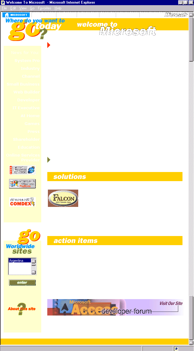
Figure 6.7. Microsoft home page.
Microsoft's own home site is nothing to sneer at. It is enormous, with information geared at the promotion of the company's products and interests, as well as the provision of customer service. The information on Microsoft's Web site should never go
unnoticed. I check with the site almost daily because the prevalence of information for the Web designer and the emergence of new technology data makes it an appetizing visit.
The amount of information on Microsoft's site has often proved a challenge to the designers of the site, who change structure and design quite regularly. It is my opinion that this isn't only done to freshen visual interest, but, rather, to accommodate
the vastness of the content. With each incarnation, Microsoft has kept a consistent focus on the content. Not only is the design on the home site attractive, but its intent is to pull the user to the functions Microsoft provides.
One of the constants in the last year has been the navigation bar along the top of the page. Few designers have been as successful in creating a top navigation option as this daddy of all Web sites. The success lies in both the simplicity of the
navigation bar and the integration of the bar into the flow of the rest of the site.
Top navigation is problematic because it can interfere with other important information that belongs at the top, such as a header for page identification. Microsoft has solved this dilemma by using a thin bar and attaching it to the header data. (See
Figure 6.7.) Also, the top navigation delineates the major portions of the site, and individual breakdowns of data are further dealt with using left margin navigation (see Chapter 7, "Sites that Explore: Travel and
Adventure"), as well as ample linking within the page itself.
This combination is a sensible approach for the amount of data Microsoft provides. The site has been generally simplified by using the top navigation. Web designers can consider this style of navigation for any site, but the primary caution is to be
sure this important area integrates with other information that belongs there, rather than distracting or confusing visitors.
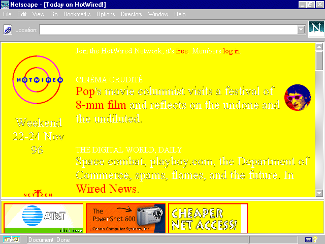
Figure 6.8. Hotwired's colorful presence.
HotWired's site and content are often controversial for the public as well as the Web designer. The same can be said of the 'zine's companion print publication, Wired magazine, which has always pushed public buttons regarding its elitist
attitude. The public controversy also extends to its design sensibility, with its vivid colors and bizarre approach to shape and continuity.
Despite these controversies, HotWired is a prime example of how to exploit client-sided power for enhancing speed. This is most evident in the use of vivid, primary colors throughout the site.
Whether the design techniques used on HotWired are found within the use of a background color, a text color, or within graphic renderings, HotWired passes right over a lot of the download time of full-spectrum graphics. The end result is still a
memorable, if occasionally headache-inducing, presence by letting browsers do the work rather than servers.
Forcing the browser to do the thinking is smart and fast, and there are many ways Web designers can do this, simply by employing the same elements that HotWired does.
Background Color. Discussed in greater detail in Chapter 10, background colors load from the browser, making the total download time of a site much less intense than the use of background graphics. If speed and bandwidth
conservation is a consideration in your Web project, consider using colors from the browser rather than using a graphic texture or design. The major caution here is the "safe" palette, also discussed in Chapter 10, as well
as in the color chart appendix in this book. (See Appendix C, "Color Table.") Further information can be found on the CD-ROM, which offers a safe palette that can be loaded directly on to your machine.
Font Faces and Colors. Also browser-dependent, the use of font colors will add life to a site without adding extended time. Discussions of fonts can be found throughout this book. (You can check in the Index for specific points of interest
regarding font use.) For the purposes of this discussion, the exploitation of font face and color enhance speed by relying on the browser's intelligence, rather than using graphics to achieve the same effect. As font faces become more platform-stable,
their use is becoming the preference for many Web designers.
Exploit Color within Graphics. Remember that the number of colors in a graphic are going to make an enormous difference in the file size of that graphic. By selecting colors very carefully, and then reducing gradations by selecting and replacing
any gradations, file sizes are tremendously reduced and download times increased dramatically.
To sum up this discussion, color is a huge part of design. To keep things hot, think a lot about color and how you can use it to create active and enjoyable viewing. To streamline the wired relationship between server and browser, and keep things moving
quickly, rely on client-side, browser-dependent features such as background colors, font faces, and colors to fulfill your color needs. The end result can be a vibrant, memorable site that loads very quickly, pleasing even the low-bandwidth visitor.
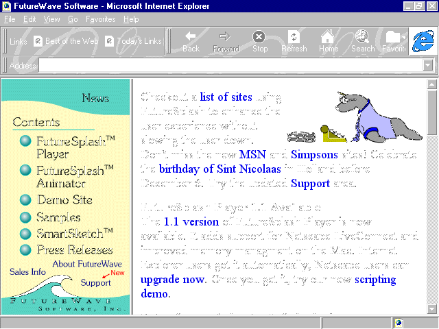
Figure 6.9. FutureWave home page.
Picture an animation program with a user interface that is easy to understand, simple to use, and results in sophisticated Web applications that are compact, can be downloaded to the browser, and run client-side (on your own computer) in a flash?
FutureSplash, a technology developed by FutureWave, offers the application program from their innovative and attractive Web site. The site is designed with a clever use of FutureSplash, including mouse-over animations. The first, as seen in Figure 6.10,
causes the button to appear depressed, or punched upon mouse-over. When you actually click the button, a splash appears. (See Figure 6.11.) A clever, inline animation of a typing seal can be found on the home page, showing off FutureWave's complete
animation features.. (See Figures 6.12.)
Figure 6.10. Mouse-over on FutureSplash button depresses the button.
Figure 6.11. Mouse-click causes a splash.
Figure 6.12. Still shot of typing seal animation.
FutureSplash technology is delivered automatically to the Internet Explorer 3.0 browser. Netscape 3.0 handles it well, too, with a quick download of a plug-in.
Animations can be created in a wide variety of formats, including GIF animations, JPEG sequences, QuickTime Movies, AVI formats, and, of course, the FuturesSplash format itself. This gives animators a lot of flexibility in terms of creating dynamic as
well as high-quality graphic renderings.
Both the tool and the player are available in Windows and Macintosh formats, making the tool very accessible to developers. The animator is also quite inexpensive, with a trial product available for download from the site, as well as on the CD-ROM that
accompanies this book.
Although FutureSplash is neither as broad a multimedia option as Shockwave, or compares with the diversity of a scripting or programming language such as Java or JavaScript, the end results of many of FutureSplash's animations are better than both
technologies in terms of ease of use, file formats, and file size. The product is exceptional and allows designers to add immediate dynamic content to Web pages that encourage visitors who use the most up-to-date technologies.
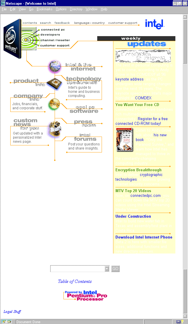
Figure 6.13. Intel's home page.
By now, most of the American public is aware of Intel, primarily because of its mass media advertisement for its processors. The "Intel Inside" insignia appears on a multitude of merchandise that have been built with Intel products.
The Intel Web site is a very nice example of low-key, attractive layout, graphics, and fonts. Intel has also used the top navigation idea discussed earlier in the Microsoft section, and it is, undeniably, used well here, too, affirming that a large part
of the trick with top navigation is that it integrates with other information normally found in the header field of a Web page.
Colors, lines, colored table backgrounds, and GIF animation have been used together to create a dynamic yet subtle look for the home page. The HTML code is technically good, but what surprised me was the amount of extra space in-between each tag.
Because HTML pages are usually small in file size to begin with, most designers pay little attention to thinking about how to reduce the size. However, if every kilobyte counts (and designers are wise to currently operate under the idea that it does),
HTML pages are then contributing to those kilobytes.
In the case of Intel's page, a lot of fat could be trimmed by removing the amount of space caused by carriage returns between tags. Here is a brief example of the space to which I am referring:
<HTML>


<HEAD>


 <TITLE>Welcome to Intel</TITLE>


</HEAD>
All told, this sequence takes up 16 separate lines! Some designers put everything on a single line, I have a problem with that as it makes things impossible to find. However, if I apply my personal HTML style to this example, I end up with a total of 5
lines, 9 less than the original:
<HTML>

<HEAD>

<TITLE>Welcome to Intel</TITLE>

</HEAD>
As an experiment, I took the entire source code off of the Intel's home page and reformatted it in my style. Intel's original code weighed in at 10 kilobytes, my version at 8. Two kilobytes might not seem much, but start adding graphics and it could be
the difference between several seconds or more of download time. And, for the bandwidth conservative, every second counts!
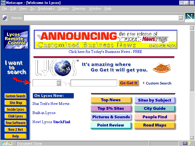
Popular as a search engine originally developed by a group of computer scientists at Carnegie Mellon, the site is now a fully commercial, ad-revenue project.
Design on this site is decidedly, and necessarily, direct. The most important function, the search engine, is wisely placed in that all- important space—just a few inches from the top and left of center. This way, folks going to the site just to
seek and find won't have to seek the finding tool!
Advertisement banners sit on top. Navigation is primarily a left margin option with various site offerings. There are also graphic, as well as link, options to stories and subcategories within the text.
Lycos offers another navigation option as well: the popular Java applet referred to by Lycos as a "remote control." I've seen similar applets also called "Launch Pads." The concept is, basically, to create a remote control style
navigation that is separate from the browser and is available to people no matter where they are on the site.
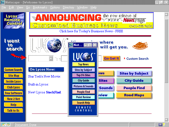
Lycos is intelligent to offer this as an option for visitors; you must first click the Remote Control icon to get the feature. (See Figure 6.14, in upper-left corner.) This is a whole heck of a lot nicer than some sites, who simply pop the
navigation up without regard to the user, who may find this type of navigation a hindrance rather than a help.
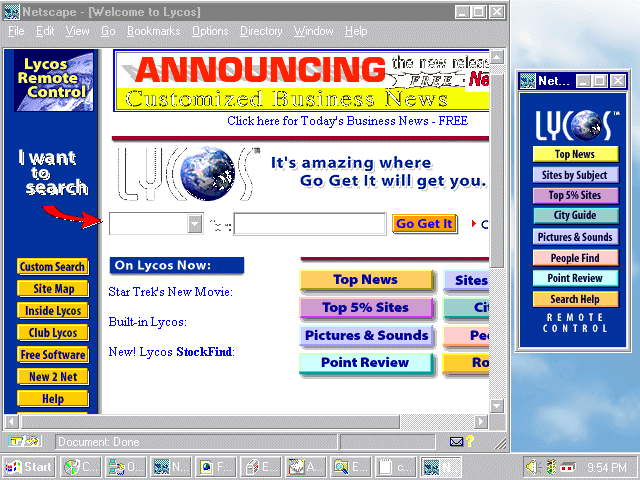
Why would such a seemingly concise method of navigation be problematic? Well, for the default population who is viewing the Web on a 15" monitor at 640x480 screen resolution, where do you put this nuisance? First it pops up on top of the browser
itself. (See Figure 6.15.) However, if you begin to use the browser and try to read or maneuver within it, the remote is suddenly very remote, as it disappears behind the browser's interface! It then becomes a nuisance to manage just where this navigation
element goes, which is a timely, exasperating project that is truly a waste of time. Furthermore, if you reduce the browser window to accommodate the launch pad at that screen size and resolution, you lose the impact of the Web page itself. (See Figure
6.16.)
Figure 6.15. Java remote control pad over browser.
Figure 6.16. Reducing screen size doesn't help on a 15", 640x480 monitor.
For those Web surfers who have larger screens and higher resolution, the launch pad or remote is a nice option because it can be placed elsewhere on the desktop, alongside the browser. The tool, then, makes sense. But I'll give you a nickel if you can
find too many people outside the field of computing (especially those on PCs) who understand that a larger monitor and higher screen resolution means placing the browser on the desktop and not expanding it to full screen size! People figure, "Hey,
more viewing space! Well, I'll just fill it up with my browser." Unfortunately, it doesn't work that way in the work-a-day world.
So, if you like the idea of a launch pad or remote control, do as Lycos has done, and give it only to the people who will use it. Offer it as an option, but not a necessity.
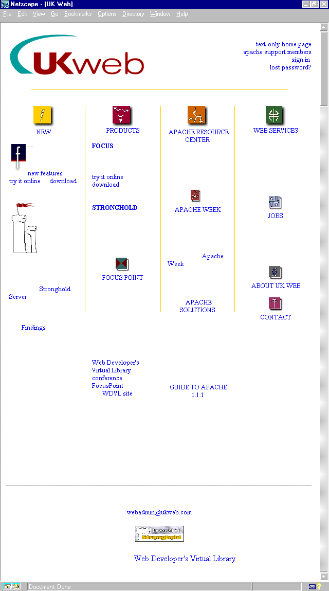
Located in Leeds, United Kingdom, UKWeb specializes in the Apache Web Server as well as several software applications, including the Web conferencing system called "Focus."
The UKWeb Web site relies on bits of color from horizontal and vertical yellow lines, a very neat layout of information offered, and simple but appealing section icons.
Because much of UKWeb's services involve customer support, it is wise that the site makes good use of the very simple but often overlooked mailto: anchor as a method of keeping people only a click away from being in touch.
Any Web site developed should have a way for visitors to send feedback or comments to at least one person on the site. Contact is imperative for almost all Web sites, and it's easily done. My particular take is to offer at least a hotlinked mailto:
option as well as physical mailing addresses and phone numbers.
All this can be done very simply and without distracting the viewer from the page's content. UKWeb has elected to place a mailto: on their pages, always at the bottom of the page, which allows people to simply drop down should there be something they
want to write to the company or Web master.
The mailto: tag must be one of the most simple things to implement in HTML! Here's the syntax:
<a href="mailto:yourname@domain.com">Contact Name Here</a>
That's it! Place it on a Web page and replace it with the appropriate mailing address and contact in the correct spots, and voila! An instant mail link literally links your clientele to the persons or people they need to be in contact with.
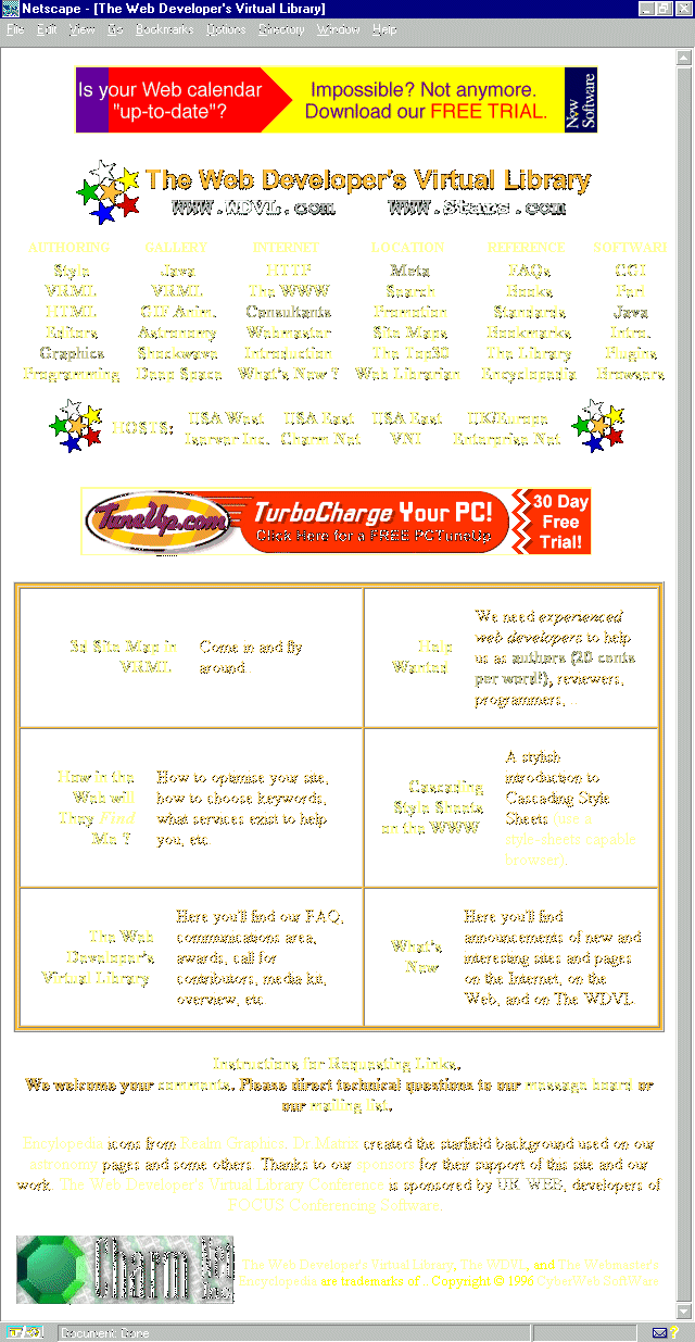
Figure 6.18. The WDVL home page.
The Web Developer's Virtual Library (WDVL) is a site that is extremely information rich and acts as a powerful gateway to numerous other resources. Ironically, I've never been much impressed with the design, and recently I found out that the maintainers
of the site are frustrated with it too. The problem simply is a case of "the painter never painting his house" syndrome: The good folks running the show never have time to get to the design because they are so busy getting the information
organized.
Nevertheless, I'm placing it here because it is my topmost choice for central information for the Web designer. So, what I'm going to do is make some suggestions based on several of the practical tips in this chapter and gently perform a simple
redesigning of the page, improving but not changing it too dramatically.
The first thing I've done is to take the six main categories and write them into a top navigation bar as Microsoft has done. This will link the categories to the top-level information, so as not to ruin the continuity. I then removed the detailed
sub-lists of these categories; they can be picked up later on individual pages, or, if I had chosen another design style, they could be placed along a left-margin, navigation system.
Next, I've pulled the featured articles up to the top of the page, and dropped the constraining table borders from around them. I like the use of color and contrast, but I have made some font changes to enhance the look and feel and make it a bit more
contemporary.
Finally, I've moved advertising below the articles. I made use of alignment principles (see Chapter Nine, "Sites that Express: People on the Net—Unique Home Pages) and fixed the centered alignment of contact and page details.
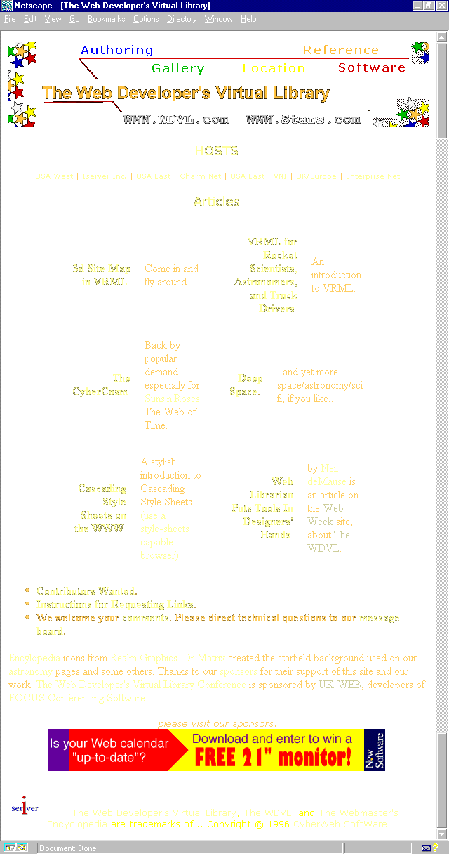
The resulting page allows for the natural dissemination of detailed information to other site sections, an easier to navigate interface, and a clean layout that doesn't appear too constrained. (See Figure 6.19.) The basic integrity of the page is
intact, however, showing how the application of a few simple techniques can considerably improve a site.
Figure 6.19. A quick redesign improves some of the WDVL design problems.
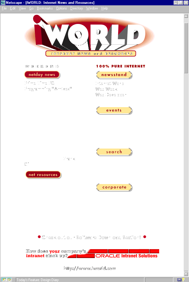
Figure 6.20. Internet World home page.
Everything Internet can be found at Internet World, Mecklermedia's Web-based contribution of various trade magazines including Internet World, Web Week, and Web Developer, as well as online-only offerings such
as software, news, and events information.
Not only do I recommend that Web designers buy subscriptions to the hard copy versions of anything and everything Mecklermedia publishes, but also keep this site bookmarked as a resource that should be visited as often as daily or weekly. The
information is often top-line, and always pertinent to the work that designers are engaged in.
The design of the IWorld site is neither overwhelming, nor should it be. It is subtle, with good use of color and layout, and the information is well-organized. This is another example from the less-is-more school of Web design. The message is in the
content, and any overdoing of bells and whistles could conceivably get in the way of quick access to the information. In a word, the design is smart.
Many designers caught on to the importance of the alt argument within image tags long ago, but I tend to be astonished at how many designers blow off this not only highly functional but very important tool.
The alt tag is a way to provide a text alternative to the image. This means that if there is a descriptive image or link necessary to define for text-only browsers, the alt tag is the way to do it. Using this tag, you can flag that graphic element as
important, as well as assign a function to it.
For those individuals who think text browsers are a thing of the past, think again. Not only are they prevalent in colleges and foreign countries, but, to this day, they are the easiest way for the blind population to navigate the Net.
Internet World inspired this teaching because it uses the alt tag as a way to describe the header's function on the main page. By clicking it, you'll get right to the feedback page. However, this is not apparent unless you're using the Internet Explorer
browser, which reads alt tag information on mouse-over. Therefore, the first use here is functional.
Other uses for the ALT element would be as follows:
Using ALT arguments properly is not only helpful to Web visitors, it also demonstrates a mature use of HTML. Professional designers are highly encouraged to understand, and use, this element well.
Before I let you pass through the pipe to the next destination, I'm going to cause a bit of a bottleneck so as to review the primary elements of learning found within this chapter. At that point, I'll be sure the administrators of the book get the
service back online, and let the data flow begin again.
Ah—looks like the data is flowing again. Next hub is one of the more adventurous along the way. Chapter 7, "Sites that Explore: Travel and Adventure," will take visitors on a fun-filled journey through the best travel resources on the Web.