![]()
![]()
![]()
Everyone needs a daily dusting-off from the edges of the work-a-day world. Most of us do this by going to a movie, enjoying humor, music, books and magazines, sports, or playing games. Everyone has his or her preferred method of entertainment, and some
extension of these favorites can be found on the Internet.
When fun, games, and the Web come together, it's an especially exciting time. Many analysts suggest that the Web is moving in the direction of merging the many forms of in-home entertainment enjoyed today. When bandwidth problems are solved, and
technologies such as cable TV and new media converge, the world will know new levels of interactive pleasure.
A great example of this movement toward convergence, but with respect toward today's bandwidth limitations, can be found at the 40K Miracle site. Dedicated to creating great animation and games that all come in under 40 kilobytes, this site is well
designed, superbly interactive, and very entertaining. Because the enjoyment of this site requires that you enjoy indulging in it yourself, I'm going to focus primarily on a more general issue—how to be sure people get to your site!
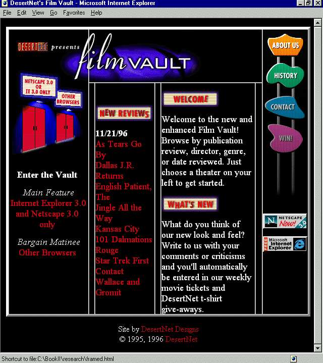
Next up is the Film Vault, a humorous and well-designed site for film buffs. Film Vault offers up capsule reviews, extended reviews, and a very nice search function where visitors can decide whether to view film information by genre, director, or date.
Using tables for design layout, which is becoming commonplace, is examined, with a helpful guide to various table elements and what they do.
ActiveX is Microsoft's exciting addition to Web technologies, and I'll offer a little information as to what it is, the types of applications it is used for, and where to get more information on how to develop ActiveX functions for the Web. Quantum
Chess is an excellent example of ActiveX; I'll use this Internet-based game environment by BR Labs as the jumping-off place for the ActiveX discussion.
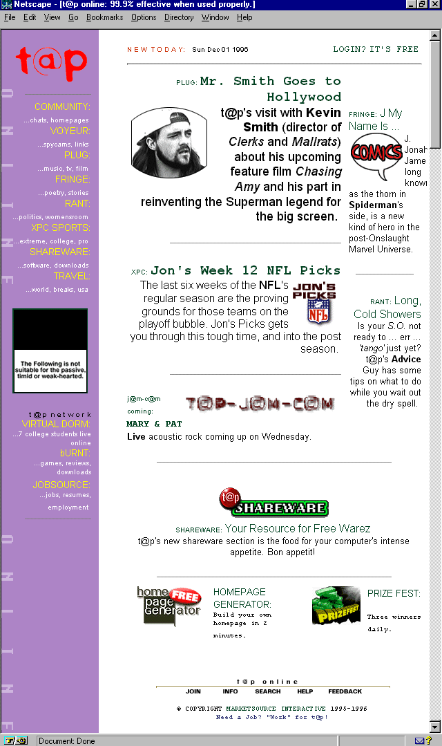
A very entertaining magazine for "next generation" users is T@P Online. Offering coverage in literature, music, style, and sports, this is a sassy and fun e-zine that provides hours of enjoyment for visitors. I'll examine the <br> tag,
as well as the HTML 3.0+ additions to it that have made it an extremely powerful and functional HTML element.
A little humor is always in order, and that is sure to be found on Max Cannon's Red Meat site. The macabre cartoon is becoming one of the world's most popular, with translations being offered as far away as the Czech Republic! The balance between visual
design and content is an important conceptual lesson, and I'll offer some points to ponder when discussing Cannon's humorous offering.
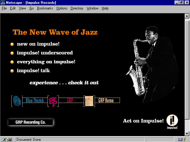
GRP Recording, a subsidiary of MCA/Universal, has a stunningly well-designed Web site dedicated to the Jazz and Blues artists represented under its labels. Proximity is an important design concept that will be examined in this overview. Then I'll jump
back into film, and look closely at the Sundance Channel's site, where the clever use of typography has been aided by the HTML <tt> tag. Sports enthusiasts are sure to enjoy Sportsline, a very extensive site with all there is to see, do, play, and
read about in the sports world. Here, I'll examine character entities and how to apply them to effectively communicate various symbols, signs, and special characters most often required by Web designers.
Paramount has a visually attractive Web site that offers a very fine example of graphic proportion. And, if you haven't had enough of film, I'll give you one more site to enjoy. A fan of director Martin Scorsese has created a very interesting set of
pages, well designed and highly functional, and with the most impressive treatment of a hit counter that I've ever seen. I'll discuss the problems with hit counters, and show that if you have to have them, the way the Scorsese site has used it is at least
attractive.
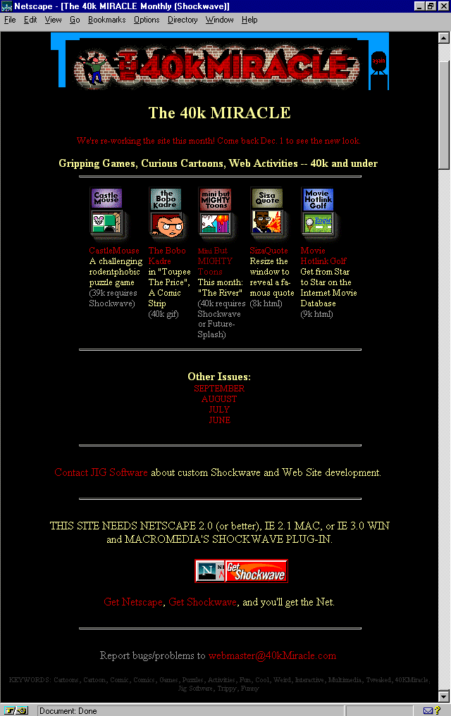
Figure 2.1. 40k Miracle Monthly Home Page.
This site is the epitome of entertainment. I thoroughly enjoy the animations, which are beautifully rendered and totally funny, and the design itself is visual candy. It's especially worthy of respect for the general bandwidth-respecting multimedia,
which all comes in under, as the title of the site says, 40 kilobytes.
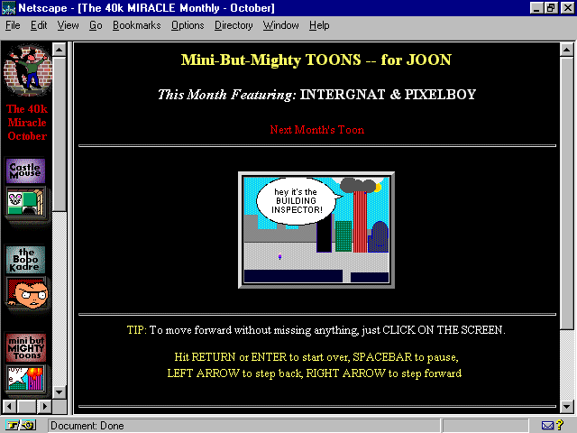
Now, get warmed up to the site with some dialog from one of the animations presented. Meet Intergnat and PixelBoy, an unlikely dynamic duo who are out to battle the evil bandwidth abusers:
"Oh no, Intergnat, that building is burning down!"
"You're right PixelBoy! And those flames look like bitmaps, too."
"Think of all the K that's been wasted!"
"Boy, if the fire trucks come with those siren .au sound files, the netizens will be waiting forever!"
Intergnat and PixelBoy save the day, of course, by putting out the fire. They didn't use water, as that would require streaming video, but they did indeed find a way to solve the problem in a low-bandwidth fashion. (See Figure 2.2.)
Figure 2.2. Intergnat and PixelBoy save the day.
Sites as marvelous as this simply cannot be missed, yet they very often are. The reason is simple: with all of the growing information on the Web, sites can easily be overlooked. There are many things that Web site developers can do, some costly, some
not, to ensure that a Web site gets seen. A discussion of banner promotions and off-line marketing techniques is offered in Chapter 11, "Sites that Sell: Company Presence on the Web." For the purposes of this chapter, I'm
going to examine the domain name as a marketing device.
Domains are the data that the Internet uses to identify specific "lots" within the network. In their raw form, domains are numeric. I'm sure you've seen this reflected in numeric URLs.
Domain names are alphanumeric overlays to the numeric component of a given domain. Essentially, they are the name of the server on which the information resides. Systems Administrators get the names from the Internic (
http://www.internic.net/). How a name will be implemented is going to be up to you and the server situation you are involved with. But, to some, having a domain name is as much a part of their marketing strategy as other forms of advertisement.
Domains have two primary parts: the name and the suffix. Names can be almost anything you want, although there are some character restrictions. Typically, any combination of letters and numbers can be used to create the name. This is followed by a
suffix, which determines the type of organization under which you register. General suffixes include
.com—Commercial organization (very common on the Web these days!)
.edu—Educational organization
.gov—Government institution
.mil—Military institution
.net—Network
.org—Organization
There are also country codes that fall into the suffix section of a domain. Some examples include
.jp—Japan
.uk—Great Britain
.mx—Mexico
Note that the www that you see at the beginning of most domains is typically a requirement of the server rather than an actual part of the numeric necessity. Sometimes they are necessary, sometimes not. With 40k Miracle Monthly, it is, in fact,
necessary to include the www with the domain name and suffix.
http://www.40kmiracle.com/
From the preceding URL, you can see the placement of the defining www, the domain name (40kmiracle), and the domain suffix.
Registered domain names are very much like a personalized license plate. If I want people to remember me, I might go out and put "Molly" on my plates, just as I could go and register the domain name http://www.molly.com/. Well, I could, if
someone else didn't already have that particular domain! Internic keeps track of registrations, and its very simple to find out if something is already being used.
Therefore, the routine is to figure out what I want my domain name to be, check it out with Internic, and if it isn't used, to register it.
Domain names, when used for the purpose of association and marketing, must be easy to remember and relate to the product or offering. The reason goes beyond my just being able to find the 7Up Web site by typing in
www.7Up.com. It also helps get the site indexed by Web worms and crawlers. Many of these highly-trafficked databases will index URLs, and will find associated references in a given search. This boosts the probability of your Web site getting found.
A domain name should not be too long, as there's too much opportunity in that case for someone to make a mistake and have trouble finding you. Keep them as short as possible. 40k Miracle has 10 total characters; this is almost stretching it. I would
recommend keeping names down to 7 or less characters. It's no accident that phone numbers in the U.S. are 7 digits. This is because 7 has been found to be an effective number for people to recall. I'd stick to that convention, as it's something people are
already familiar with.
Suffixes should best represent your organization. Most commercial Web sites should be registered with the .com domain. Because there's a glut of names in this suffix, there is some discussion that Internic will be adding another suffix, such as .biz, to
accommodate the commercial infiltration of the Net. If you are a commercial organization, start with the .com suffix.
Educational, military, and government organizations must fulfill specific requirements in order to qualify for those suffixes. The .net suffix is always an alternative. Any network qualifies, and the meaning of network in this instance is considerably
vague. The same is true for .org, which refers to the general "organization." Typically, .org is appropriate for not-for-profit organizations, but as with .net, there is an amount of vagueness involved, and it will be up to you to determine what
most truthfully reflects your site.
Note that if you've selected a great domain name but someone already has it registered with your preferred suffix, you might try changing suffixes to something else, in order to get the combination that bests suits you.
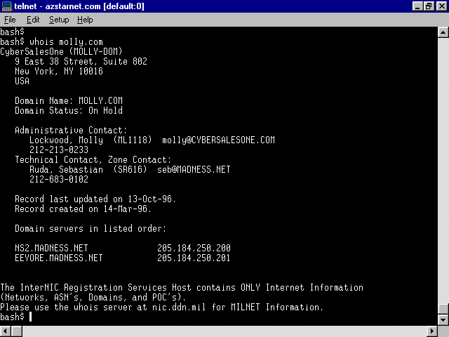
Once you've made your selection, you can do a simple whois search. Using a Telnet application, or logging into a shell account with a command prompt, simply type the following:
whois www.molly.com
If the domain is taken, the search results will show who owns it and what its status is, as you can see in Figure 2.3, where someone has absconded molly.com! However, if a domain is not taken, which molly.net is not, a "no match" will result.
Figure 2.3. whois search showing that someone already has dibs on molly.com!
The Internic also has a Web-based whois application that you can use as an alternative to this line-based option.
I can now go register my chosen domain, molly.net. To do this, I can use the Internic's Web interface. From the main page at http://www.internic.net/, select Registration Services and follow the links accordingly.
Choose your preferred way for payment. Fees are very reasonable: $100.00 to register and $50.00 a year thereafter will maintain the domain name.
Once your domain is registered, it will be implemented by your Systems Administrator to work on your server. Some Sysadmins require payment for this service, and there will be various ways to handle the domain. If you either run at the root (you
are the server), or if you have what is known as a virtual server (a server has been "multi-homed" to make your section pretend it is root), you can have the straight-forward domain name. If your Sysadmin doesn't provide this type of
service, you will likely have a directory name after the domain name:
http://www.molly.net/molly/
Make sure to work with your Sysadmin from the start. This will ensure that you get the type of domain name and the results you are seeking!
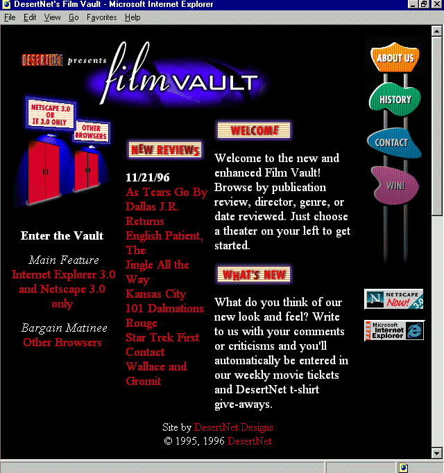
Figure 2.4. The Film Vault home page.
This extremely popular Web site has gone through several incarnations in its design, as many sites that stay with the times do. The current incarnation is very notable for several reasons. First, the graphic design is quite attractive, and humorous!
Enjoy the flickering film light sneaking out under the door on the home page. Custom JavaScript enhancements have allowed for very sophisticated sort-and-search options, and the use of advanced frame technology makes the interface extremely functional.
Although much of what is on the Film Vault could conceivably provide interesting, individual design discussion, the most significant, for the purposes of this book, comes with the way the designers of the site have used tables to create the graphic
layout of the pages. The technique of using tables as the layout code for most sites has become so commonplace on the Web, it almost indicates the beginning of a standard. Although HTML is in and of itself a layout tool, it has limitations. When tables
were introduced, designers realized that tables were the answer to many of the headaches brought on by HTML limitations. Tables have become the real layout tool, rather than just a way to organize lists of information.
There are many ways to approach table layout; often, similar layout results can occur from different approaches. Here I'll discuss table basics, showing what various table elements do. It will be up to you as a designer to implement the various elements
in order to get the results you're after. In Figure 2.5, I turned on the table borders so you could see how the Film Vault designers actually broke up images in order to gain effective layout with tables.
Figure 2.5. Film Vault home page with table borders turned on.
Practice might not make perfect in the case of tables, because there is so much evolving in HTML and the way it is used. Despite the rapid changes in the Hypertext Markup Language, practice might very well find you discovering all kinds of unique ways
to present material, as it has with the Film Vault.
I'll begin with the most obvious, the <table> tag. This tag invokes a table, and the data that comes after it will determine the structure and content of how the table will be implemented. Like most traditional HTML tags, <table> requires a
closing tag to indicate the end of the table, represented by </table>.
Data within a table is handled by the determination of rows and table data. Table rows are signified by <tr> and the companion close, </tr>. Table data tags follow the open and close rule, <td> and </td>, respectively.
There are other elements, such as <th>, that refers to table heading cell, and <caption>, which places a caption for the table. I rarely use either of these. Their general use seems limited too, because there are more logical methods of
achieving the same effects.
Each of the preceding tags allows for a variety of arguments. It is constant addition to these arguments that make tables considerably effective as a layout tool. Table tag arguments control a great deal of information, and learning various ways to use
the arguments will dramatically increase the quality and diversity of your layout skills.
The <table> tag itself allows for the following arguments:
The table row tag <tr> is the container for table data information. Table rows can argue the following attributes:
The last tag attributes I'll examine here in detail are the table data, or <td> arguments. They include
There are, of course, other instances of arguments and methods of working with tables. For more details on how to use them effectively, one excellent place to find cutting-edge use of and extensions for table layout is Microsoft's Site Builder Workshop
( http://www.microsoft.com/workshop/).
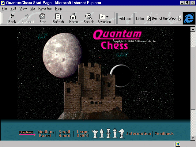
Figure 2.6. Quantum Chess home page.
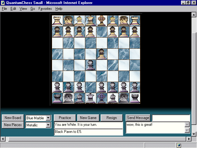
Chess lovers will thoroughly enjoy the opportunity to gain both practice and bona-fide live-over-the-Net chess games with a beautiful, flexible chess-board interface (see Figure 2.7) created by Brilliant Labs.
Figure 2.7. Quantum Chess interactive board.
Using ActiveX controls, Brilliant Labs has built several interactive games for use over the Net. An ActiveX-enhanced browser is required, and that's easily managed with Microsoft's Internet Explorer.
ActiveX seeks to create a component that integrates objects built in any programming language or multimedia application with Web client/server technology. These languages and applications can, and do, include Java, C++, Visual Basic, VRML,
QuickTime Virtual Reality, and Shockwave. Essentially, this means that no matter the developer tool, there is a way to integrate these as applications via the browser.
This integration enables tremendous cross-browser and cross-platform solutions. Web designers are quite enthusiastic about the possibilities and extended applications that ActiveX can bring to the desktop via the Internet. ActiveX is an extension on the
OLE (object linking and embedding) concept, and brings that technology into a new time.
For Web designers, it is imperative to become familiar with ActiveX applications, even if programming is not your specialty. Understanding a bit about what ActiveX can do, and learning where to find more resources now, will help you in the long-term
development of dynamic, integrated Web content. A few minutes at the Quantum Chess site should inspire you in terms of games, but this is only one very small application.
The best information on ActiveX development can be found by visiting Microsoft's Internet for Developers ( http://www.microsoft.com/intdev/). Another very impressive resource, particularly for examples of
ActiveX in action, is C|NETs ActiveX site at http:www.activex.com/.
Figure 2.8. T@P Online home page.
It's young, independent, sassy, and full of fun. T@P Online is a well-designed, well-written, and superbly presented 'zine geared at the "next generation" (whoever that is)! My sense is that it's catering to twentysomething-year olds, or what
others might refer to as "Gen-X'rs" (before that became de[as]classe[as]). It doesn't matter, though. If you're young-at-heart and want a fresh perspective on all forms of entertainment, from fashion to sports, this 'zine is worth a look.
The layout uses lots of tables, as described earlier, and allows easy access to the wide variety of articles and interests within. Simple navigation and a fine appreciation of typography and Web design elements are noted throughout, as is the clean HTML
code. This clean HTML code makes good use of a number of HTML 3.0+ arguments and extensions, including those related to the break <br> tag.
The <br> tag (no closing </br> exists) has historically been used as a way to create white space between paragraphs, or to mimic a hard return. This hard return breaks lines of text where the designer wants to do so without adding a line of
white space beneath the break, as would a paragraph (<p>) tag.
In earlier days of HTML, page creators used the <br> tag in a number of creative variations, including multiple tags in a row, to arrange elements spatially. Thank goodness that as HTML has evolved, so have the way important elements such as this
have been used.
There is actually only one argument allowed in the <br> tag, but it has three values, each powerful enough to give the tag new flexibility and importance in HTML coding.
<br clear="x"> is the syntax, where x equals one of the following values:
This series of syntax is especially helpful when trying to control page data in a consistent fashion between different browsers that support HTML 3.0 and above. Using these arguments with the break tag creates a default layout for the elements involved
that is determined by you, the Web designer, rather than the browser.
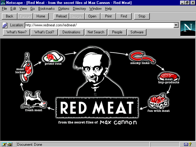
Figure 2.9. Red Meat splash page.
The rather bizarre work of cartoonist Max Cannon is taking the world by storm, both offline and online. The Web site is used as an extension of the syndicated cartoon, as well as a place for interesting sale items, history, press information, and other
important data on the life and works of this contemporary cult hero.
The Red Meat site is very well-designed, having begun as a fan's site, which then was taken control by Cannon's agent and publishers. The look of the site improved, the custom, Java-enhanced navigation (see Figure 2.10) is simply a joy, and the graphic
design is as humorous and macabre as the cartoon strip itself.
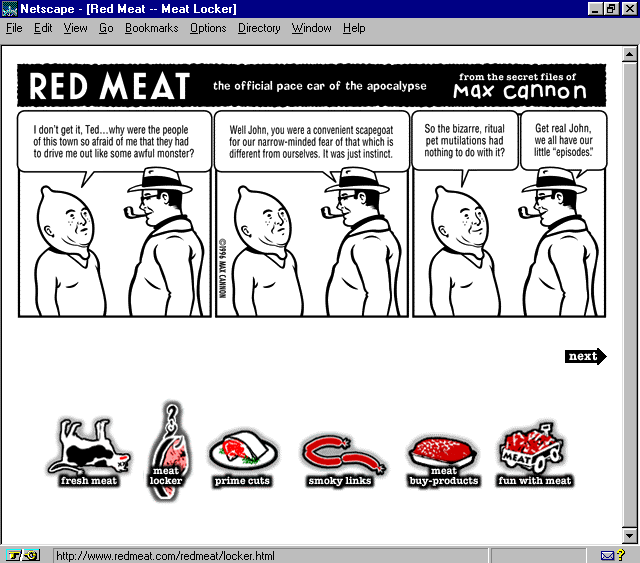
Figure 2.10. Java mouse-over animation on Red Meat: note reverse colors on the second navigation option.
Web sites need a certain balance of content-to-design, and this is an important note for Web designers to take and place in the concept section of their design references. It speaks to the idea that a Web site can have fantastic visual imagery, sensible
sections, and impeccable presentation, but if the content isn't fleshed out (if you'll pardon the pun), savvy eyes are going to notice.
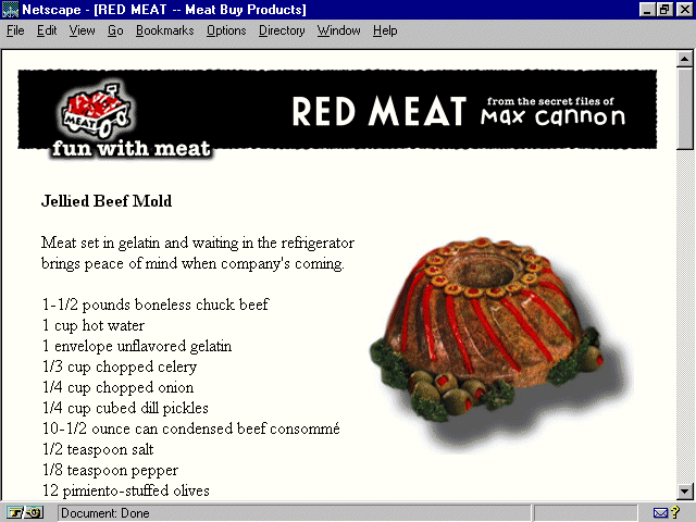
In Figures 2.9 and 2.11 you'll see the complete navigation set and an example of one section of content, which provides some side-splitting, fun graphics and information. Other sections are almost bare, as can be seen in Figure 2.12. Although you'll
note that I often discuss how writing for the Web should be "short, sharp, and shocked," there are also examples where too little written content is detrimental. This can be avoided by doing one of two things:
Balance is the key, which could also be said about just how much red meat one eats!
Figure 2.11. Fun with Meat Page: note ample content.
Figure 2.12. Where's the beef? This page lacks text!
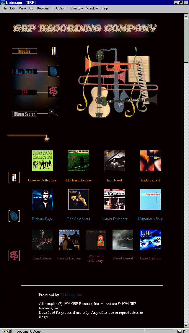
Truly a beautiful site, this site, designed by T3 Media, is a visual, as well as aural, tribute to the contemporary jazz artists within its group of labels. Such noted musicians include George Benson, Larry Carlton, and Keith Jarret.
GRP's home page is a study in proximity. This is the design concept that relates the distance of a given page element from the next. It's a lesson designers should take home and study, because this is a design concept that flies right over the
head of many people creating Web pages. That's forgivable for the hobbyist, but unforgivable for the professional. And there are many professionals not paying attention!
Because of the small visual space of a Web page, trying to fit too many elements into a page goes against the primary need of proximity, which is to group elements that form a cohesive idea together. This grouping creates organization, ease of access to
the information, and aids in the creation of white space by forming natural clusters of visual information.
Breaking up space in clever ways is part of the challenge of design, especially Web design. Again, this is because of the limitations of the space. Turn those limitations into opportunities and you've accomplished a great deal in improving the vista of
the Web.
Note that in Figure 2.13, the GRP home page has done a very precise job of keeping important elements together, but has also allowed for some spatial fun in the way the top graphics are arranged. In Figure 2.14, an internal GRP label page, notice how
the type to the left is larger, separate from the picture to the right or the navigation bar along the bottom.
Figure 2.14. Internal GRP page.
The concept of proximity suggests that each element has a relationship to itself, to other like elements, and to the page as a whole. First, keep the necessary information, so that it appears together in one space. Then, lead the eye to the next
information, with just the right amount of space in between. Too much distance would confuse, too little would be visually busy and annoying. Finally, notice the general balance of the site. Does it flow well? Is there enough space between elements, or too
much? None at all? Remember that organization is the key!
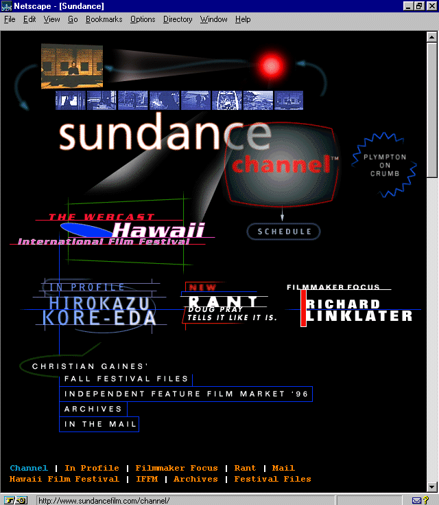
Figure 2.15. Sundance Channel home page.
This site is the home page for the film extension of the variety of Sundance-related projects started by actor/director Robert Redford. Long interested in the works of independent film makers, the Sundance Channel is a subscription-based service
available via satellite, or by petitioning local cable companies to carry it. Independent full-length and short subjects are featured, as are animation and documentaries.
The Web site is expertly designed, with advanced use of lines, color, shape (see Chapter 4: "Sites that Teach: Arts, Culture, and the Humanities"), dynamic animation, and a very nice respect for typography. (See Appendix B, "Top Design Tips," for more references to type control.)
There are more and more methods of type control coming to the Web, via graphics, HTML advances and special browser extensions, Cascading Style Sheets, and clever uses of HTML tags. For some time, designers played with the <pre> tag, which forces
pre-formatted text and space, as well as defaulting to the monospaced default font within the browser. Due to the inconsistencies with using the <pre> tag to force a monospaced type, it has become less and less popular to use as a typographic trick.
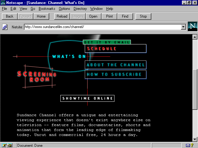
Appearing more frequently is the <tt> and </tt> tags, which force a monospaced font. This can be used very effectively as a typographical element, as shown in Figure 2.16, an internal page from Sundance.
Figure 2.16. Internal Sundance channel page.
See how the type looks like a typewriter-style font? That's the result of the <tt> tag. The syntax to create this look is very simple:
<tt>
Place the text you wish to appear as monospaced here.
</tt>
Typography on the Web is really in its infancy. As you've seen with this discussion, and with others throughout the book where typography is discussed (please refer to Appendix A, "Site Index," for a list of
references), Web designers are using as many workarounds as possible to achieve font control. It is likely that creative applications, as found here with the <tt> tag, will continue to serve Web design in this fashion until such a time that better
type controls are available.
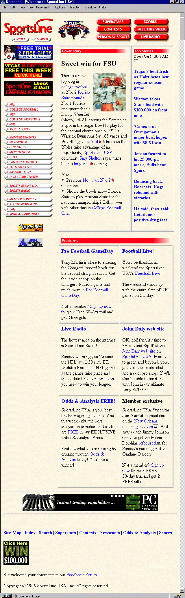
Figure 2.17. Sportsline home page.
Sports fanatics who also enjoy the Web are sure to be in for a treat with this great offering from SportsLine. This magazine-style site serves up feature stories, up-to-the-minute scores, contests, odds and analysis, and even radio broadcasts of various
events.
The design is easy-going, more functionally pleasing than esthetically so, but with plenty of sensible, mature design elements employed. The site is well worth many return visits for both the content and its ease of use.
When peeking at the code, it occurred to me that this was a perfect opportunity to discuss character entities. These are elements that appear in what is known as the ISO-Latin-1 character set, several of which are used frequently by coders to achieve a
variety of important symbols. I'll go over a few that are used most frequently, as well as offering a few resources that you can explore to get the full set.
The advantage of using character entities allows for consistency across various browsers. One could literally type out an entire document using the ISO-Latin-1 set; however, that would be ridiculous.
Some of the most frequently used character entities are shown in Table 2.1.
| Character | Entity | Classification |
| & | & | Ampersand |
| @ | @ | The famous "at" symbol |
| © | © | Copyright Symbol |
| ® | ® | Registered Trademark |
| Indent | | Creates a tab indent |
For a complete listing of ISO-Latin-1 entities, visit Jasper Verkroost's character set (
http://ourworld.compuserve.com/homepages/jasper_verkroost/isolatin.htm).
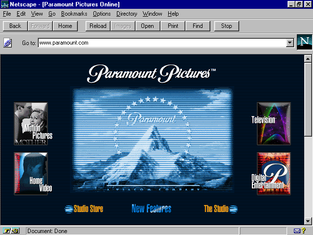
Figure 2.18. Paramount Pictures home page.
The earlier discussion of proximity relates well to the example that Paramount's home page provides. This is proportion, or the size of the graphics that are placed on a page.
Paramount's site is attractive, offering information on motion pictures, home video, television, digital entertainment, the Paramount Studio, and access to the Paramount store online. There's plenty of fun to be had, particularly for movie buffs, who
will appreciate the ample information on new releases and upcoming attractions.
Note in Figure 2.18 the way that the size of the graphics don't force me to scroll down to view the main interface of the site. This is intelligent proportion, working within the parameters of a 640x480 pixel environment. Paramount takes that a step
further by being aware that some of that space is further taken up by other elements, such as my browser tool or location bar. When I do scroll down, it's because I want to, not because I have to.
This is not to say that many well-designed sites don't require me to scroll down to get the gist of the design. However, if the objective is to create a navigational interface with that first "splash" screen, it is very wise to make sure it
all fits into that defined area. Test, and then retest, on different browsers, machines, and monitors to be sure.
Web designers have a bad tendency to oversize graphics, perhaps because many of them either have no design background, or because they misunderstand the diversity in technology—that not everyone is using high-resolution, large monitors and millions
of colors. It might also be the fact that graphic designers are simply not used to such restricted space. Please bear in mind that I am expressing this not to place blame or highlight a fault, but rather offer an observation to designers who wish to become
more effective in the mien of the Web.
This means thinking about proportion! Certainly, things can be designed larger and then rendered smaller in order to be able to play with layout, proximity, placement, and so on, but be sure to remember that, as with the kilobytes of data you'll be
sending over limited bandwidth, size matters!
The following are a few questions and considerations:
Is the visual information clear?
If I'm creating a complete interface, does the most important information fit within one screen?
Have I created a page that is simply too long? Three screens of scroll should suffice, give or take.
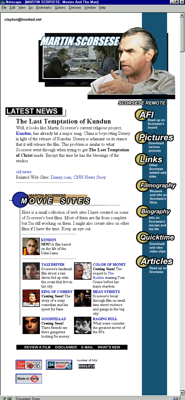
Figure 2.19. Martin Scorsese site main page.
This highly discerning Web site built by a fan is not only jam-packed with information about one of the most venerable living film directors, but is presented in a high style as well.
A right-sided navigation bar is used, an unusual choice that begs some danger; however, it creates a divergence from the more standard left-margin, which is very admirable. Tables are used to create a very esthetic as well as functional layout, and the
site is regularly updated with fresh information for the Scorsese fan.
One of the things I liked most about the site was the way hit counters were placed. Typically, I'm one of the members of the "I hate them/won't use them" group, for a number of reasons, ranging from their total lack of accuracy to the way they
are overused to the point of disgust. But, some people want them, in fact, demand them, and if you find yourself wanting or needing to use them, I'd take inspiration from this site.
The counter appears way at the bottom of the page, along with other "announcement" style information, including browser links and so on. Then, very simply, and proportionately subtle, the counter resides alongside this common information.
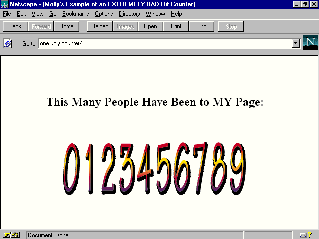
Nothing is pulling extreme attention to it. It's not placed at the top of the page, or the center of the page, as some page creators do. (See Figure 2.20. Note that the counter is an example of a real counter program, but the page is fake, so as to protect
the perpetrators.) Instead, it's there if you look for it, but it doesn't hit you over the head and say "LOOK how many hits I have."
Figure 2.20. One very ugly hit counter example.
Hit counters, links to browsers, awards, in fact, any item that is extraneous to the information that is imperative to a given page, will ideally be left off, simply because it impedes the quality and integrity of a design. In some instances, these
things might be desirable, so how about placing them on a help page, or credits page? This way, your audience members can visit a page designed around that information, rather than forcing the information into a page that is well-designed.
Take your final bows for having fun while learning how to do the following:
For my encore, I've prepared the next chapter, which highlights newspapers and magazines on the Web!
![]()
![]()
![]()
![]()