


|
You might have thought that I explained everything about images on the Web in the previous chapter. Well, although I did explain how to use images in HTML in that chapter, you might have noticed that I said very little about the images themselves. And in Web page design, a lot of the technique in working with images doesn't have anything to do with HTML at all, but instead with features and tricks you can do with the images before you even put them onto the page. In this chapter, I'll explain a bit more about basic image concepts on and off the Web, including the following:
I mentioned earlier in this book that GIF is the only format available on the Web that is guaranteed to be cross-platform, meaning that it could be viewed on any computer system. Your choice of image formats has doubled since the first edition of this book appeared: JPEG files have been growing in support on the Web and should be widely available on the Web by the time you read this. In this section, I'll give a quick overview of both formats, and the rest of this chapter will explain some of the advantages and disadvantages of each so that you can make the decision about which format to use for your images.
GIF, or CompuServe GIF, is the most widely used graphics format on the Web today. GIF stands for Graphics Interchange Format and was developed by CompuServe to fill the need for a cross-platform image format. You should be able to read GIF files on just about any computer with the right software.
| Note |
GIF is pronounced jiff, like the peanut butter, not GIF with a hard G as in gift. Really. It says so in the early documentation of GIF tools. |
The GIF format is actually two very similar image formats: GIF87, the original format; and GIF89a, which has enhancements for transparency, interlacing and for multi-frame GIF images that you can use for simple animations. You'll learn about interlacing and transparency in this chapter, and about multi-frame GIFs in Chapter 9, "External Files, Multimedia, and Animation."
GIF files are great for logos, icons, line art, and other simple images. They don't work as well for highly detailed images because the GIF format is limited to only 256 colors. Photographs in GIF format, for example, tend to look grainy and blotchy.
The biggest problem with GIF at the moment has nothing to do with its technical aspects. The problem is that the form of compression it uses, LZW, is patented. UniSys, the owner of the patent, has requested that developers who use the GIF format after 1994 pay a per-copy royalty for the use of LZW. That includes Web browser developers and the people who write image-editing programs. Because of the problems with the patent on LZW, the GIF format may fade from view in the future and be replaced on the Web with some other, more freely available platform-independent format.
The most obvious candidate for the format likely to replace GIF for the time being is JPEG, which stands for Joint Photographic Experts Group (the group that developed it). JPEG is actually more of a compression type that several other file formats can use. But the file format for which it is known is also commonly called JPEG. JPEG is pronounced jay-peg.
JPEG was designed for the storage of photographic images. Unlike GIF images, JPEG images can have any number of colors, and the style of compression (the compression algorithm) it works especially well for photographic patterns, and so the file sizes it creates from photographs are considerably smaller than those that GIF can produce. On the other hand, the compression algorithm isn't nearly as good for line art and images with large blocks of color. It also uses lossy compression, which means that it throws out bits of the image to make the image smaller.
JPEG files have just begun to be widely supported by browsers on the World Wide Web, but most of the major browser makers already have JPEG support, and more are sure to follow.
If I had a whole book to talk about color theory, I could go into the half-dozen or so common models for describing color. But this is a book about the Web, and this chapter is specifically about images that will be displayed on the Web, so I don't need to be so verbose (and boring). Instead, I'll talk about the two major color models: the model for how you and I perceive color, which is called HSB (Hue, Saturation, and Brightness), and the model for how your computer handles color, which is called RGB (Red, Green, and Blue). With a basic under-standing of how these two color models work, you should be able to understand most of the color issues you'll encounter when dealing with images on the Web.
The Hue, Saturation, and Brightness model is sometimes called subjective or perceptive color, because this model intuitively describes how we perceive color and changes from one color to another. Under the HSB model, each color is represented by three numbers indicating hue, saturation, and brightness.
| New Term |
HSB stands for Hue, Saturation, and Brightness and is a way of representing individual colors based on how they are subjectively seen by humans. |
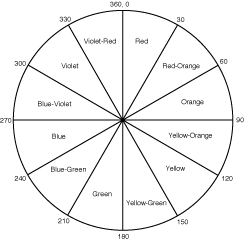
Hue is the actual color you're working with. Think of it as being like the tubes of paint that an artist uses: red, blue, yellow, orange, violet, and so on are all hues. But so are orange-yellow or bluish-green. The hue encompasses all the colors in the spectrum and is measured from 0 to 360 in degrees around a color wheel, starting with red at 0 and 360, yellow at 120 degrees, blue at 240, and all the other colors in between (see Figure 8.1).
| New Term |
Hue is the actual shade of color you're working with: for example, red, blue, or greenish-yellow. Hue values are from 1 to 360. |
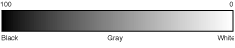
Brightness is how light or dark the color is. When you mix white or black paint in with the main color you're using, you increase or decrease the brightness. Brightness is measured as a percentage, with 0 being white and 100 being black (see Figure 8.2).
| New Term |
Brightness is how light or dark the color is. Brightness can be made darker by adding more black, or lighter by adding more white. Brightness numbers are from 1 (white) to 100 (black). |
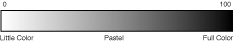
Saturation is the intensity of the color you're using-how much color there is in the mix. If you had a sky blue, which was a little blue paint and a little white paint, you could add more blue paint to increase the saturation and make it more blue. Saturation is also measured as a percentage, with 0 as no color and 100 as full color (see Figure 8.3).
| New Term |
Saturation is the amount of color. Less saturation creates pastel colors; more saturation creates more vibrant colors. Saturation numbers are from 1 (no color) to 100 (full color). |
You can represent any color you can see using the HSB model, and more importantly, you can represent any color you're using by simply using the three HSB numbers. Also, modifying colors is easy using the HSB model. When you seek to "make a color lighter" or "make it more purplish-blue," these correspond neatly to modifications to brightness and hue, respectively. In fact, if you've ever used a color picker on your computer, such as the one from Adobe Photoshop (shown in Figure 8.4), usually the user interface for that picker is based on the HSB model (or one similar with a different name such as "HSL: Hue Saturation and Lightness").
Figure 8.4 : An HSB color picker in Photoshop.
Now that I've spent all that time explaining color in terms of HSB, I'm going to mess it all up: most of the time when you deal with colors in image-editing programs and on the Web, you don't describe a color in HSB. Most image programs indicate color as RGB (Red, Green, and Blue) values instead.
RGB is the way computer monitors display color. If you get really close to your monitor, you'll see what look like individual dots, which are actually combinations of red, green, and blue dots that are produced by the red, green, and blue electron guns in your monitor. It's the combination of those dots in varying intensities that creates a single color on your screen. Color values in RGB, as you learned in the previous chapter, are indicated using three numbers (one each for red, blue, and green) that range from 0 to 255. 0 0 0 is black, 255 255 255 is white, and the full range of colors (more than 16.7 million, which is more than the human eye can distinguish) is represented in the middle.
| New Term |
RGB stands for Red, Green, and Blue, and is a way of representing color based on color from light sources (display monitors, for example). RGB values have three 0-to-255 values (one each for red, green, and blue). |
| Note |
Although you can specify any of the 16.7 million colors as an RGB value in this way, your monitor or display system might not be able to display the color entirely accurately. The 16.7 million colors you can represent using the three RGB values is called 24-bit color (the RGB values are three eight-bit numbers, therefore, 24 bits total). If your display can handle only eight-bit or 16-bit color (256 and 65536 colors, respectively), it will try to match the color you asked for as closely as it can to the colors it has, or it will create a pattern for the missing color. Don't worry about the differences in your display's capability to display colors and the image's colors; displays with more colors will just give finer gradations of color, usually not the wrong color altogether. |
Note that you can still get the full range of colors using both RGB and HSB. They're not different sets of color; they're just different ways of describing color mathematically. The same color can be given in RGB numbers or HSB numbers, and if you convert one to the other, you'll still get the same color. It's like measuring your height in inches, centimeters, cubits, or cans of Spam: each one is a different measurement scale, but you stay the same height regardless of how you measure it.
So why did I go on for so long about HSB if RGB is much more common? Because it's easier to think about changes in color using HSB than it is in RGB. You usually won't say, "I need to increase the green level in that image" (which, in the RGB model, results in a more orangy red, believe it or not). So when you're working with images, go ahead and think in HSB to create the colors you want. But keep in mind that when a program asks you for a color, it is asking for the RGB values for that color. Fortunately, most color pickers and editing tools will give you color values in both RGB or HSB.
Both the GIF and JPEG formats can represent color as three 0 to 255 RGB values. The major difference between the two formats, however, is that images stored in a GIF file can have only 256 total colors, whereas JPEG images can store any number of colors.
The GIF format stores its colors in an indexed color map. A color map is like a series of slots, each one holding a single RGB color. The colors for each pixel in the image point to a slot in the color map. If you change a color in the map, all the pixels in the image that pointed to that slot will be changed (see Figure 8.5).
Figure 8.5 : Color maps in GIF images.
| New Term |
A color map is a table of all the colors in the image, with each pixel in the image pointing to a slot in the color map. |
The GIF format has a 256-color color map, which means that you can store a maximum of 256 colors in the image. When you convert an image to GIF format, you usually also have to reduce the number of colors in the image to 256 (and if your image-editing program is powerful enough, you'll have some options for controlling which colors are discarded and how). Of course, if you want to use fewer than 256 colors, that's an excellent idea. The fewer colors you use, the smaller the file.
| Note |
Color maps are called by a great variety of names, including color table, indexed color, palette, color index, or Color LookUp Table (CLUT or LUT). They're all the same thing-a table of the available colors in the image. Your image-editing program should give you a way of looking at the color map in your image. Look for a menu item with one of these names. |
JPEG, on the other hand, can represent any number of RGB colors, allowing you to choose from millions of colors. Reducing the number of colors won't help you much in JPEG because JPEG file sizes are determined primarily by the amount of compression, not by the number of colors.
When I first started working with images on the Web, someone told me that if I reduced the number of colors in my image, the file size would be smaller. Okay, I thought, that makes sense. But how does one reduce the number of colors? For simple icons I could just paint with only a few colors, but for more sophisticated images such as photographs or scanned art, trying to reduce the existing number of colors seemed like an incredibly daunting task.
With the help of some image-editing friends, I figured it out. In this exercise, we'll go through the process I use when I need to reduce the number of colors in an image so that you can see what is involved.
| Note |
I'm going to be using Adobe Photoshop for this procedure. If you do a lot of image editing, Photoshop is by far the best tool you can use and is available for Macintosh, Windows, Sun, and SGI platforms. If you're using another editor, check the documentation for that editor to see whether it provides a similar procedure for reducing the number of colors in an image. |
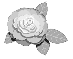
The image we'll start with is an RGB drawing of a pink rose (see Figure 8.6), with many shades of pink and green. (You can't see the pink and green here, but you can get the idea.)
The first step is to try converting the image to indexed color in preparation for making it into a GIF file. If we're lucky, there won't be more than 256 colors to begin with, in which case the job is easy.
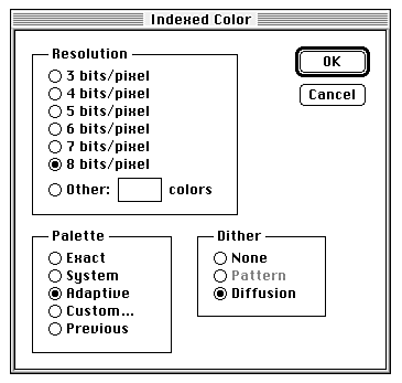
In Photoshop, selecting Indexed Color from the Mode menu gives you the dialog box you see in Figure 8.7.
Figure 8.7 : The Indexed Color dialog box in Photoshop.
If the image contains fewer than 256 colors, the actual number of colors is listed in the Other part of the Resolution section. If your image already contains fewer than 256 colors, by all means use those colors. Otherwise, you'll have to cut some of them out. In the pink rose image, we didn't get lucky: because there's nothing in the Other box, we've got more than 256 colors in the image. Darn.
To reduce the number of colors, choose one of the radio buttons
in the Resolution section. The smaller the bits per pixel, the
fewer colors you have. Look at Table 8.1 for a quick reference.
Remember that each of the colors you have is still a full RGB color, so you aren't restricted in the set of colors from which you can choose-just in the total number of colors you can have. So you could have an image with 256 colors, all of them varying shades of pink, if you wanted it.
Because fewer colors is better, let's try going for the minimum-three bits per pixel, or eight total colors. When you're reducing the number of colors, Photoshop also asks you which palette (Photoshop's name for the color map) you want to use and which Dithering option. Dithering is a way of reducing colors in an image by creating patterns of available colors that, when viewed together, look like the original color (for example, a black-and-white checkerboard to approximate a gray color). Most of the time, you'll want to use an Adaptive Palette (which weights the colors in the palette based on how frequently they're used in the original image) and a Diffusion dither (which provides the most uniform dithering of missing colors).
| Note |
If you were lucky enough to have fewer than 256 colors in the image, use the Exact palette instead of the Adaptive palette. |
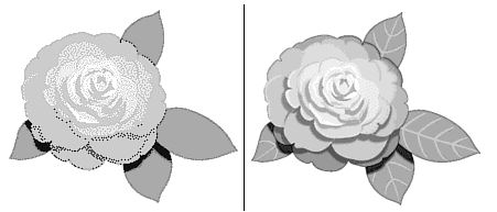
After you select OK, the colors are converted and dithered, and the new image is created. In Figure 8.8, I've put the original image on the right so you can compare.
Figure 8.8 : The new image (3 bits per pixel).
With only eight colors, much of the detail that was in the original image is gone. The veins in the leaves are no longer visible, and the rose is primarily a pink blob with some black and white highlights.
But all is not lost. Just undo the mode change and go back to RGB color. Don't convert back to RGB using the Mode menu; when you converted to eight colors, you lost the original data. Use Undo instead.
Try converting to Indexed Color again, this time using four bits per pixel, slowly moving up in colors until the image quality is where you want it to be. Obviously, for the highest-quality image, you should use eight bits per pixel, but you might be able to get away with five or six and still have close to the same image to work with.
For this rose, I eventually ended up using five bits per pixel, which gave me 32 colors to choose from. The image still looks a little dithered, but the quality is quite good. Figure 8.9 shows the result (with the original image on the right for comparison).
Figure 8.9 : The final image (five bits per pixel).
You might be interested in the actual file sizes before and after, for comparison purposes. The rose image, using 256 colors, was about 10.5K. The version with only eight colors was all the way down to 3K. The final version-the one with 32 colors-is a nice happy medium at 6K. Although the difference in three or four kilbytes may seem incredibly trivial, if you use multiple images on your pages, the total space saved can mean your page loads that much faster.
Even if you manage to reduce the colors on your GIF images to a point at which the image quality is pretty good, or if you use JPEG images so you don't have to worry about reducing your colors, on some platforms and some pages, you might be in for a nasty surprise. Some of your images could come out looking horrible or in all the wrong colors. What's going on here?
This is most likely a problem with color allocation with the platform on which you're viewing the page. On some systems, the video card or display system might be limited to a single color map for everything on the system. That's only a certain number of colors (usually 256) for every application running on the system. And slots in the table for colors are allocated (assigned) on a first-come, first-served basis.
So let's assume that you have two images on your Web page: one that uses a 256-color map of predominantly pink hues and another (also 256 colors) that uses predominantly blue hues. Your Web browser has only 256 slots, but your images require 512 total colors. What can the browser do? Depending on the browser, it might display the first image fine and then try to use the remaining slots, if any, for the second image. Or it might try to merge the two color maps into something in the middle (a sort of lavender for both images). It might just apply the first color map to the second image (turning the second image pink). At any rate, the more images and more colors you use on a page, the more likely it is that people using systems with limited color maps are going to run into problems.
However, there are two ways to work around color-allocation problems and increase your chances of getting the colors correct.
One way is to make sure that the total colors in all the combined images in your page do not go over 256 colors. For example, if you have four images of equal size with 50 colors each, you can take only up 200 colors. Use the procedure you learned in the previous exercise to reduce the number of colors in each image.
Alternatively, you can use a single color map for all the images you want to put on the page. You can do this in Photoshop by using the following method:
If you described a 24-bit color bitmap image as a list of pixels starting from the top of the image and working down to the bottom line by line, with each pixel represented by the three numbers that make up an RGB value, you would end up with an awful lot of numbers and a very large file size. The larger the file size, the harder it is to store and handle the image. This is where image compression comes in. Compression, as you might expect, makes an image smaller (in bulk, not in dimensions on the screen). Therefore, it takes up less space on your disk, is less difficult to process, and (for Web images) takes less time to transfer over the network. In this section, you'll learn about how the GIF and JPEG files handle compression and the best kinds of files for each file format.
Most common image formats have some sort of compression built in so that you don't have to stuff or zip the images yourself. It's all handled for you as part of the image format and the programs that read or write that image format. Different image formats use different methods of compression, which have varying amounts of success in squeezing a file down as far as it can go, based on the kind of image you have. One form of compression might be really good for images that have few colors and lots of straight lines, but not so good for photographs. Another form of compression might do just the opposite.
Some forms of compression manage to get really small file sizes out of images by throwing out some of the information in the original image. They don't just randomly toss out pixels. (Imagine what this book would be like if you threw out every other word, and you can imagine the effect on an image using that method of compression.) Lossy compression, as it's called, is based on the theory that there are details and changes in color in an image that are smaller than the human eye can see. And if you can't tell the difference between two portions of an image, you don't need to keep both of them around in the file; just keep one and note that there were originally two of them. Lossy compression usually results in very small file sizes, but because you're losing some information when you compress it, the overall image quality might not be as good.
| New Term |
Lossy compression discards parts of the image that the compression program deems unimportant. Lossy compression results in a degadation of image quality. |
The reverse of lossy compression is lossless compression, which never throws out any information from the actual file. With lossy compression, if you have two identical images and you compress and then decompress one of them, the resulting two images will not be the same. With lossless compression, if you compress and decompress one of the images, you'll still end up with two identical images.
| New Term |
Lossless compression compresses without discarding any information from the original image. Lossless compression is less effective than lossy compression, but with no image degradation. |
That's all well and good, you say. You can now impress your friends at parties with your knowledge of lossless and lossy compression. But what does this mean for your image files and the World Wide Web?
GIF and JPEG use different forms of compression that work for different kinds of images. Based on the image you're using and how concerned you are with the quality of that image versus the size you want it to be, you might want to pick one format over the other.
GIF images use a form of lossless compression called LZW, named after its creators, Lempel, Ziv, and Welch. LZW compression works by finding repeated pixel patterns within an image (pixels that have the same color next to each other). The more repetition, the better the compression. So images with large blocks of color such as icons or line art images are great as GIF files because they can be compressed really well. Scanned images such as photographs, on the other hand, have fewer consistent pixel patterns and, therefore, don't compress as well.
JPEG has a reputation for being able to create smaller files than GIF, and for many images, that might be true. JPEG files use the JPEG compression algorithm, which examines groups of pixels for the variation between them and then stores the variations rather than the pixels themselves. For images with lots of pixel variations, such as photographs, JPEG works especially well; for images with large portions of similar colors, it doesn't work so well (and, in fact, it can introduce variations in formerly solid blocks of color). So, the rule that JPEG files are smaller than GIFs isn't entirely true. GIF is better for icons, logos, and files with few colors.
JPEG is also a form of lossy compression, as I noted earlier, which means that it discards some of the information in the image. When you save an image to JPEG, you can choose how lossy you want the compression to be, from lossless to extremely lossy. The more lossy the compression, the smaller the resulting file size but also the greater the degradation of the image. Extremely compressed JPEG files can come out looking blotchy or grainy, which might not be worth the extra space you saved.
If you're using the JPEG format for your image files, try several levels of compression to see what the optimum level is for the image quality you want.
A compressed file can't be displayed until it is decompressed. Programs that read and display image files, such as your image editor or your Web browser, decompress your image and display it when that image is opened or when it is received over the network. How long it takes to decompress the image is a function of the type of compression that was originally used and how powerful your computer is.
In general, JPEG files take significantly longer to decompress and display than GIF files do because JPEG is a much more complicated form of compression. If you have a fast computer, this might not make much of a difference. But keep that in mind for the readers of your Web pages. You might have saved some file space (and loading time) by using the JPEG format over GIF, but decompressing and displaying a JPEG image can use up those time savings on a slower computer.
All this compression stuff is rather theoretical, and you might not be able to grasp exactly what it means to you. Let's try a couple of examples with some real images so you can compare the difference between GIF and JPEG compression firsthand. In this example, I'll use two images: one of a logo with only a few colors, and the other of a photograph with thousands of colors. Both are the same size and resolution (100¥100 pixels at 72 dpi), and when saved as raw data (an uncompressed list of pixels, each one with an RGB value), both are 109,443 bytes (110K).
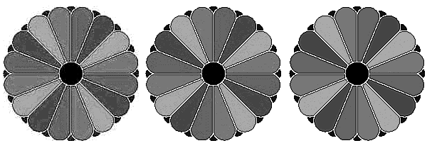
Let's work with the logo first. I'm going to use Photoshop as my image editor again; your image editor might work slightly differently than the one described in this example. Figure 8.10 shows the original logo I started with, a sort of blue flower-like thing.
Figure 8.10 : The original logo.
First, I had to convert the image to indexed color before I could save it, but it had only seven colors, so converting it was easy. When it is saved as a GIF image, the file is a mere 2,944 bytes (3K, down from 110K)! We've managed to compress the file over 97 percent. In compression lingo, that's about a 30:1 compression ratio, meaning that the original file size was 30 times larger than the compressed file size. Because LZW compression looks for repeating patterns (and there are lots of them in this image, with the big blocks of color), a good amount of compression was to be expected. And because GIF uses lossless compression, the GIF file is identical to the original logo.
Now, let's try JPEG. When you save the logo as a JPEG image, Photoshop gives you a dialog box for how much compression you want (see Figure 8.11).
Figure 8.11 : JPEG compression in Photoshop.
I saved the image as JPEG three times with varying amounts of compression and image quality-one at either end of the scale, and one in the middle.
The first image was saved with excellent compression and fair image quality. With this setting, the resulting file size was 6K, a 95 percent gain (about a 20:1 compression ratio), but it still was not as good as with GIF (of course, the difference between 3K and 6K isn't that significant). The second JPEG file was saved with good compression and good image quality, and the last with fair compression and excellent image quality. The resulting file sizes were 19K (an 83 percent gain, 7:1) and 60K (a 45 percent gain, 2.5:1), respectively-both hardly even worth the effort compared to GIF.
Checking out the image quality proved to be even more enlightening, particularly with that first JPEG file. Figure 8.12 shows the result of all three images.
Figure 8.12 : The logo on JPEG images.
The first image I tried, on the left, the one that approached the space savings of GIF, is barely usable. The JPEG compression produced a grainy, smeared image with strange patterns outside the image itself. As a logo, it's unusable.
The other two images (the images on the middle and the right, the ones I saved at good and excellent image quality, respectively) look much better. But GIF, which is the smallest file and doesn't lose any information, is the clear winner here.
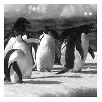
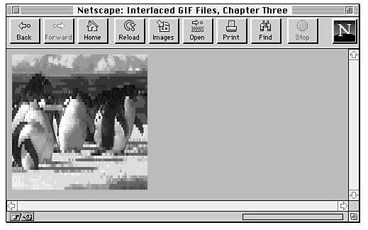
Now let's try the photograph-my favorite penguin picture (see Figure 8.13). Just like the logo, this file is 191¥191 pixels, and the raw data is 109,443 bytes (about 110K).
Figure 8.13 : The original photograph.
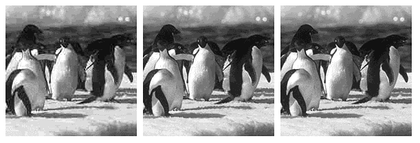
To convert the image to a GIF file, I first have to change it to an indexed color image. Because of the number of colors in this image, I'll save the maximum number of colors (eight bits per pixel, or 256 colors), which will fill up the color map with the most common colors in the image, dithering the remaining colors.
The resulting GIF file is 26,298 bytes (26K), a 76 percent gain, and a 4:1 compression ratio. It's not nearly as good as the logo but not horrible either.
Now onto the JPEG, which should provide significantly better results. Once again, I created three files with varying amounts of compression and image quality, which resulted in the following file sizes:
Even the JPEG image with excellent image quality, which discards very little information, creates a smaller file than the GIF file of the same image. JPEG really becomes an advantage in photographs and images with lots of colors and detail.
Let's look at the resulting images to compare image quality (see Figure 8.14).
Figure 8.14 : The photograph as JPEG images.
Although the difference between the three is noticeable, the one with fair image quality is still quite usable. Because you can get a smaller file with a less noticeable degradation in the image (in the case of the middle one), either the middle or right image would be a good choice, and all three would be better (in terms of file sizes) than using GIF.
You should try this experiment with your own images to see what savings you get with each format.
In addition to the color and compression features of GIF and JPEG images, there are several additional optional features of GIF and JPEG files that provide different effects when those images are displayed on your Web pages, including transparent backgrounds and interlaced images.
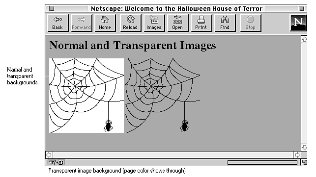
Transparent GIF images have an invisible background so that the color (or pattern) of the page background shows through, giving the image the appearance of floating on the page. Figure 8.15 illustrates the difference between normal and transparent GIFs.
Figure 8.15 : Normal and transparent backgrounds.
Transparency is a feature of newer GIF files (called GIF89a format). It is not available in JPEG files or in GIF files in the earlier GIF87 format. In order to create a GIF file with a transparent background, you'll need an image tool or program that can create transparent backgrounds. I discuss programs to do that later in this chapter.
| New Term |
Tranparency is a feature of GIF files that allows the background of an image to have no color; the color or pattern that the image is displayed over shows through the transparent parts of the image. |
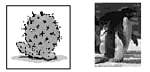
Before you can convert the image, however, you need an image with an appropriate background. The easiest images to convert have transparent backgrounds or are icons or other simple art in which the image and the background are distinct (see Figure 8.16). Although you can have photographs with transparent backgrounds, the results might not be as nice if the defining line between the image and the background is not clear.
Figure 8.16 : Good and bad images for transparent backgrounds.
The goal is to make sure that your background is all one color. If that background consists of several colors that are sort of close to each other (as they might be in a photograph), only one of those colors will be transparent.
You can isolate the background of your image using any image-editing program. Simply edit the pixels around the image so they are all one color. Also, be careful that the color you're using for the background isn't also used extensively in the image itself because the color will become transparent there, too.
| Note |
Even if you have a GIF image in the proper format with a transparent background, some browsers that do not understand GIF89 format may not be able to display that image or may display it with an opaque background. Transparent GIFs are still a new phenomenon, and full support for them in browsers has not yet become commonplace. |
Unlike transparency, interlacing a GIF image doesn't change the appearance of the image on the page. Instead, it affects how the image is saved and its appearance while it is being loaded. As the image comes in over the network, it may have the appearance either of fading in gradually or of coming in at a low resolution and then gradually becoming clearer. To create this effect, you have to both save your GIF files in an interlaced format and have a Web browser such as Netscape that can display files as they are being loaded.
| New Term |
GIF interlacing is a way of saving a GIF file so that it displays differently from regular GIF files. Interlaced GIFs appear to gradually fade in rather than displaying from top to bottom. |
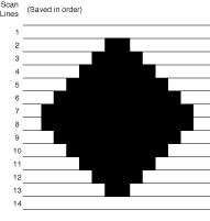
Normally, a GIF file is saved in a file one line at a time (the lines are actually called scan lines), starting from the top of the image and progressing down to the bottom (see Figure 8.17). If your browser can display GIFs as they are being loaded (as Netscape can), you'll see the top of the image first and then more of the image line by line as it arrives over the wire to your system.
Figure 8.17 : GIF files saved normally.
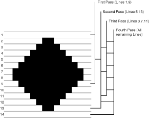
Interlacing saves the GIF image in a different way. Instead of saving each line linearly, an interlaced GIF file is saved in several passes: a first pass saves every eighth row starting from the first, followed by a second pass which saves every eighth row starting from the fourth, followed by on which saves every fourth row starting from the third, and then the remaining rows (see Figure 8.18).
Figure 8.18 : GIF files saved as interlaced.
When the interlaced GIF file is displayed, the rows are loaded in as they were saved: the first set of lines appears, and then the next set, and so on. Depending on the browser, this can create a "venetian blind" effect. Or (as in Netscape) the missing lines might be filled in with the information with the initial lines, creating a blurry or blocky effect (as you can see in Figure 8.19), which then becomes clearer as more of the image appears.
Figure 8.19 : Interlaced GIF files being loaded.
If your browser doesn't support interlaced GIF files, or if it waits until the entire image is loaded before displaying it, you won't get the interlaced effect, but your image will still display just fine. Interlacing doesn't break the GIF for other browsers; it just changes how it's loaded for browsers that can take advantage of it.
Interlacing is great for large images that may take some time to load. With the interlacing effect, your readers can get an idea of what the image looks like before it's finished-which then allows them to stop loading it if they're not interested or, if the image is an image map, to click on the appropriate spot and move on.
On the other hand, interlacing isn't as important for smaller files such as icons and small logos. Small images load quickly enough that the interlacing effect is lost.
The concept of progressive JPEG files is very similar to that of GIF interlacing. Progressive JPEG files are saved in a special way so that they display in a progressively detailed fashion as they're loaded. And, like interlaced GIF files, you need special tools to create progressive JPEG files.
The most significant difference between progressive JPEG and interlaced GIF is in older browsers and tools. Unlike interlaced GIF files, which are still readable in older browsers or browsers that support the older GIF87 format, progressive JPEGs are not backward compatible. Although a quick survey of browsers shows few that cannot display progressive JPEGs at all, the possiblity is there nevertheless. If you do decide to use progressive JPEG files, keep this incompatibility in mind.
Many image-editing programs allow you to save GIF files as interlaced or with transparent backgrounds, or both, and JPEG files as progressive JPEGs. If your favorite program doesn't, you might try contacting its author or manufacturer-with these new features becoming more popular on the Web, a new version of your favorite tool may be out that provides these features.
Many of these tools are available on the CD-ROM that accompanies this book.
On Windows, LView Pro is a great shareware image-editing program that you can get from just about any site that distributes shareware software (I like http://www.shareware.com/). LView Pro enables you to create GIF images with both transparency and interlacing, and the newest version (1.C) enables you to create progressive JPEG files. (Note that 1.B runs only on Windows 3.1; 1.C runs only on Windows 95 and NT.)
On the Mac, the shareware program GraphicConverter can create both transparent and interlaced GIF images as well as progressive JPEG files (and it reads files from Photoshop). You can get GraphicConverter from one of the many Sumex-AIM mirrors (I like http://hyperarchive.lcs.mit.edu/HyperArchive.html).
For UNIX, a program called GIFTool enables you to create both interlaced and transparent images, and it can also batch-convert a whole set of GIF files to interlaced format (great for converting whole directories at once!). You can get information, binaries for several common UNIX platforms, and source for GIF tools from http://www.homepages.com/tools/.
Also for UNIX and the X Window System is ImageMagick, which supports a vast variety of image formats and can handle all these options. See http://www.wizards.dupont.com/cristy/ImageMagick.html for details about ImageMagick.
Now, with a firm grasp of image formats, compression, color, and other cool features, you should be all set to go out and create lots of images for your Web pages. Right? Here are some ideas for where to get them.
If you've got even a small amount of artistic talent, consider drawing or painting your own images for the Web. Your own images will always have more of an impact on pages than the images everyone else is using, and with many image-editing programs there's a lot you can do even if you can't draw a straight line (the computer can do that for you).
Consider looking into scanners if drawing directly on the computer isn't your cup of tea. For flexibility in the sorts of images you can create, scanners are enormously powerful and great fun. Besides the obvious capability to scan in whole photographs (voilà-instant image), you can scan in drawings you've made on paper, patterns from paper or from other objects (leaves, wood, skin), or anything else you can stuff under the lid, and combine everything into an interesting pattern or image.
Flatbed scanners have come down enormously in price over the last couple of years, and you don't need a really high-quality scanner to do images for the Web. Remember, most monitors are only 72dpi, so you don't need a scanner that can do 1200, 2400, or more dpi. A basic 300dpi scanner will do just fine.
If you can't afford a flatbed scanner, hand-held scanners are good for flat images if you have a calm hand and some extra time. Alternatively, your local printing or copying shop might have scanning services, and you could bring your art in and scan it on their machines. Check around. If you're serious about images on the Web, you'll find scanning to be an enormous asset.
| Warning |
Scanning is fun, but don't get carried away. Images you find in books and magazines are copyrighted, and scanning them is a form of stealing. Depending on how net-savvy the company is that owns the copyright, you could find yourself in a lot of trouble. When scanning, be careful that you don't scan anyone else's work. |
Not artistically inclined? Don't feel confident enough to draw your own images, or can't use scanned images? Sometimes the best source of images for your Web pages are the several thousand clip-art packages available on the market. You can get disks and CDs full of clip art from any store or mail-order vendor that sells software for your platform. Look in the back of your favorite computer magazine for dealers.
You should be careful with clip art, however, making sure that you have a right to put the image on the Web. Read the license that comes with the clip art carefully. You're looking for words such as public domain and unlimited distribution. If the license says something to the effect of "you may not publish the computer images as computer images," you do not have a right to put the images on the Web. The Web counts as publishing, and it counts as computer images.
When in doubt, ask. Most clip-art packages have a Technical Support or Customer Service line. Call them up and ask them.
With the demand for images, clip art, and icons on the Web, several sites have sprung up that archive freely available GIF files that you can use on your own Web pages. Here are some that I particularly like.
Barry's Clip Art Server has hundreds of images. Some of them require a donation to the author, but most are public domain. Sorting through this page can keep you busy for hours. Check it out at http://www4.clever.net/graphics/clip_art/clipart.html.
If you're looking specifically for icons, try Anthony's Icon Library at http://www.cit.gu.edu.au/~anthony/icons/index.html.
Also, there are several Web indexes that have topics for clip art and icons. My favorite is Yahoo, which has a whole section for icons on the Web at http://www.yahoo.com/Computers/World_Wide_Web/Programming/Icons/, and one for general clip art and image archives at http://www.yahoo.com/Computers/Multimedia/Pictures/.
Say you've been wandering around on the Web, and you find a page in which the author has created really awesome 3D arrows for his navigation buttons that you haven't seen before. You really like those icons, and you'd like to use them in your own pages.
What do you do? You can copy the files over to your own server. Because they've been published on the Web, you can get them as easily as finding their names (they're in the source for the page) and then loading them into your browser and saving them. But taking the images from someone else's pages and using them on your own is ethically, if not legally, wrong. Someone might have worked hard on those images, and although copyright law for the Web has yet to be ironed out, you're certainly walking close to the illegal line by stealing the images.
The second idea you might have is to just put the URL of that image in your page, so you're not technically copying anything-you're just including a reference to those images on your page. The artist may very well find this worse than copying. The problem with just creating a reference to an image on a different site is that every time someone loads your page they retrieve the image from the original server, creating traffic for that server that it may not want. So putting in a reference can sometimes be worse than directly copying the image.
The neighborly thing to do if you're interested in using someone else's images is to ask permission to use them on your site. You might find out that the images are freely available already, in which case there isn't a problem. Or the artist might ask you simply to give credit for the original work. At any rate, a quick e-mail to the person who owns the pages will cover all the bases and diminish the potential for trouble.
After the end of 1994, when the controversy over the GIF file format and its patented algorithm made the news, there was a scramble among graphics companies and organizations to come up with an image format that would replace GIF. Several image formats were proposed, including TIFF and a modified GIF format with a different compression, but there were disadvantages to all the formats that made them unsuitable for the demanding environment that the Web provides. In particular, the new image format needed to have the following:
As of early spring 1995, one new format proposal seemed to be standing out from the others. PNG, the Portable Network Graphics format, was designed by graphics professionals and Web developers to meet many of the needs of images that are intended to be used and displayed in a network environment. PNG is primarily intended as a GIF replacement, not as a general all-purpose graphics format. For photographs and other images where a slight loss in image quality is acceptable, JPEG is still the best choice.
PNG (which is pronounced ping) provides all the features listed in the preceding requirements, plus the following:
A significant boost for the support of PNG has been from CompuServe, which published the original specification for GIF and has been caught in the middle between UniSys's patent and the huge array of angry graphics developers. CompuServe was originally going to propose its own replacement format, called GIF24, but announced its support for PNG instead.
At the time this book is being written, PNG is still in the specification stage. You can get the current technical information about PNG from http://www.boutell.com/boutell/png/ or from the PNG home page at http://quest.jpl.nasa.gov/PNG/. You can also send mail to png-info@uunet.uu.net for more information.
In a chapter of this size, I can barely scratch the surface of computer graphics and image theory, and it has not been my intent to provide more than a basic overview of the features of JPEG and GIF and how to best use them for the Web. For more information on any of the topics I've covered in this chapter, there are several FAQ (Frequently Asked Questions) files available on the Web, as well as several books on the subject. Here is partial list of the resources that helped me with this chapter:
Until recently, it was easy to pick an image format for the images you wanted to put on the Web, one that would work on all platforms. You could pick any format you wanted to, as long as it was GIF. Now, with JPEG support becoming more popular, there is a choice, and things are complicated. Both GIF and JPEG have advantages for different kinds of files and for different applications. Based on the type of images you want to put on your pages, you can pick one or the other, or mix them. In this chapter, I've explained a few of the issues and how the different formats handle them; I hope I've provided some ideas for how to choose.
Table 8.2 shows a summary of the features and merits of GIF and
JPEG at a glance.
| Format | Availability in Browsers | Colors | Interlacing and Transparency | Compression Type | Compression of Logos/Icons | Compression of Photos |
| GIF | Excellent | 256 | Both | Lossless | Excellent | Fair |
| JPEG | Good | Millions | Progressive | Lossy | Poor | Excellent |
| Q | What about image resolution? |
| A | If you were creating images for printing in newsletters or books, you'd be more concerned about getting the image resolution right because printed images need a great deal of fidelity (600-1200dpi and up). But for the Web, your images are usually going to be viewed on a regular monitor, in which case the resolution is almost never greater than 72dpi. If you scan and create all your images at 72dpi, you should be fine. |
| Q | You didn't talk much about bit depth. You didn't talk at all about halftones, resampling, or LAB color. You didn't talk about alpha channels or gamma correction. |
| A | I only had so many pages. I focused on what I thought were the most important topics for people designing images for the Web-and halftoning and gamma correction aren't as important as understanding color maps and lossy compression. My apologies if I didn't cover your pet topic. |
| Q | My clip-art packages say the images are "royalty free." Does that mean the same thing as public domain? |
| A | All "royalty free" means is that you don't have to pay the author or the company anything if you use the image as they intended you to use it. It says nothing about how you can use the image. The images might be royalty free for use in printed material, but you might not be able to publish them as computer images at all. Again, read your license, and contact the company if you have any questions. |
| Q | You talked about HSB and RGB, but the other one I keep seeing is CMYK. What's that? |
| A | CMYK stands for Cyan, Magenta, Yellow, and Black (B is already taken by Blue). The CMYK color model is used in the printing industry. If you've heard of four-color printing, CMYK are the four colors. The color
model is actually CMY, and various combinations of the three produce all the colors you'll ever need to print on paper. Full amounts of the three combined are supposed to add up to black, but because of variations in ink quality, they rarely do (you
usually end up with a dark brown or green). For this reason, true black ink is usually added to the model so that the blacks can really be black.
Because CMYK is used for printing, and not for images that are designed for display, I ignored it in this chapter. If you're really interested, feel free to look at the books and FAQs I mentioned in the section "For More Information," earlier in this chapter. |