Perhaps the most interesting feature of Visual Basic 5 is the capability to create ActiveX controls. What was once reserved for C++ programmers with a master's degree in Microsoft's Component Object Model now is available to Visual Basic programmers. ActiveX controls are presented in a simplified, object-oriented form with which VB programmers have become familiar. The simplification, however, does not hinder the possibilities available; you can create robust, distributable controls with ease.
This chapter presents a background on the creation of ActiveX controls and starts you on your way to creating custom controls. You will build some simple controls in this chapter that introduce you to the facilities available as a VB programmer.
Why build ActiveX controls? You might think that there are plenty of control vendors out there. "Why should I build controls when I need to get business-critical work done?" Or, "Hasn't XYZ company already built and tested the do-everything widget?" The answer is no. All programmers have controls they know and love, and they continue to write the same code over and over to get a familiar behavior out of that control. By creating reusable components, you might spend less time implementing common code required to use tools created by others. Creating ActiveX controls is a convenient way to encapsulate common functionality.
Programmers also have controls that can do almost everything they need. Sometimes they sacrifice functionality in an application because their current controls don't provide it. At times, programmers must write ugly looking code to accomplish a task their controls do not provide. Now Visual Basic provides a way for programmers familiar with its object model to access the desired functionality without having to build the entire control from scratch.
Visual Basic 5's new control-creation capabilities are based on the Component Object Model (COM). This component standard enables the controls you create to be fully functional in environments that support COM. You can use ActiveX components in Visual Basic, C++, Delphi, PowerBuilder, ActiveX-capable Internet browsers, and the Microsoft Office suite of applications.
Using ActiveX controls on the Internet/intranet can provide a dynamic diversion from static HTML. You can place ActiveX controls on Web pages to present a more exciting environment.
New terminology has come along with Visual Basic's new look and feel. What were once called OLE servers have become ActiveX components. Although the names have changed, the underlying idea is still the same; the notion of the client using some functionality provided by the server still exists. The new terminology allows for further classification of the types of servers (or components) that might be created.
When you start a new project in VB 5, you are presented with the types of projects you can create. Of the component types, you can create code components or interactive components. Code components provide an easy way to package libraries of code for reuse. ActiveX executables and ActiveX DLLs are types of code components. These component types are different in the way in which they are executed. ActiveX executables are out-of-process components; they run in their own address space. You must start an ActiveX executable manually. ActiveX DLLs (formerly known as OLE DLLs) are in-process types of code components; they run in the address space on another application. DLL components cannot operate on their own; other applications or components must initiate the DLLs. An ActiveX control is an example of an interactive component. Like ActiveX DLLs, ActiveX controls run in-process, but they are more suited for interacting with the user or developer. These controls can provide both design-time and runtime behaviors. ActiveX controls (formerly known as OLE controls) compile into .ocx files and work in all environments that support OCXs. This process is called component-based software development. This development can cut production cycles and enable you to assemble robust applications from tested standard objects.
Visual Basic has many features dedicated to the authoring of ActiveX controls.
This section lists the enhancements to the design environment and the language in
the ActiveX author's bag of tricks. IDE Features The Visual Basic design environment
provides the features listed in Table 16.1 to help you develop custom ActiveX controls.
Table 16.1. VB 5 IDE Features.
| Feature | Function |
| ActiveX Interface Wizard | Walks you through adding properties, methods, and events to your control. |
| Control Designer | Works much like the Form Designer; you use it to build the appearance of your control. |
| Project groups | Enables you to open related projects in IDE at one time. Great for testing controls. |
| Property Page Wizard | Walks you through designing and implementing Property pages for your controls. |
| Setup Wizard | Packages your components specifically for deployment on the Web. |
| Feature | Function |
| Ambient object | Provides hints to your control about how to best display itself in the container |
| Asynchronous downloading | Speeds the downloading of a control's properties over the Internet |
| Enumerations | Add enumerated constants to your control just like Visual Basic's built-in constants |
| Events | Enable you to declare, raise, and handle any existing or new events |
| Extender object | Specifies properties or methods provided by the container of your control |
| Hyperlink | Enables your control to specify a URL for an Internet-aware container |
| Implements statement | Offers polymorphism features by enabling your control to provide multiple interfaces |
| PropertyBag object | Holds persistent information to be stored across invocations of your control |
| PropertyPage object | Adds robust dialog boxes for users of your control to adjust its behavior |
| UserControl object | Provides a base on which you can build your control |
Normal application development follows a familiar cycle. Here is a simplified version of this cycle:
To build ActiveX controls, you must follow a more complex procedure. The process you follow to design and implement the appearance of your control is similar to the one you use to create a standard program. You cannot execute controls directly, however. This requires that you, the control author, also produce an application that tests the features and properly debugs the control.
The standard procedure for building most ActiveX controls follows:
You can build an ActiveX control in three ways. You can subclass an existing control, assemble a new control composite from several existing controls, or write your own control from scratch. The method you select depends on the appearance or behavior you want your control to provide and whether existing controls can provide some of that behavior for you. This section examines the methods and looks at some examples that use each method.
Control subclassing is perhaps the easiest method to use when creating an ActiveX control. First, you select and draw the control you want to subclass. You begin with a completely tested control, such as a textbox. Then you decide whether to inherit all its current features or some subset of those features. Next, you add some behavior (property or method) that the existing control does not have. You can even change the default behavior of the events or methods of the subclassed control.
All physical painting behavior of your control on the form is handled internally by Windows and the subclassed object. All you have to worry about is the location of the subclassed control on your ActiveX.
Examples of a subclassed control follow:
Another method of creating an ActiveX control is to combine several existing controls into one logical unit. This sort of encapsulation allows for speedy development cycles when common user interface (UI) features are used throughout an application. How many times have you used separate controls for name, address, city, state, and ZIP code in a customer screen, or the user ID/password combination for a logon screen? You can create these types of objects easily as a composite control. Each interface element has been previously tested and debugged. You then are free to concentrate on the functions you want to provide. You are limited only by the huge array of available controls from which to build. You can choose to expose certain properties to the constituent controls, gathering the strengths from each control and masking any of the complexities.
Like the subclassing method, the composite control method is dependent on its constituents. All runtime painting behavior is controlled by the contained controls.
Any properties or methods your composite exposes can map directly to the default behavior of the constituents. Suppose that a user changes the State listbox on your Address control. In the code for the clicked event of the listbox, you can fire off a Changed event in your control.
Examples of a composite control follow:
Building a control from scratch offers the most flexibility of all the methods. You must write all the code that handles the appearance of your control. No constituent controls or confines are placed on your control's painting behavior. All drawing must be done by graphics methods or Windows API calls in your control's Paint event. You have ultimate control over the interface (properties, methods, and events) that you provide. This method is recommended if your ActiveX control needs complete authority over its runtime or design-time appearance.
One advantage of building a control from scratch is that it has no dependencies on other controls. You can distribute this control without any licensing issues or added weight of constituent .ocx files.
Examples of controls that are built from scratch follow:
Any ActiveX control you build is based on a UserControl object. Like a form in a standard executable file, a UserControl object is composed of code elements and visual elements. Each object has its own Code window and Visual Design window. You place controls on a UserControl object just as you would any Visual Basic form. The UserControl object is maintained as a plain text file with a .ctl extension. Visual elements that cannot be represented textually are stored in a binary .ctx file.
A project can contain more than one UserControl object. You can package a set of common controls in this manner. After the controls are compiled, they are placed in a single .ocx file. If these controls are made public, they may be used to develop other applications.
Remember that a UserControl cannot execute by itself; it must be placed on a form in order to operate. The form it is placed on is referred to as the container (or parent) of the UserControl. You also can have the control itself serve as a container by placing controls directly on its surface during UserControl authoring or by allowing others to place controls on it during application development.
The interface (properties, methods, and events) exposed by the control is entirely up to you, the author. If the UserControl contains other controls, you can present properties of those constituents to look like properties of the UserControl. You accomplish this task by using delegation. You can delegate a particular interface from one control to the UserControl object itself. You might want an occurrence of a Changed event in a contained textbox to fire the Changed event of the UserControl, for example. To the user, typing in the textbox simply appears to fire the UserControl's Changed event directly. You will see examples of delegation when we map events in "Using the ActiveX Control Interface Wizard," later in this chapter.
The control author interacts with UserControl properties exactly as if
he or she were manipulating form properties. Table 16.3 lists some properties useful
in control creation.
Table 16.3. UserControl Properties.
| Property | Function |
| Alignable | Specifies whether a control can be aligned to the top, bottom, left, or right of its containing object. If so, it can use the extender Align property. |
| Ambient | Returns the AmbientProperties object of the control. This is where the UserControl can access some current properties of the containing object. (See "Working with the Parent Container," later in this chapter.) |
| CanGetFocus | Specifies whether the UserControl can receive the focus. |
| ContainedControls | Returns the collection of controls in the UserControl. |
| ControlContainer | Specifies whether the UserControl can act as a container other controls. |
| DefaultCancel | Specifies whether the UserControl can act as a default or Cancel button for the form. If so, the extender properties Default and Cancel are available. |
| EditAtDesignTime | Specifies whether a control can become active during developer's design-time. |
| EventsFrozen | Specifies whether the container currently is ignoring events raised by the control. |
| Extender | Returns the Extender object of the control. The Extender object holds properties of the control that actually are managed by the container of the control instead of by the control itself. (See "Working with the Parent Container," later in this chapter.) |
| Hyperlink | Returns the Hyperlink object of the control. By using properties and methods of the Hyperlink object, your ActiveX control can request a hyperlink-aware container, such as Microsoft Internet Explorer, to jump to a given URL. |
| InvisibleAtRuntime | Specifies whether the control has a visible representation during runtime. |
| ParentControls | Returns a collection of controls owned by the parent of UserControl. |
| PropertyPages | Specifies a string array containing the names of the Property pages in the project associated with this control. |
| Public | Determines whether the UserControl control can be shared with other applications. |
| ToolBoxBitmap | Specifies the image that will represent the UserControl in the Visual Basic toolbox during design-time. The size of the bitmap should be 16x15 pixels, but the bitmap specified by this property is scaled to these dimensions if necessary. |
Table 16.4 lists some key UserControl methods available to the control
author at design-time.
Table 16.4. UserControl Methods.
| Method | Function |
| AsyncRead | Begins the background process of reading a property value of the UserControl from a file or URL. |
| CancelAsyncRead | Stops a background-download process of a property value. |
| CanPropertyChange | Asks the container whether a UserControl property bound to a data source can have its value modified. |
| PropertyChanged | Indicates that a UserControl property has been modified. This is required to determine whether a control needs to save its properties (in the WriteProperties event) to the containing form file. |
Whenever you add a UserControl object that you have authored to a form,
a design-time instance is created. At this point, the control is in Run mode. Any
behavior that you have put in the UserControl now is active. When you run
the form, the design-time instance is destroyed, and a runtime instance is created.
As properties are changed at design-time, they are saved to a copy of the form (.frm).
Table 16.5 lists the key events in a UserControl's lifetime.
Table 16.5. UserControl Events.
| Event | Description |
| AmbientChanged | Occurs after one of the Ambient property values is changed in the container. |
| AsyncReadComplete | Occurs when a specific property finishes downloading. |
| Initialize | Occurs when an instance of the control is created. |
| InitProperties | Occurs once when an instance of a control is added to a form. This is where you can supply default values for a control's properties. |
| Paint | Fires whenever the container instructs the control to itself. |
| ReadProperties | Occurs after the control is initialized. This is where persistent property values are set from the containing form file (.frm). |
| Resize | Occurs after the control is initialized and every time it is resized--whether in Design mode or at runtime. |
| Show | Called before the container begins to display itself. |
| Terminate | Occurs after the control is destroyed. |
| WriteProperties | Occurs when a design-time instance of the control is being destroyed and at least one property has changed. The properties are written to the containing form file. |
This section explores how the UserControl object can communicate with its environment--most often, the form on which it is sitting. As a control author, you can access the containing object through the read-only Parent and ParentControls properties. The ParentControls property is a collection that is useful when performing some actions on the controls on the form. This property allows iteration through these controls.
In addition to the Parent properties, the Extender object and AmbientProperties objects enable you to interact with the container.
The containing object best handles some of a control's interface. The Top and Left properties, for example, determine where on the form your control is placed. This type of container- specific information is supplied to the ActiveX author by means of the Extender object. This object supplies properties, methods, and events that do not need to be implemented by your UserControl.
Table 16.6 lists the set of Extender properties implemented by all containers.
Table 16.6. Extender Properties.
| Property | Function |
| Default, Cancel | Determines whether the control behaves as a default or Cancel button on the form |
| Name | Specifies the user-defined name of the control |
| Enabled | Specifies whether the control has been enabled |
| HelpContextID | Specifies a numeric reference used for Help lookups |
| Index | Keeps track of control-array instances |
| Left, Top, Width, | |
| Height | Determines the location on the Parent container |
| Parent | Specifies an object that represents the container of the control, such as a form |
| Visible | Determines whether the control is visible at runtime |
| ToolTipText | Optional text pop-up hints |
Private Sub UserControl_InitProperties()
   Text = Extender.Name
End Sub

Public Property Text(Byval sNewVal As String)
   txtBase.Text = sNewVal
End Sub
When a TextWidget control is added to a form, its Text property is set to its name--for example, TextWidget1 and TextWidget2.
Containers provide hints to your UserControl about how they should best display themselves. These hints enable the UserControl to provide an appearance and behavior that is consistent with the container. An example is the Ambient Font property. Ambient.Font references the font that the containing form is using. For your control to appear similar to the form, you should use the same font.
Like the Extender properties, the Ambient properties also are
specific for each container object. Several standard properties should be implemented
by all containers. Table 16.7 lists some of the key Ambient properties.
Table 16.7. Ambient Properties.
| Property | Function |
| DisplayName | Specifies the user-defined name of the control. This property is identical to the Extender.Name property. |
| Font, TextAlign | Specifies the current font settings for the container. |
| ForeColor, | Specifies the colors your control can use to keep |
| BackColor, Palette | it consistent with the container. |
| UserMode | Determines when the instance of the control is executingUserMode is false during design-time and true during runtime. |
Perhaps the most useful Ambient property is the UserMode property. UserMode offers a higher level of control over the design-time and runtime behaviors your control provides. Suppose that you want to change the way your control handles Resize events during design-time. Examine the following code:
Private Sub UserControl_Resize()

    `-Do not allow sizing of the control design time
    `  Keep the control the size of the contained TextBox
    If Not Ambient.UserMode Then
        Height = txtBase.Height
        Width =  txtBase.Width

    End if
End Sub
The Resize event of a UserControl can fire at design-time or runtime. This code allows dynamic runtime changes to the control's appearance, but it restricts the size to the constituent TextBox dimensions at design-time.
Now you'll start to build a simple control. What should you build? They say that necessity is the mother of invention, and ActiveX development is a perfect example of this. In the last application I worked on, it was proclaimed that all textual input from the user was to be uppercase. Simple enough, right? Did I mention that all 20 or so previously built forms needed this new behavior? That meant that whenever a KeyPress event occurred in any of the forms, I had to convert that key to an uppercase character. Each form's KeyPreview property was turned on, a piece of common code was checked if the active control was a TextBox, and then the key press was converted. Accommodating, but repetitive and very ugly! If the TextBox control only had a Case property, I could set this at design-time and leave it up to the control to specify lowercase, uppercase, or whatever.
Never fear--ActiveX control creation is here. I simply could subclass the TextBox control and add the Case property to it. This is the background for the NewText control that follows. You will use only one control to build it (a TextBox), and you will implement the features described so far in this chapter.
Before you can begin work on a new control, you must set up the required project files. Follow these steps:
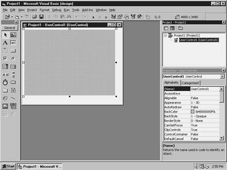
FIGURE 16.1. Newly created UserControl1 and Project1.
Table 16.8. Objects and Their Associated Filenames.
| Object | Filename |
| NewTextControl project | NewTextControl.vbp |
| NewText control | NewText.ctl |
| NewTextTester project | NewTextTester.vbp |
| FrmTest form | Test.frm |
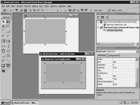
| NewText project group | NewText.vbg |
As you develop features in your UserControl, it helps to see the immediate results. Visual Basic programmers have become used to this familiar code-run-debug cycle. The UserControl code begins to run as soon as you place an instance on the test form. You can step through the Initialize or InitProperties just as you would the Load event of a standard form.
To add the current NewText control to the test form, follow these steps:
Private Sub UserControl_Initialize()
    Debug.Print "A NewText control was Initialized, but I do not know its name"
End Sub

Private Sub UserControl_InitProperties()
    Debug.Print "A NewText control called "& Ambient.DisplayName & "has been added"
End Sub
FIGURE 16.3. The NewText instance is deactivated during design-time.
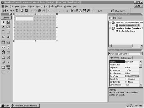
Your control still does not have a function, so now you'll add a constituent control using the Designer Form. Follow these steps:
FIGURE 16.4. Adding a textbox to the NewText control.
Private Sub UserControl_Resize()
     `-Force the TextBox control to fill the NewText's
     `  visible surface area
     txtBase.Move 0, 0, ScaleWidth, ScaleHeight
End Sub
    `--Default the TextBox to show the name
    `  of the control
    txtBase.Text = Extender.Name
FIGURE 16.5. Effects of the InitProperties event.
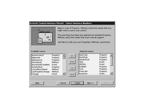
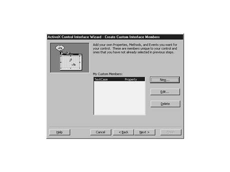
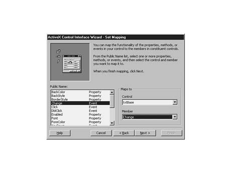
Now that you have placed the required appearance elements on your NewText control, you need to define the public interface it exposes to the developer using it. To do this, you use an add-in that ships with Visual Basic called the ActiveX Control Interface Wizard. This wizard simplifies the building of subclassed or composite type controls by enabling you to use interface elements (also called members) from the constituent objects used to build your control. The members that you decide to expose make up your new control's interface.
You can use the ActiveX Control Interface Wizard to perform these tasks:
The ActiveX Control Interface Wizard presents the following sections:
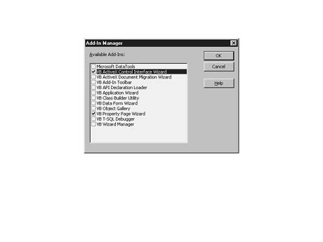
To use the ActiveX Control Interface Wizard, you must add it to the development environment. Follow these steps to add and execute the Interface Wizard:
FIGURE 16.6. The Visual Basic Add-In Manager.
FIGURE 16.7. The Select Interface Members step.
FIGURE 16.8. Adding a custom interface member.
FIGURE 16.9. The Set Mapping wizard step.
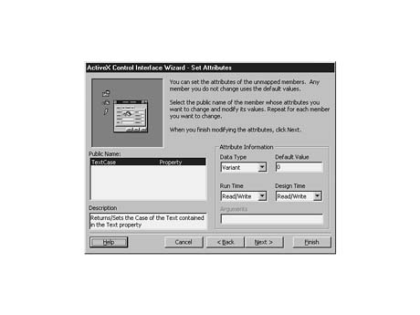
FIGURE 16.10. The Set Attributes wizard step.
When the wizard is finished, it generates all the code required to implement the selections you made. Listing 16.1 displays the code generated from these steps. Various comments are added with warning messages. These comments help the wizard remember the choices you made in previous visits.
Listing 16.1. Code Created by the Interface Wizard.
`Default Property Values:
Const m_def_TextCase = 0
`Property Variables:
Dim m_TextCase As Variant
`Event Declarations:
Event Click() `MappingInfo=txtBase,txtBase,-1,Click
Event DblClick() `MappingInfo=txtBase,txtBase,-1,DblClick
Event KeyDown(KeyCode As Integer, Shift As Integer) `MappingInfo=txtBase,txtBase, Â-1,KeyDown
Event KeyPress(KeyAscii As Integer) `MappingInfo=txtBase,txtBase,-1,KeyPress
Event KeyUp(KeyCode As Integer, Shift As Integer) `MappingInfo=txtBase,txtBase, Â-1,KeyUp
Event MouseDown(Button As Integer, Shift As Integer, X As Single, Y As Single) `MappingInfo=txtBase,txtBase,-1,MouseDown
Event MouseMove(Button As Integer, Shift As Integer, X As Single, Y As Single) `MappingInfo=txtBase,txtBase,-1,MouseMove
Event MouseUp(Button As Integer, Shift As Integer, X As Single, Y As Single) `MappingInfo=txtBase,txtBase,-1,MouseUp
Event Change() `MappingInfo=txtBase,txtBase,-1,Change


`WARNING! DO NOT REMOVE OR MODIFY THE FOLLOWING COMMENTED LINES!
`MappingInfo=txtBase,txtBase,-1,BackColor
Public Property Get BackColor() As OLE_COLOR
    BackColor = txtBase.BackColor
End Property

Public Property Let BackColor(ByVal New_BackColor As OLE_COLOR)
    txtBase.BackColor() = New_BackColor
    PropertyChanged "BackColor"
End Property

`WARNING! DO NOT REMOVE OR MODIFY THE FOLLOWING COMMENTED LINES!
`MappingInfo=txtBase,txtBase,-1,ForeColor
Public Property Get ForeColor() As OLE_COLOR
    ForeColor = txtBase.ForeColor
End Property

Public Property Let ForeColor(ByVal New_ForeColor As OLE_COLOR)
    txtBase.ForeColor() = New_ForeColor
    PropertyChanged "ForeColor"
End Property

`WARNING! DO NOT REMOVE OR MODIFY THE FOLLOWING COMMENTED LINES!
`MappingInfo=txtBase,txtBase,-1,Enabled
Public Property Get Enabled() As Boolean
    Enabled = txtBase.Enabled
End Property

Public Property Let Enabled(ByVal New_Enabled As Boolean)
    txtBase.Enabled() = New_Enabled
    PropertyChanged "Enabled"
End Property

`WARNING! DO NOT REMOVE OR MODIFY THE FOLLOWING COMMENTED LINES!
`MappingInfo=txtBase,txtBase,-1,Font
Public Property Get Font() As Font
    Set Font = txtBase.Font
End Property

Public Property Set Font(ByVal New_Font As Font)
    Set txtBase.Font = New_Font
    PropertyChanged "Font"
End Property

`WARNING! DO NOT REMOVE OR MODIFY THE FOLLOWING COMMENTED LINES!
`MappingInfo=txtBase,txtBase,-1,Refresh
Public Sub Refresh()
    txtBase.Refresh
End Sub

Private Sub txtBase_Click()
    RaiseEvent Click
End Sub

Private Sub txtBase_DblClick()
    RaiseEvent DblClick
End Sub

Private Sub txtBase_KeyDown(KeyCode As Integer, Shift As Integer)
    RaiseEvent KeyDown(KeyCode, Shift)
End Sub

Private Sub txtBase_KeyPress(KeyAscii As Integer)
    RaiseEvent KeyPress(KeyAscii)
End Sub

Private Sub txtBase_KeyUp(KeyCode As Integer, Shift As Integer)
    RaiseEvent KeyUp(KeyCode, Shift)
End Sub

Private Sub txtBase_MouseDown(Button As Integer, Shift As Integer, X As Single,  ÂY As Single)
    RaiseEvent MouseDown(Button, Shift, X, Y)
End Sub

Private Sub txtBase_MouseMove(Button As Integer, Shift As Integer, X As Single,  ÂY As Single)
    RaiseEvent MouseMove(Button, Shift, X, Y)
End Sub

Private Sub txtBase_MouseUp(Button As Integer, Shift As Integer, X As Single,  ÂY As Single)
    RaiseEvent MouseUp(Button, Shift, X, Y)
End Sub

Private Sub txtBase_Change()
    RaiseEvent Change
End Sub

`WARNING! DO NOT REMOVE OR MODIFY THE FOLLOWING COMMENTED LINES!
`MappingInfo=txtBase,txtBase,-1,Text
Public Property Get Text() As String
    Text = txtBase.Text
End Property

Public Property Let Text(ByVal New_Text As String)
    txtBase.Text() = New_Text
    PropertyChanged "Text"
End Property

Public Property Get TextCase() As Variant
    TextCase = m_TextCase
End Property

Public Property Let TextCase(ByVal New_TextCase As Variant)
    m_TextCase = New_TextCase
    PropertyChanged "TextCase"
End Property

`Initialize Properties for User Control
Private Sub UserControl_InitProperties()
    m_TextCase = m_def_TextCase
End Sub

`Load property values from storage
Private Sub UserControl_ReadProperties(PropBag As PropertyBag)

    txtBase.BackColor = PropBag.ReadProperty("BackColor", &H80000005)
    txtBase.ForeColor = PropBag.ReadProperty("ForeColor", &H80000008)
    txtBase.Enabled = PropBag.ReadProperty("Enabled", True)
    Set Font = PropBag.ReadProperty("Font", Ambient.Font)
    txtBase.Text = PropBag.ReadProperty("Text", "")
    m_TextCase = PropBag.ReadProperty("TextCase", m_def_TextCase)
End Sub

`Write property values to storage
Private Sub UserControl_WriteProperties(PropBag As PropertyBag)

    Call PropBag.WriteProperty("BackColor", txtBase.BackColor, &H80000005)
    Call PropBag.WriteProperty("ForeColor", txtBase.ForeColor, &H80000008)
    Call PropBag.WriteProperty("Enabled", txtBase.Enabled, True)
    Call PropBag.WriteProperty("Font", Font, Ambient.Font)
    Call PropBag.WriteProperty("Text", txtBase.Text, "")
    Call PropBag.WriteProperty("TextCase", m_TextCase, m_def_TextCase)
End Sub
Examine the code generated by the Interface Wizard. Notice that each event is declared near the beginning. These events and the events provided by the Extender object are available to the user of this control at design-time. Following the events is a set of Let and Get procedures for each added property. Also notice the delegation of events from the TextBox control to the UserControl's events declared earlier. This is accomplished by the RaiseEvent function. Finally, note the ReadProperty and WriteProperty events. Here, you can see the procedure for saving and reading persistent property values. You should use the code generated by the wizard as a model if you create controls from scratch or add any interface members to a control.
Your NewText control still requires a little work to be functional. The first item on your list is to set up the types of cases (uppercase, mixed case, and so on) your NewText control will handle. You need the NewText control to handle normal upper- and lowercase as well as mixed-case letters if you want to leave the case as the user enters it. You will make mixed case (or no case distinction) the default for this property. One last case would be useful--one that capitalizes the first character of each word; this type of case commonly is called initial caps.
To save the user of your control from having to remember any codes for these types, you will create an enumeration. The enumeration will hold all the possible TextCase values. Your Enum statement for those cases looks like this:
`-- Define an enumerated type for the
`  new TextCase property
Public Enum Cases
    MixedCase = 0
    UpperCase = 1
    LowerCase = 2
    InitialCaps = 3
End Enum
You then can replace the private member variables and the default values generated by the wizard from this:
`Default Property Values:
Const m_def_TextCase = 0
`Property Variables:
Dim m_TextCase As Variant
to this:
`Default Property Values:
Const m_def_TextCase = MixedCase

`Property Variables:
Dim m_TextCase As Cases
You then can replace the standard property Let and Get procedure stubs that were generated by the wizard with the two functions in Listing 16.2.
Listing 16.2. Modified Property Let and Get Procedures for TextCase.
Public Property Get TextCase() As Cases
    TextCase = m_TextCase
End Property

Public Property Let TextCase(ByVal New_TextCase As Cases)

    Select Case New_TextCase
        Case MixedCase
        Case UpperCase
            Text = UCase$(Text)
        Case LowerCase
            Text = LCase$(Text)
        Case InitialCaps
            Text = InitialUCase(Text)
        Case Else
            MsgBox "Invalid Property Value: " & New_TextCase
            Exit Property
    End Select
    m_TextCase = New_TextCase
    PropertyChanged "TextCase"
End Property
As you can see, the TextCase Let procedure now accepts a parameter of type Cases, which you defined with your Enum statement. For mixed case, you do not care what the case is in the Text field, so no code is needed. For uppercase and lowercase, you can use the appropriate Visual Basic functions. Next, you must add a function for handling your initial caps type of case. Listing 16.3 shows the code you need to convert any string to initial caps.
Listing 16.3. Converting Strings to Initial caps.
Private Function InitialUCase(ByVal sInText As String) As String
`-- convert the incoming string to initial caps
Dim sOutText As String
Dim i As Integer
Dim sCurrChar As String
Dim sLastChar As String

    `-- Loop through the input string and add each
    `  character to the output string
    For i = 1 To Len(sInText)

        `-- get the current character
        sCurrChar = Mid$(sInText, i, 1)

        If sLastChar = " " Or sLastChar = "" Then
            `-- Force uppercase if it is a new word
sOutText = sOutText & UCase$(sCurrChar)
        Else
            sOutText = sOutText & LCase$(sCurrChar)
        End If

        `-- save the last character
        sLastChar = sCurrChar

    Next
    `-- return the result
    InitialUCase = sOutText
End Function
The last enhancement you need to make before you begin to test your control is to change the way you set your default Text property. In the section "Adding Constituent Controls," you added code to set the Text property of the txtBase control to default to the name of the control. You did this in the InitProperties event. Now, through delegation, you are directing the contents of your txtBase control to the public Text property of NewText. Your line in the InitProperties event now should look like this:
Text = Extender.Name
Text in this line references the NewText.Text property.
You also should make sure that your properties are being written to the form file correctly. Between coding and debugging sessions, you need to make sure that properties in your control are saved to the plain text file of the containing form. The events that handle property persistence across sessions are WriteProperties and ReadProperties. These events both manipulate an object called the PropertyBag. The PropertyBag stores the control's property values in the containing form's file. When the form is read into memory, those data values also are read. When the developer changes properties, a flag is set to alert the WriteProperties event procedure to fire, thereby writing those changes.
Modify the ReadProperties event so that the Text property defaults to the control's name:
txtBase.Text = PropBag.ReadProperty("Text", Extender.Name)
Set the same default value when the PropertyBag is written to the file in the WriteProperties event:
Call PropBag.WriteProperty("Text", txtBase.Text, Extender.Name)
Now your default text value should work and be persistent across development sessions. You now should test the functionality you added.
To test the functionality of your control, you need to revisit your test project and update it to use the new features of NewText. Follow these steps to enhance the test form:
You now have tested the behavior of the control at design-time. In order to test the behavior at runtime, you must add additional support on your test form. Follow these steps:
| Object | Property | Value | |
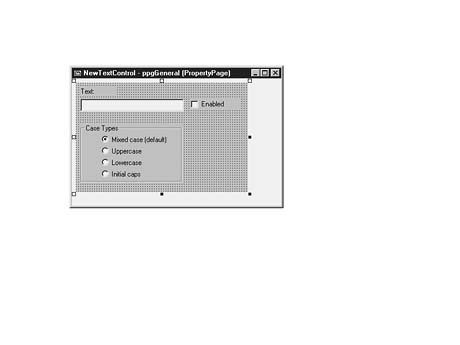
| optCase(0) | Caption | Mixed case (default) | |
| Value | True | ||
| optCase(1) | Caption | Uppercase | |
| optCase(2) | Caption | Lowercase | |
| optCase(3) | Caption | Initial caps |
Private Sub optCase_Click(Index As Integer)

    Select Case Index
        Case 0
            NewText1.TextCase = MixedCase
        Case 1
            NewText1.TextCase = UpperCase
        Case 2
            NewText1.TextCase = LowerCase
        Case 3
            NewText1.TextCase = InitialCaps
    End Select

End Sub
Private Sub txtBase_KeyPress(KeyAscii As Integer)

Dim nLoc As Integer

    `-- Check to see whether a letter was pressed
    If UCase(Chr$(KeyAscii)) <= "Z" And UCase$(Chr$(KeyAscii)) <= "Z" Then
        Select Case TextCase
            `-- Mixed case allows any combination of cases
            Case MixedCase

            `-- force the character to uppercase
            Case UpperCase
                KeyAscii = Asc(UCase$(Chr$(KeyAscii)))

            `-- force the character to lowercase
            Case LowerCase
                KeyAscii = Asc(LCase$(Chr$(KeyAscii)))

            `-- force the character to upper or lower
            `  based on what the previous character was
            Case InitialCaps
                `-- Sel start tells us where the caret is
                nLoc = txtBase.SelStart

                `-- if we are at the beginning of a word
                `  force this character UP
                If nLoc = 0 Or Trim$(txtBase.Text) = "" Then
                    KeyAscii = Asc(UCase$(Chr$(KeyAscii)))
                Else
                    `-- if the last character was a space
                    ` force it UP
                    If Mid$(txtBase.Text, nLoc, 1) = " " Then
                        KeyAscii = Asc(UCase$(Chr$(KeyAscii)))

                    Else `-- force it down
                        KeyAscii = Asc(LCase$(Chr$(KeyAscii)))
                    End If

                End If
        End Select

    End If

    `Send the Keypress event on to the NewText control
    RaiseEvent KeyPress(KeyAscii)
End Sub
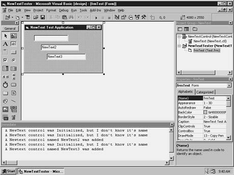
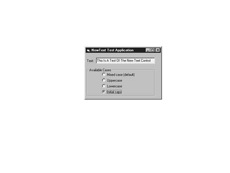
FIGURE 16.11.The NewText test application in action.
After you complete all the properties you want for your control, you can choose to implement Property pages. Property pages enable you to represent more complex data and property data types that are not easily modified in Visual Basic's Property window. Although your NewText control is small, you will build a simple Property page to see how easy it is. To get started designing Property pages for your control, you will run the Property Page Wizard. This wizard offers a simple approach to Property pages and introduces you to the procedure.
To add a Property page, follow these steps:
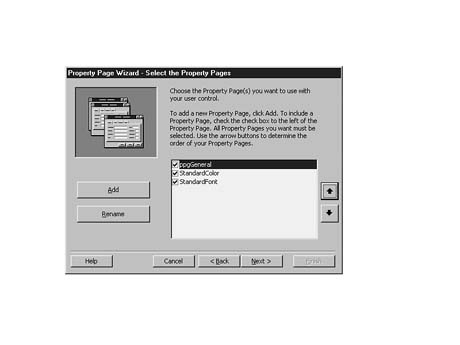
FIGURE 16.12. Selecting the Property pages.
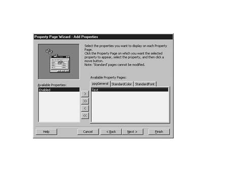
FIGURE 16.13. The Add Properties screen.
FIGURE
16.14.The General Property page.
Now that your Property page design elements are placed, you must integrate them with
your control. The SelectedControls collection of the PropertyPage
object enables you to interact with the control. When a Property page is opened during
design-time, at least one control must have been selected. You will use the SelectedControls(0)
element to reference the first control selected. The Changed property of
the PropertyPage object signals the availability of the Apply button contained
in the PropertyPage dialog box.
The key events of a Property page object are the SelectionChanged and ApplyChanges events. When a developer selects different controls, you should update the values in your Property pages. Place code in the SelectionChanged event to examine the selected controls collection. When changes are made on the Property pages, you must enable the Apply button by setting Changed to True. After the Apply button is clicked, the ApplyChanges event is fired. Place code here to update all the selected controls with the correct values from the Property page controls.
You need to make the following modifications to your General Property page:
Private m_nTextCase As Integer

Private Sub optCase_Click(Index As Integer)
    m_nTextCase = Index
    Changed = True
End Sub
optCase(SelectedControls(0).TextCase).Value = true
optCases(SelectedControls(0).TextCase).Value = true
FIGURE 16.15. NewText Property pages.
You can compile an ActiveX control separately or include it in a project. You can use public controls outside of Visual Basic in environments that support .ocx files. Private controls are stored in .ctl files and must be added to and compiled into the respective projects.
The Project Properties dialog box offers several compile options for creating a public component. Require License Key If you are compiling a component that you want to distribute to other developers or Web servers, choose the Require License Key option. When the project is built, Visual Basic creates a license file (.vbl). For a developer or Website to use your control, the .vbl file must be registered on that machine. The Setup Wizard helps you build the proper setup program to accomplish this registration. If you require the license key and someone uses your control without the authorized setup program, he will not be able to use your control for development. P-Code Versus Native Code Another option available when compiling your component is whether to compile using p-code (interpreted) or native code. For controls designed for Web page development, you probably will want to compile using p-code. This method usually produces a smaller .ocx than using native code. Compiling the NewText control with p-code, for example, creates a 26KB .ocx file. Compiling the same control using native code using the Optimize for Small Code option results in a 33KB .ocx file. Web developers usually prefer the speed of downloading instead of an unnoticeable degree of speed efficiency with native code. Which option you decide to use depends on your particular situation. Versioning The Component tab of the Project Properties dialog box also offers options for version compatibility. This enables you to control the compatibility of your component with earlier versions and applications that use those versions. The compatibility options for a control project follow:
To compile your NewText control, choose File | Make NewText.ocx. Click the Options button in the Make Project dialog box to display the Project Property pages. Here, you may increment the version number of the control or set it to increment automatically on each compile. Other options include setting the company name, project name, copyright, and trademark information that will be visible when a user is viewing your control from within Windows Explorer.
You now are ready to start building a real application with your control.
Most often, ActiveX controls are placed on forms to capture some information from the user or to offer some dazzling effect. The same is true on Internet or intranet Web pages. ActiveX controls created in VB 5 are lightweight and can be used to spruce up any static Web page. The client, however, must have a ActiveX-capable browser or an appropriate plug-in to view and interact with the ActiveX controls. When placed on a Web page, an ActiveX control should offer the same behavior as it does on a form.
Internet features are available when the controls are placed in an Internet-aware container, such as Microsoft's Internet Explorer.
Your control can contain images or other large amounts of data. If so, you might choose to download this information in the background. To see an example of this process, look at most Web pages developed today. When a browser begins loading a page for view and encounters an HTML image tag, it spawns a background process to load the image and then continues to read the rest of the inline text.
Controls built in Visual Basic can download large property values (such as images) asynchronously. The control can begin a background loading process by calling its own AsyncRead method. The AsyncRead method has the following syntax:
AsyncRead Location, Type, Property
The Location argument is a string that determines the path or address of the data or picture. This can be any valid URL, such as this:
file://c:\Multimedia files\logo.gif
or this:
http://www.kscsinc.com/CardShop/images/activex.gif
The Type argument specifies one of three types of data that can be downloaded:
The Property argument is a string that specifies the name of the property that will receive this data. An example using the AsyncRead method follows:
Private Sub cmdGetPic_click()
    `--Download the picture from the URL specified
    `  by txtURL
    cmdCancel.Enabled = True
    AsyncRead txtURL.Text, vbAsyncPicture, "Picture"
End Sub
Downloading the control might call AsyncCancelRead at any time to stop the process, though. It takes a property name string as an argument and only stops the download for that particular property. The following code illustrates how to use a Cancel button to stop a transfer:
Private Sub cmdCancel_click()
    CancelAsyncRead "Picture"
End Sub
When each property download is complete, the AsyncReadComplete event is fired. In the event, an AsyncProperty object is specified. This object contains the following properties:
The following code fragment provides an example of how you might use a property after a download has been completed:
Private Sub UserControl_AsyncReadComplete(AsyncProp As VB.AsyncProperty)
On Error goto err_AsynComplete

    Select Case AsyncProp.PropertyName
       Case "Picture"
          Set Picture = AsyncProp.Value
    End Select

err_AsyncComplete:
   MsgBox Err.Number & ": " & Err.Description & " occurred in " & Ambient.DisplayName & ".AsyncReadComplete."
End Sub
By using the Hyperlink object, a control can take over a hyperlink-aware container. The control can then force the container to jump to a specific URL or navigate backward or forward through its history list. The Hyperlink object contains these three methods:
Private Sub UserControl_Click()
    `-Go to the Virginia's weather page
    Hyperlink.NavigateTo "http://www.weather.com", "va.htm"
End Sub
If the container is not hyperlink-aware, the application registered on the client machine, such as a browser, is launched. Errors are raised if no entries are in the history list or the specified URL or document is not available.
In order for controls to be used with Web pages, they first must be downloaded to the client machine. It is the browser's responsibility to copy the required files and install the components only if they do not currently exist. Several Internet component download features follow:
You can find more detailed information on the Internet component download facilities in Chapter 17, "Distributing Active X Documents and Controls via the Web Using VB 5."
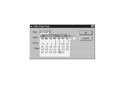
Now that you see how easy it is to add functionality to a TextBox control, you probably have plenty of ideas about the types of controls you want to build. Because this new frontier for Visual Basic is so broad, this section provides another example of a type of control you can create. It is a composite control that contains features of a date selection box. You can use it simply to enter a date into its constituent textbox, or you can click the drop-down arrow and select from a scrollable calendar, as the test application in Figure 16.16 shows.
FIGURE
16.16 The DatePicker control
example in action.
The DatePicker control is a slim 35KB (a download screamer). It was built
using only a TextBox control and a handful of PictureBox controls.
The calendar display was performed simply by using Print statements directly
to one of the PictureBox controls. It is simplistic by design, yet functional.
Examining the source code for the DatePicker control may help you learn
more of the options now available to a Visual Basic ActiveX control designer.
This concludes the discussion of building ActiveX controls in Visual Basic 5. Although we have covered only a portion of the features and capabilities available in control development with VB 5, you should now have a basic understanding of the concepts involved. A more detailed discussion of ActiveX development could have filled an entire book this size.
The simple controls created in this chapter make use of wizard shortcuts provided by the developers at Microsoft. These wizards offer a fast way to build ActiveX components and at the same time provide the flexibility required to accomplish otherwise difficult tasks. If you can understand and learn from the process in which these wizards help you to build controls, you should be ready to create some more complex components on your own. Because control creation in Visual Basic is as simple as creating standard applications, it should soon become the method of choice for the multitude of programmers with VB skills.
There are an infinite number of possibilities available for the use of ActiveX controls in Internet/intranet environments. They may range from the interface objects that we have created for simple Web page design to the integrated client/server controls that communicate to stores of enterprise data. Whatever the function, the fact remains that VB programmers now have another trick up their sleeves and the Web of the future promises to be teeming with their active creations.