


by Evangelos Petroutsos
The ActiveX controls explored in the previous chapter come with
Internet Explorer. Since the release of Internet Explorer and
the ActiveX Control Pad, Microsoft introduced a number of additional
ActiveX controls, and there will be many more in the future, both
from Microsoft and from third-party companies. In this chapter,
we are going to explore a few additional ActiveX controls, which
we believe you'll find very useful in VBScript programming. These
are the Popup Menu and Menu controls, which let you incorporate
menu structures in your documents; the Marquee control, which
lets you scroll a page within another page; the Popup Window control,
which can display a URL in a window without switching the browser
to another URL; and the Chart control, which presents numeric
data to the viewer as graphs.
| Automatic Component Installation |
As mentioned, the additional ActiveX controls we are going to explore in this chapter, as well as a large number of ActiveX controls that will become available in the future from Microsoft and third-party companies, are not automatically installed with Internet Explorer 3.0. So, what will happen if the users of your application don't have the controls already installed on their systems? A common property of all ActiveX controls is called CodeBase, and is the URL of the control's code. If the control hasn't been installed on a given client, Internet Explorer will connect to the URL specified by the CodeBase property and download and install the control. The first time you open any of this chapter's projects, you might experience a delay while the message "Downloading components" appears in the browser's status bar. Internet Explorer is downloading the missing components from the appropriate URLs. Once a component (an ActiveX control) has been installed on your system, Internet Explorer won't download it again. When an ActiveX control is installed, it's registered in the Windows Registry and other applications can find it there. The URL for the Chart control, for instance, is "http://activex.microsoft.com/controls/iexplorer/iechart.ocx Of course, the missing components won't be installed unless you are already connected to the Internet. If you are testing the examples locally, you must first establish a dialup connection to your Internet service provider, so that Internet Explorer can connect to the URL specified by the CodeBase property. When the Downloading components message is displayed on your browser's window, you needn't worry about your system's security. No components will be installed directly from this book's CD; the ActiveX controls will be installed directly from Microsoft's Web site. The values of the CodeBase property for the ActiveX controls covered in this chapter are listed next. In general, every time you include an ActiveX control in your projects, you should find out the value of the CodeBase property from the control's manufacturer and include it in the control's definition with a line similar to the following ones: Menu control: CODEBASE="http://activex.microsoft.com/controls/iexplorer/btnmenu.ocx#Version=4,70,0,1161" Chart control: CODEBASE="http://activex.microsoft.com/controls/iexplorer/iechart.ocx#Version=4,70,0,1161" Popup menu: CODEBASE="http://activex.microsoft.com/controls/iexplorer/iemenu.ocx#Version=4,70,0,1161" Popup window: CODEBASE="http://activex.microsoft.com/controls/iexplorer/iepopwnd.ocx#Version=4,70,0,1161" |
ActiveX controls provide all the functionality of a typical Windows application from within Internet Explorer's environment. But there is one function, which is so common among Windows applications, that isn't available to your VBScript applications-the menu bar. HTML layouts don't have a menu bar, and there's no ActiveX control you can place on a layout that would provide the functionality of a menu bar. There are, however, two ActiveX controls that provide a similar functionality. They are not as convenient or flexible as the elaborate Windows menu structures, but they provide the basic functionality of a menu structure. They are the Popup Menu control, which causes a popup menu to be displayed anywhere on the browser's window, and the Menu control, which is a like a custom command button that displays a drop-down menu every time it's clicked.
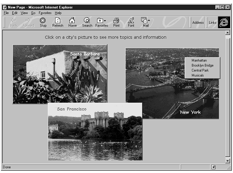
Let's start our discussion with the Popup Menu control, which is the simpler one. Figure 9.1 shows a popup menu that acts as a shortcut menu. (It's displayed when the user right-clicks a specific area of the layout.) The layout of Figure 9.1 contains three Image controls, each with a picture of a different city. Each time the user right-clicks one of the images, a popup menu is displayed with choices about the specific city. The shortcut menus are also context-sensitive, because each one can be invoked only when the pointer is on top of an Image control.
Figure 9.1 : The Popup Menu document uses the Popup Menu control to display shortcut menus.
The Popup Menu control provides four methods that let you manipulate
its contents and display it:
| Clear | This method clears the menu (removes any existing options) in preparation for a new menu structure. If you must change the items of a Popup Menu control at runtime, you must first clear its current contents. |
| AddItem menuItem | Appends another option (command) to the popup menu. menuItem is the string you want to appear in the menu. To insert an option at a specific location in the menu, supply the
item's index in the menu. (The first option has index 1.) The statement IEPop1.AddItem "This is the third choice", 1 will insert the specified string at the first menu item. IEPop1 is the default name for the first Popup Menu control placed on a layout or form. |
| RemoveItem index | Removes the item at the specified index.The statement IEPop1.RemoveItem 1 removes the first item in the menu. The popup menu has two properties, one of them being the ItemCount property, which reports the number of items in the menu. To remove the last item, use the statement IEPop1.RemoveItem IEPop1.ItemCount |
| PopUp (x, y) | This method causes the Popup Menu control to pop up on the screen. x and y are the coordinates of the upper-left corner of the control, and you can use them to control the popup menu's location. Both arguments are optional, and if you omit them the menu will pop up at the pointer's location. The values of the x and y coordinates are relative to the window, with the origin being the window's upper-left corner. |
To display a popup menu from within a command button's Click event, insert a statement like the following in the button's Click event handler:
Sub CommandButton1_Click()

    IEPop1.Popup

End Sub
To find out whether the user has clicked a menu item, use the Click event of the control, which reports the index of the item that was clicked:
Sub IEPop1_Click(index)

    MsgBox "Item # " & index & " was selected"

End Sub
After this introduction to the Popup Menu control, you can look at the implementation of the Popup Menu project, which you will find in this chapter folder on the CD. Create a layout with the three Image controls and then place a Popup Menu control somewhere on the layout. The popup menu is not in the toolbox, so you'll have to customize your toolbox by adding an extra control. Right-click an empty area of the current page (or create a new page, if you plan to add many new controls) and from the shortcut menu select Additional controls. In the Insert ActiveX dialog box that will appear, locate Popup Menu Object and click OK. The icon of the new control will be added to the toolbox's current page. Select the tool and draw a small rectangle on the layout.
The size of the Popup Menu control on the layout has nothing to do with its actual size when it pops up. The actual size of the control depends on the number of choices it contains-and it will be large enough to accommodate them all. One thing you should keep in mind is that the current implementation of the control isn't invisible. Instead, a white stripe with the size of the control at design time will remain visible on the layout. Once the Popup Menu control has been placed on the layout, reduce it to a single line to avoid this white stripe on the layout at runtime. The Popup Menu control doesn't have many properties you can set at design time through the Properties window anyway.
If you save the layout now and look at its code, you'll see that the following definition was inserted by the Control Pad:
<OBJECT ID="IEPOP1"

     CLASSID="CLSID:7823A620-9DD9-11CF-A662-00AA00C066D2"

	 STYLE="TOP:239pt;LEFT:355pt;WIDTH:17pt;HEIGHT:0pt;TABINDEX:0;ZINDEX:3;">

        <PARAM NAME="_ExtentX" VALUE="582">

        <PARAM NAME="_ExtentY" VALUE="0">

    </OBJECT>
The menu inserted with the previous OBJECT definition doesn't contain any item yet. Instead, you must add its items with the AddItem method from within your script. To assign some initial items to the popup menu, insert additional PARAM tags with the MenuItem property, as follows:
<PARAM NAME="MenuItem[0]" value="First menu item">

<PARAM NAME="MenuItem[1]" value="Second menu item">

<PARAM NAME="MenuItem[2]" value="Third menu item">

<PARAM NAME="MenuItem[3]" value="Fourth menu item">

<PARAM NAME="MenuItem[4]" value="Fifth menu item">
The MenuItem property is an array with as many elements as there are options in the menu. Notice that where the indexing of the menu item starts at 1, the MenuItem array's indexing starts at zero.
Before you display the popup menu you just placed on the layout, you must populate it with the AddItem method. Use the Script Wizard or your favorite text editor to edit the Click event handler for each Image control. We could have used three Popup Menu controls in our design, one for each image. But because we want to demonstrate how to manipulate popup menus dynamically with VBScript, we used a single one, which will be invoked when the user right-clicks an image. As soon as the code detects a right-click operation on one of the images, it must clear the menu and append the items for the specific image with the AddItem method. Here's the MouseDown event handler for Image1:
Sub Image1_MouseDown(Button, Shift, X, Y)

    If Button<>2 Then Exit Sub

    IEPop1.Clear

    IEPop1.AddItem "Manhattan"

    IEPop1.AddItem "Brooklyn Bridge"

    IEPop1.AddItem "Central Park"

    IEPop1.AddItem "Musicals"

    IEPop1.PopUp

End Sub
(The Click event can't be used because it's not invoked with the right mouse button.) The code tests which button was pressed, and if it wasn't the right button it exits the subroutine. (You would probably execute a different command for the Click event.) Then the IEPop1 menu is cleared and populated with the menu items that apply to the image of New York City. The last statement causes the popup menu to be displayed on the window. The MouseDown event handlers for the other two Image controls are quite similar. They simply add different options to the popup menu.
After the user has made a selection, the popup menu's Click event is triggered, which reports the index of the selected item:
Sub IEPOP1_Click(item)

    MsgBox "You 've selected option " & item

End Sub
The Popup Menu control doesn't provide a property that would return the actual string of the selected item, just its index. If you need access to the actual string from within your code, you must store the options in a global array and use the index returned by the Click event to access the values. Listing 9.1 is the complete listing of the PopMenu layout.
Listing 9.1. The PopMenu project's source code.
1: <SCRIPT LANGUAGE="VBScript">

2: <!--

3:

4: Sub Image1_MouseDown(Button, Shift, X, Y)

5:     If Button<>2 Then Exit Sub

6:     IEPop1.Clear

7:     IEPop1.AddItem "The beaches"

8:     IEPop1.AddItem "Santa Barbara Peer"

9:     IEPop1.AddItem "Riviera"

10:     IEPop1.PopUp

11: End Sub

12:

13: Sub Image3_MouseDown(Button, Shift, X, Y)

14:     If Button<>2 Then Exit Sub

15:     IEPop1.Clear

16:     IEPop1.AddItem "Golden Gate Bridge"

17:     IEPop1.AddItem "Fisherman's Wharf"

18:     IEPop1.AddItem "Alcatraz"

19:     IEPop1.AddItem "Sausalito"

20:     IEPop1.PopUp

21: End Sub

22:

23: Sub Image2_MouseDown(Button, Shift, X, Y)

24:     If Button<>2 Then Exit Sub

25:     IEPop1.Clear

26:     IEPop1.AddItem "Manhattan"

27:     IEPop1.AddItem "Brooklyn Bridge"

28:     IEPop1.AddItem "Central Park"

29:     IEPop1.AddItem "Musicals"

30:     IEPop1.PopUp

31: End Sub

32:

33: Sub IEPOP1_Click(item)

34:     MsgBox "You 've selected option " & item

35: End Sub

36: -->

37: </SCRIPT>

38: <DIV ID="Layout1" STYLE="LAYOUT:FIXED;WIDTH:545pt;HEIGHT:330pt;">

39:     <OBJECT ID="Image1"

40:      CLASSID="CLSID:D4A97620-8E8F-11CF-93CD-00AA00C08FDF"

         STYLE="TOP:33pt;LEFT:17pt;WIDTH:243pt;HEIGHT:153pt;ZINDEX:0;">

41:         <PARAM NAME="PicturePath" VALUE="mission.bmp">

42:         <PARAM NAME="BorderStyle" VALUE="0">

43:         <PARAM NAME="SizeMode" VALUE="3">

44:         <PARAM NAME="SpecialEffect" VALUE="1">

45:         <PARAM NAME="Size" VALUE="8571;5396">

46:         <PARAM NAME="PictureAlignment" VALUE="0">

47:         <PARAM NAME="VariousPropertyBits" VALUE="19">

48:     </OBJECT>

49:     <OBJECT ID="Image2"

50:      CLASSID="CLSID:D4A97620-8E8F-11CF-93CD-00AA00C08FDF"

         STYLE="TOP:41pt;LEFT:305pt;WIDTH:243pt;HEIGHT:183pt;ZINDEX:1;">

51:         <PARAM NAME="PicturePath" VALUE="bridges.bmp">

52:         <PARAM NAME="BorderStyle" VALUE="0">

53:         <PARAM NAME="SizeMode" VALUE="3">

54:         <PARAM NAME="SpecialEffect" VALUE="1">

55:         <PARAM NAME="Size" VALUE="8571;6454">

56:         <PARAM NAME="PictureAlignment" VALUE="0">

57:         <PARAM NAME="VariousPropertyBits" VALUE="19">

58:     </OBJECT>

59:     <OBJECT ID="Image3"

60:      CLASSID="CLSID:D4A97620-8E8F-11CF-93CD-00AA00C08FDF"

         STYLE="TOP:182pt;LEFT:107pt;WIDTH:243pt;HEIGHT:153pt;ZINDEX:2;">

61:         <PARAM NAME="PicturePath" VALUE="lake.bmp">

62:         <PARAM NAME="BorderStyle" VALUE="0">

63:         <PARAM NAME="SizeMode" VALUE="3">

64:         <PARAM NAME="SpecialEffect" VALUE="1">

65:         <PARAM NAME="Size" VALUE="8571;5396">

66:         <PARAM NAME="PictureAlignment" VALUE="0">

67:         <PARAM NAME="VariousPropertyBits" VALUE="19">

68:     </OBJECT>

69:     <OBJECT ID="IEPOP1"

70:      CLASSID="CLSID:7823A620-9DD9-11CF-A662-00AA00C066D2"

         STYLE="TOP:239pt;LEFT:355pt;WIDTH:17pt;HEIGHT:0pt;TABINDEX:0;ZINDEX:3;">

71:         <PARAM NAME="_ExtentX" VALUE="582">

72:         <PARAM NAME="_ExtentY" VALUE="0">

73:     </OBJECT>

74:     <OBJECT ID="Label1"

75:      CLASSID="CLSID:978C9E23-D4B0-11CE-Bf2D-00AA003f40D0"

         STYLE="TOP:8pt;LEFT:58pt;WIDTH:396pt;HEIGHT:17pt;ZINDEX:4;">

76:         <PARAM NAME="Caption" VALUE="Click on a city's picture to see more

            topics and information">

77:         <PARAM NAME="Size" VALUE="13970;582">

78:         <PARAM NAME="FontName" VALUE="Verdana">

79:         <PARAM NAME="FontHeight" VALUE="220">

80:         <PARAM NAME="FontCharSet" VALUE="0">

81:         <PARAM NAME="FontPitchAndFamily" VALUE="2">

82:         <PARAM NAME="ParagraphAlign" VALUE="3">

83:         <PARAM NAME="FontWeight" VALUE="0">

84:     </OBJECT>

85:     <OBJECT ID="Label2"

86:      CLASSID="CLSID:978C9E23-D4B0-11CE-Bf2D-00AA003f40D0"

         STYLE="TOP:50pt;LEFT:165pt;WIDTH:91pt;HEIGHT:17pt;ZINDEX:5;">

87:         <PARAM NAME="ForeColor" VALUE="65535">

88:         <PARAM NAME="VariousPropertyBits" VALUE="8388627">

89:         <PARAM NAME="Caption" VALUE="Santa Barbara">

90:         <PARAM NAME="Size" VALUE="3202;582">

91:         <PARAM NAME="FontName" VALUE="Comic Sans MS">

92:         <PARAM NAME="FontEffects" VALUE="1073741825">

93:         <PARAM NAME="FontHeight" VALUE="220">

94:         <PARAM NAME="FontCharSet" VALUE="0">

95:         <PARAM NAME="FontPitchAndFamily" VALUE="2">

96:         <PARAM NAME="FontWeight" VALUE="700">

97:     </OBJECT>

98:     <OBJECT ID="Label3"

99:      CLASSID="CLSID:978C9E23-D4B0-11CE-Bf2D-00AA003f40D0"

         STYLE="TOP:190pt;LEFT:132pt;WIDTH:91pt;HEIGHT:17pt;ZINDEX:6;">

100:         <PARAM NAME="ForeColor" VALUE="255">

101:         <PARAM NAME="VariousPropertyBits" VALUE="8388627">

102:         <PARAM NAME="Caption" VALUE="San Francisco">

103:         <PARAM NAME="Size" VALUE="3202;582">

104:         <PARAM NAME="FontName" VALUE="Comic Sans MS">

105:         <PARAM NAME="FontEffects" VALUE="1073741825">

106:         <PARAM NAME="FontHeight" VALUE="220">

107:         <PARAM NAME="FontCharSet" VALUE="0">

108:         <PARAM NAME="FontPitchAndFamily" VALUE="2">

109:         <PARAM NAME="FontWeight" VALUE="700">

110:     </OBJECT>

111:     <OBJECT ID="Label4"

112:      CLASSID="CLSID:978C9E23-D4B0-11CE-Bf2D-00AA003f40D0"

          STYLE="TOP:198pt;LEFT:446pt;WIDTH:91pt;HEIGHT:17pt;ZINDEX:7;">

113:         <PARAM NAME="ForeColor" VALUE="16776960">

114:         <PARAM NAME="VariousPropertyBits" VALUE="8388627">

115:         <PARAM NAME="Caption" VALUE="New York">

116:         <PARAM NAME="Size" VALUE="3202;582">

117:         <PARAM NAME="FontName" VALUE="Comic Sans MS">

118:         <PARAM NAME="FontEffects" VALUE="1073741825">

119:         <PARAM NAME="FontHeight" VALUE="220">

120:         <PARAM NAME="FontCharSet" VALUE="0">

121:         <PARAM NAME="FontPitchAndFamily" VALUE="2">

122:         <PARAM NAME="FontWeight" VALUE="700">

123:     </OBJECT>

124: </DIV>
In a practical situation, the popup menu's Click event handler will do something more meaningful than simply displaying the index of the selected item. The project RTF Editor makes use of the popup menu to display the usual shortcut menu of a text editor, which implements the Cut, Copy, and Paste operations.
The Menu control is quite similar to the Popup Menu control, only closer to the actual structure of a menu bar. Each Menu control remains visible on the screen at all times and looks like a command button, as shown in Figure 9.2. When the mouse pointer is moved over the Menu control, the control's caption takes a three-dimensional look. In addition, an arrow pointing down suggests that the menu leads to a submenu. It is possible to have menus without submenus, which behave similarly to command buttons, but they have the same look as the other Menu controls.
To implement the project Menu, shown in Figure 9.2, we aren't going to use the Control Pad as usual, because Control Pad doesn't insert a meaningful definition in the HTML file. Start a new HTML document and manually insert the following definition:
<OBJECT

      id=menu1

      classid="clsid:52DFAE60-CEBF-11CF-A3A9-00A0C9034920"

      width=80

      height=25

      align=middle

>

<param NAME="Caption" value="Menu">

</OBJECT>
This definition doesn't attach any items to the menu; you'll have to insert them manually with PARAM tags. The second Menu control (the File menu) in the Menu document was defined with the following OBJECT definition:
<OBJECT

      id=menu1

      classid="clsid:52DFAE60-CEBF-11CF-A3A9-00A0C9034920"

      width=80

      height=25

      align=middle

   >

   <param NAME="Menuitem[0]" value="New">

   <param NAME="Menuitem[1]" value="Open">

   <param NAME="Menuitem[2]" value="Save">

   <param NAME="Menuitem[3]" value="Save As">

   <param NAME="Menuitem[4]" value="">

   <param NAME="Menuitem[5]" value="EXIT">

   <param NAME="Caption" value="File">

   </OBJECT>
Notice the similarities between the Menu and Popup Menu controls. Moreover, the Menu control provides the same methods for manipulating the contents of the menu at runtime. The Clear, AddItem, RemoveItem, and PopUp methods work with the Menu control as well. It's doubtful that you'll ever need to call the PopUp method to expand a Menu control, but it's an option.
The Menu control has an ItemCount property that returns the number of items in the control, as well as a Caption property that sets the menu's title (the caption of the button). The index of the selected item is reported back to the program from within the control's Click event handler. This event is triggered when a menu option is selected. Because some menus might not lead to submenus, the Menu control recognizes the Select event, which is triggered only when the user clicks a Menu control without a submenu. (The arrow-down symbol will be missing from such a menu.) The Menu document contains three Menu controls and a multiline textbox (inserted with the TEXTAREA tag). The first Menu control is a single command that doesn't lead to a submenu. The other two have their own submenus that are the typical File and Edit submenus of a text-editing application. (VBScript can't save data on the local disk, so what's the point in a File menu? It is possible to store data on the local disk with VBScript; it just isn't a recommended, or common, practice yet. The options of the menus of this project were not implemented, of course. This example is meant to demonstrate how to manipulate the Menu control at runtime.)
The complete listing of the Menu document is shown in Listing 9.2.
Listing 9.2. The Menu document.
<HTML>

<HEAD>

<TITLE>Menu demo</TITLE>


<SCRIPT LANGUAGE=VBS>

Sub Menu1_Select(i)

    MsgBox "You selected item # " & i & " from the File menu"

End Sub


Sub Menu2_Select(i)

    MsgBox "You selected item # " & i & " from the Edit menu"

End Sub


Sub Menu0_Click()

    MsgBox "You clicked on the Help menu!"

End Sub


</SCRIPT>

</HEAD>


<H1>The Menu Structure of a Text Editor</H1>

<P>

 <OBJECT

    id=menu0

    CODEBASE="http://activex.microsoft.com/controls/iexplorer/btnmenu.ocx#Version=4,7

	0,0,1161"

    classid="clsid:52DFAE60-CEBF-11CF-A3A9-00A0C9034920"

    width=80

    height=25

    align=middle

>

    <param NAME="Caption" value="Help">

</OBJECT>


 <OBJECT

    id=menu1

    classid="clsid:52DFAE60-CEBF-11CF-A3A9-00A0C9034920"

    CODEBASE="http://activex.microsoft.com/controls/iexplorer/btnmenu.ocx#Version=4,7

	0,0,1161"

    width=80

    height=25

    align=middle

>

    <param NAME="Menuitem[0]" value="New">

    <param NAME="Menuitem[1]" value="Open">

    <param NAME="Menuitem[2]" value="Save">

    <param NAME="Menuitem[3]" value="Save As">

    <param NAME="Menuitem[4]" value="">

    <param NAME="Menuitem[5]" value="EXIT">

    <param NAME="Caption" value="File">

    </OBJECT>


 <OBJECT

    id=menu2

    classid="clsid:52DFAE60-CEBF-11CF-A3A9-00A0C9034920"

    CODEBASE="http://activex.microsoft.com/controls/iexplorer/btnmenu.ocx#Version=4,7

	0,0,1161"

    width=80

    height=25

    align=middle

>

    <param NAME="Menuitem[0]" value="Copy">

    <param NAME="Menuitem[1]" value="Cut">

    <param NAME="Menuitem[2]" value="Paste">

    <param NAME="Menuitem[3]" value="Select All">

    <param NAME="Menuitem[4]" value="">

    <param NAME="Caption" value="Edit">

    </OBJECT>

<BR>

<TEXTAREA rows=15 cols=100></TEXTAREA>

</HTML>

</HTML>
The Click event handlers of the File and Edit menus are quite similar. They simply report the index of the item selected. The Help menu's Click event handler reports in a message box that the menu was clicked.
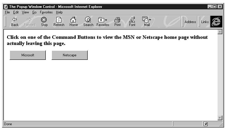
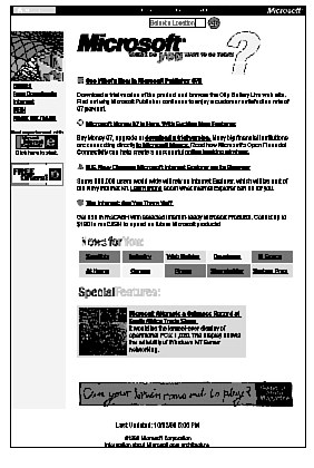
The Popup Window control is a small browser in a window that lets you display any valid URL without leaving the current page. Figures 9.3 and 9.4 show how the Popup Window control works. The page of Figure 9.3 contains two command buttons. When they are clicked, they display the MSN and Netscape pages in a separate window, like the one shown in Figure 9.4. The large window is a Popup Window control that contains the home page of the MSN site. The user can't do anything with it-can't click on hyperlinks, for example, or execute any scripts that happen to be on the page. In fact, as soon as a key is pressed the popup window disappears. Its sole purpose is to provide the user with a preview of an Internet site or document, from within another page.
Figure 9.4 : This is the MSN home page viewed in a popup window.
The OBJECT definition for the Popup Window control is
<OBJECT ID="PreVu1" WIDTH=1 HEIGHT=1

    CLASSID="CLSID:A23D7C20-CABA-11CF-A5D4-00AA00A47DD2"

    CODEBASE="http://activex.microsoft.com/controls/iexplorer/iepopwnd.ocx#Version=4,

	70,0,1161>"

    <PARAM NAME="_ExtentX" VALUE="5054">

    <PARAM NAME="_ExtentY" VALUE="3519">

</OBJECT>
The control's dimensions in the OBJECT definition don't matter, because it will be resized to fit the page that's displayed on it. To display the window, use the control's Popup method, which accepts two arguments: the URL of the document to be displayed in the popup window and an optional argument that determines whether the destination document will be resized to fit the popup window or not. The complete syntax of the Popup method is
PreVu1.Popup URL, True|False
where PreVu1 is the default name of the first popup window, URL is the URL of the document to be displayed on the window, and the last argument can be True or False value, which determines how the document will fit into the window: whether the document will be resized to fit the window, or the window will be resized to display the document in actual size. The popup window in Figure 9.4 was invoked with the statement:
PreVu1.Popup "http://www.microsoft.com", False
Figure 9.5 shows the same popup window, only this time it was invoked with the line
PreVu1.Popup "http://www.microsoft.com", True
There is also a Dismiss method, which does the opposite. It closes the popup window programmatically. Any user action will close the popup window so the Dismiss method is used rarely, most likely from within a Timer event to close a popup window that remained on the screen for a long period.
The PopupWin example was created with Control Pad, as an HTML document. Start Control Pad, create a new HTML file, and using the Insert ActiveX control command, put two command buttons and a popup window on the document. The text was entered directly on the HTML document (it's not on a label or other control). Once the HTML file is generated for you (the PopupWin document you will find on the CD was edited a little to arrange the buttons), enter the following event handlers in the document's SCRIPT section:
Sub CommandButton1_Click

    PreVu1.Popup "http://www.microsoft.com", True

End Sub


Sub CommandButton2_Click

    PreVu1.Popup "http://www.netscape.com", False

End Sub
The two popup windows are invoked with a different URL and a different value for scaling. You can change the values True and False to see how they affect the appearance of each site. The code listing of the PopupWin document is in Listing 9.3.
Listing 9.3. The PopupWin document.
1: <HTML> 2: <HEAD> 3: <TITLE>The Popup Window control</TITLE> 4: <SCRIPT Language="VBSCRIPT"> 5: Sub CommandButton1_Click 6: PreVu1.Popup "http://www.microsoft.com", True 7: End Sub 8: 9: Sub CommandButton2_Click 10: PreVu1.Popup "http://www.netscape.com", False 11: End Sub 12: 13: </SCRIPT> 14: </HEAD> 15: <BODY BGCOLOR=WHITE> 16: <H3>Click on one of the command buttons to view the MSN or Netscape 17: home page without actually leaving this page. 18: <P> 19: <OBJECT ID="PreVu1" WIDTH=10 HEIGHT=10 20: CLASSID="CLSID:A23D7C20-CABA-11CF-A5D4-00AA00A47DD2"> 21: <PARAM NAME="_ExtentX" VALUE="5054"> 22: <PARAM NAME="_ExtentY" VALUE="3519"> 23: </OBJECT> 24: 25: <OBJECT ID="CommandButton1" WIDTH=123 HEIGHT=32 26: CLASSID="CLSID:D7053240-CE69-11CD-A777-00DD01143C57"> 27: <PARAM NAME="Caption" VALUE="Microsoft"> 28: <PARAM NAME="Size" VALUE="3254;846"> 29: <PARAM NAME="FontCharSet" VALUE="0"> 30: <PARAM NAME="FontPitchAndFamily" VALUE="2"> 31: <PARAM NAME="ParagraphAlign" VALUE="3"> 32: <PARAM NAME="FontWeight" VALUE="0"> 33: </OBJECT> 34: 35: 36: 37: <OBJECT ID="CommandButton2" WIDTH=123 HEIGHT=32 38: CLASSID="CLSID:D7053240-CE69-11CD-A777-00DD01143C57"> 39: <PARAM NAME="Caption" VALUE="Netscape"> 40: <PARAM NAME="Size" VALUE="3254;846"> 41: <PARAM NAME="FontCharSet" VALUE="0"> 42: <PARAM NAME="FontPitchAndFamily" VALUE="2"> 43: <PARAM NAME="ParagraphAlign" VALUE="3"> 44: <PARAM NAME="FontWeight" VALUE="0"> 45: </OBJECT> 46: </BODY> 47: </HTML>
The popup window is similar to the keywords of a Windows 95 help file. Although most keywords act as hyperlinks to other pages (or topics, in the case of help files), some keywords cause a small frame with a short explanation to be displayed. This should give you an idea of the kind of functionality you can place on your pages with the Popup Window control. Instead of displaying an entire new page (which, admittedly, isn't very practical), you can display a short HTML document that further explains a term on the current page. In this capacity, the Popup Window control is very useful, if you consider how many times you clicked on a hyperlink only to be taken to a small page with a few lines of text.
The Marquee control is Microsoft's first attempt to provide the means for simple animation on Web pages. This control has a function similar to that of the MARQUEE tag, only instead of scrolling a piece of text, it can scroll an entire HTML page in a rectangular area on the document. Moreover, the Marquee control can scroll its contents in all directions, even diagonally. The document displayed and scrolled in a Marquee control is a regular HTML document that can contain images, any HTML tags (including the MARQUEE tag), and even its own animation. The only limitation is that it can't handle hyperlinks and can't contain embedded HTML layouts.
To place an ActiveX Marquee control on your page, use the Insert ActiveX control command on the HTML Editor's Edit menu or insert a definition like the following one in the document:
<OBJECT ID="Marquee1" WIDTH=408 HEIGHT=160 BORDER=2

 CLASSID="CLSID:1A4DA620-6217-11CF-BE62-0080C72EDD2D">

   <PARAM NAME="ScrollStyleX" VALUE="Circular">

   <PARAM NAME="ScrollStyleY" VALUE="Circular">

   <PARAM NAME="ScrollPixelsX" VALUE="0">

   <PARAM NAME="ScrollPixelsY" VALUE="-2">

   <PARAM NAME="ScrollDelay" VALUE="100">

   <PARAM NAME="LoopsX" VALUE="-1">

   <PARAM NAME="LoopsY" VALUE="-1">

</OBJECT>
The Marquee control comes with Internet Explorer 3.0 and you needn't specify its CodeBase property in the control's definition.
Do not add the Marquee control to the Control Pad's toolbox, because any attempt to place a Marquee control on a layout will crash the program. Just type in the definition or open the Marquee project in this chapter's folder on the CD, copy the definition of the object, and paste it in your HTML document. The various properties of the Marquee control are explained shortly.
These properties set the scrolling style of the marquee, and their
values can be
| Circular | The document is wrapped around the control. When it reaches the end of the control, the document enters the control from the other end. |
| Bounce | The document bounces in the control. When it reaches the end of the control, it starts scrolling in the opposite direction. |
The direction of the scrolling is controlled with the ScrollPixelsX and ScrollPixelsY properties. Assign the number of pixels by which the contents of the control should scroll in each direction. Positive values cause the contents of the control to scroll right and down. Negative values cause the contents of the controls to scroll in the opposite directions. The contents of the Marquee can scroll in both directions simultaneously, which is equivalent to a diagonal movement.
The ScrollDelay property is the delay between successive
movements of the control's contents, and its value is expressed
in milliseconds. This property, along with ScrollPixelsX
and ScrollPixelsY, determines how fast the contents of
the Marquee will scroll. Consider two Marquee controls with the
following properties:
| Marquee 1 | Marquee 2 |
| ScrollPixelsX=0 | ScrollPixelsX=0 |
| ScrollPixelsY=10 | ScrollPixelsY=20 |
| ScrollDelay=100 | ScrollDelay=200 |
Both controls scroll their contents at the same speed. The first control scrolls its contents by 10 pixels vertically every 100 milliseconds (10 times per second), while the second one scrolls them by 20 pixels at a time, but twice as frequently. Both controls scroll the document by 100 pixels per second, but the movement is smoother in the first control.
The LoopsX and LoopsY parameters specify how many times the contents will scroll in each direction. The value -1 causes the document to loop forever.
This is the name of the HTML document to be scrolled. The value of this property can be a local file or a URL of any page on the Web.
This property defines how much white (blank) space will appear between successive scrolls. If you want some extra space to appear before the next appearance of the document displayed in the Marquee control, set this property to the number of pixels of white space. The WhiteSpace value is expressed in pixels.
The document displayed in the Marquee control can be larger or smaller than normal size. The Zoom property reduces or enlarges the document by a percentage value. Its default value is 100 and corresponds to actual size. The value 200 will cause the document to appear twice as large as normal.
The WidthOfPage property is identical to the WhiteSpace property but applies to the horizontal direction. It determines the width of an empty area that will be drawn between horizontal scrolls.
The Marquee ActiveX control provides two methods for controlling the scrolling, the Pause and Resume methods, which pause and resume scrolling respectively.
The Marquee control recognizes a number of events, too, which give you control over the control's operation. Some of the Marquee events aren't working with the current implementation of the control, but they are documented and you should expect to find a revised version of the control on Microsoft's Web site. Here are the descriptions of the Marquee control events:
The OnStartOfImage event is triggered immediately before the document starts scrolling and the OnEndOfImage event is triggered immediately after the URL has completely scrolled. Both event handlers accept an argument, the HorizontalOrVertical argument, which is H for horizontal scrolling and V for vertical scrolling.
The OnBounce event is triggered when the document bounces off one end of the control, if the scroll style is set to Bounce (properties ScrollStyleX, ScrollStyleY). This event handler accepts an argument (SideBouncedOff) that tells you on which of four possible sides the document bounced (L for left, R for right, T for top, and B for bottom).
You can capture mouse clicks on the control, too, with the OnLMouseClick event. This event is the same as the Click event of other ActiveX controls, but it's named differently.
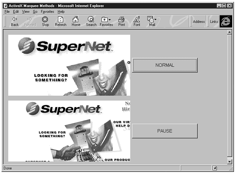
Figure 9.6 shows the Marquee page (which you'll find in this chapter's folder on the CD). The Marquee page contains two Marquee controls, which both display the Sams Web site. One of them scrolls its contents vertically and the other one horizontally. The two command buttons next to the Marquees demonstrate the Zoom property and the Pause/Resume methods. When the user clicks the ZOOM button, the contents of the top Marquee control are enlarged to 120% and the button's caption becomes NORMAL. If clicked again, it restores the contents of the first control to normal size.
Figure 9.6 : The Marquee example demonstrates the Zoom property and the Pause/Resume events.
The second button temporarily stops the scrolling of the document in the Marquee control, and its caption becomes RESUME. If clicked again, the scrolling resumes and the button's caption becomes PAUSE again. The code of the Marquee document is shown in Listing 9.4.
Listing 9.4. The Marquee document.
 1: <HTML>

 2: <HEAD>

 3: <TITLE>ActiveX Marquee Methods</TITLE>

 4: <SCRIPT LANGUAGE="VBScript">

 5: <!--

 6: Sub CommandButton1_Click()

 7: If CommandButton1.Caption="ZOOM" then

 8:     Marquee1.Zoom = 125

 9:     CommandButton1.Caption="NORMAL"

10: Else

11:     Marquee1.Zoom = 100

12:     CommandButton1.Caption="ZOOM"

13: End If

14: End Sub

15:

16: Sub CommandButton2_Click()

17: If CommandButton2.Caption="PAUSE" Then

18:     Marquee2.Pause

19:     CommandButton2.Caption="RESUME"

20: Else

21:     Marquee2.Resume

22:     CommandButton2.Caption="PAUSE"

23: End If

24:

25: End Sub

26: -->

27: </SCRIPT>

28:

29: </HEAD>

30: <BODY>

31: <OBJECT ID="Marquee1" WIDTH=400 HEIGHT=200 align=CENTER BORDER=1 HSPACE=5

32:    CLASSID="CLSID:1A4DA620-6217-11CF-BE62-0080C72EDD2D">

33:     <PARAM NAME="WhiteSpace" VALUE="42">

34:     <PARAM NAME="szURL" VALUE="http://www.sams.com">

35:     <PARAM NAME="_ExtentX" VALUE="124">

36:     <PARAM NAME="_ExtentY" VALUE="125">

37:     <PARAM NAME="Zoom" VALUE="100">

38:     <PARAM NAME="ScrollPixelsX" VALUE="0">

39:     <PARAM NAME="ScrollPixelsY" VALUE="4">

40:     <PARAM NAME="WidthOfPage" VALUE="300">

41:   </OBJECT>

42: <OBJECT ID="CommandButton1" WIDTH=215 HEIGHT=48

43:    CLASSID="CLSID:D7053240-CE69-11CD-A777-00DD01143C57">

44:     <PARAM NAME="Caption" VALUE="ZOOM">

45:     <PARAM NAME="Size" VALUE="5689;1270">

46:     <PARAM NAME="FontName" VALUE="Arial">

47:     <PARAM NAME="FontHeight" VALUE="220">

48:     <PARAM NAME="FontCharSet" VALUE="0">

49:     <PARAM NAME="FontPitchAndFamily" VALUE="2">

50:     <PARAM NAME="ParagraphAlign" VALUE="3">

51:     <PARAM NAME="FontWeight" VALUE="0">

52:   </OBJECT>

53: <P>

54: <OBJECT ID="Marquee2" WIDTH=400 HEIGHT=200 align=CENTER BORDER=1 HSPACE=5

55:    CLASSID="CLSID:1A4DA620-6217-11CF-BE62-0080C72EDD2D">

56:     <PARAM NAME="szURL" VALUE="http://www.sams.com">

57:     <PARAM NAME="_ExtentX" VALUE="124">

58:     <PARAM NAME="_ExtentY" VALUE="125">

59:     <PARAM NAME="Zoom" VALUE="100">

60:     <PARAM NAME="ScrollPixelsX" VALUE="4">

61:     <PARAM NAME="ScrollPixelsY" VALUE="0">

62:   </OBJECT>

63:

64: <OBJECT ID="CommandButton2" WIDTH=215 HEIGHT=48

65:    CLASSID="CLSID:D7053240-CE69-11CD-A777-00DD01143C57">

66:     <PARAM NAME="Caption" VALUE="PAUSE">

67:     <PARAM NAME="Size" VALUE="5689;1270">

68:     <PARAM NAME="FontName" VALUE="Arial">

69:     <PARAM NAME="FontHeight" VALUE="220">

70:     <PARAM NAME="FontCharSet" VALUE="0">

71:     <PARAM NAME="FontPitchAndFamily" VALUE="2">

72:     <PARAM NAME="ParagraphAlign" VALUE="3">

73:     <PARAM NAME="FontWeight" VALUE="0">

74:   </OBJECT>

75: </BODY>

76: </HTML>
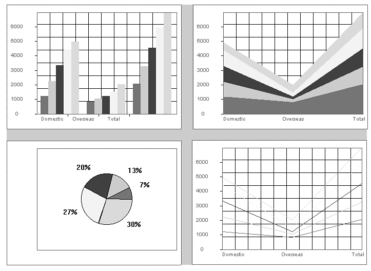
The Chart control presents numeric data as graphs, and supports a variety of different types and styles of graphs, such as pie charts and bar graphs. You supply the data and the parameters of the graph, and the Chart control generates the graph on-the-fly. Figure 9.7 is a collection of various chart types generated with the Chart control.
Figure 9.7 : Various types of graphs produced by the Chart control.
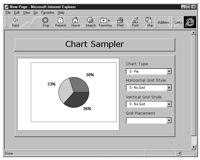
There are seven chart types you can produce with the Chart control: Pie, Point, Line, Area, Bar, Column, and Stocks. In addition, there are more than one flavor of each of these styles. Most of these types have the following variations: Simple, Stacked, and Full. Use the Chart document, which we will present shortly, to experiment with the various graph types and styles.
The Graph control is in essence a mechanism for plotting data. Because of the numerous parameters a data plot can have, the Chart control has a long list of properties. Yet, there are no methods (short of the About method, which displays information about the control) and no events. Let's start with the simpler properties that control the appearance of the chart.
These two values determine the total number of data points to be plotted. Obviously, you must supply Rows ´ Columns data points to the control. (In the section "Manipulating the Chart Control's Data," you'll see how to specify the data to be plotted.)
These two properties determine the type of horizontal and vertical
grid that will be placed on the graph, and they can have one of
the following values:
0 No grid 1 Solid grid 2 Bold grid 3 Dotted grid 4 Bold dotted grid
The ChartType property determines the graph's type and
may have one of the following values:
0 Simple pie chart 1 Special pie chart 2 Simple point chart 3 Stacked point chart 4 Full point chart 5 Simple line chart 6 Stacked line chart 7 Full line chart 8 Simple area chart 9 Stacked area chart 10 Full area chart 11 Simple column chart 12 Stacked column chart 13 Full column chart 14 Simple bar chart 15 Stacked bar chart 16 Full bar chart 17 HLC (high low close) simple stock chart 18 HCL WSJ stock chart 19 OHLC (open high low close) simple stock chart 20 OHCL WSJ stock chart
There are five predefined color schemes (0, 1, 2, 3, and 4), and you can set one of them for your chart by setting the ColorScheme property.
This property determines whether the graph's background will be transparent (BackStyle=0) or not (BackStyle=1).
This is a scaling factor for the graph data and it can go up to 100%, but no more.
This property specifies a row name. (The row names are the legends that appears along the Y axis.)
This property specifies a column name. (The column names are the legends that appear along the X axis.)
Use this property to view (Legend=-1) or hide (Legend=0) the chart's legend.
This property controls how the grid is drawn. The grid lines can
be drawn either over the chart (foreground) or below the chart
(background), and it can have one of the two values
0 Grid lines drawn behind the graph 1 Grid lines drawn on top of the graph
To manipulate the chart's data, the Chart control provides the RowIndex and ColumnIndex properties. Imagine that the data to be plotted is stored in a tabular arrangement, with Rows rows and Columns columns. Each row of data in the table corresponds to one line in a line graph, one color in an area graph, or one set of bars with a common color in a bar graph. Successive data for each row is stored in successive columns. To address a specific data point, you must first set the RowIndex and ColumnIndex properties of the control. To address the second data point of the fourth data set, use the following statements:
Chart1.RowIndex=3    ' 4 th row

Chart1.ColumnIndex=1    ' 2 nd column
To set the value of this point, use the DataItem property:
Chart1.DataItem=1002
In other words, you must first select the data point you want to access and then set its value. To assign values to an entire row (which is a data set), use a loop like the following one:
Chart1.RowIndex=3    ' 3 rd data set

For i=0 to Chart1.Rows-1

    Chart1.ColumnIndex=i

    Chart1.DataItem=DataPoints

Next
You can also set the legends of the chart in a similar way. The ColumnName and RowName properties are the legends of each dataset and each point along the dataset, respectively. The row names appear along the X axis, and the column names appear in a small box on the graph, as shown in Figure 9.8.
Figure 9.8 : The legends on the chart are specified with the RowName and ColumnName properties.
The URL property of the Chart control lets you specify the data to be plotted with the remaining parameters of the graph in a file, which you can specify by means of its URL. In other words, if you want to post data that changes daily on your Web, you don't have to reprogram your pages. You can just create a file with the new data and have a Chart control on one of your pages request them from the server. This is done with the URL property, which is assigned the URL of the file with the control's data on the server.
The format of this data file is as follows:
The first line describes the ChartType property and contains a number between 0 and 20, as described earlier.
The second line contains an integer, which is the number of rows.
The third line contains another integer, which is the number of columns, followed by the optional column names (separated by tab characters).
The fourth line, and any additional lines beyond the fourth, contains the data for each row. The first element in each of these lines can be the name of the row (optional). Successive data points are separated by tab characters.
The following data file specifies a chart type 9 (stacked area) with 3 rows and 5 columns. The column names are 1996, 1997, 1998, 1999, and 2000. The first row's name (first dataset) is Domestic, the second row's name is Overseas, and the third row's name is Total.
9

3

5        1996    1997    1998    1999    2000

Domestic    1234    2242    3342    4434    4954

Overseas    845    1045    1212    1504    2045

Total        2079    3287    4554    5938    6999
If you save these lines to a file on the server and assign its name to the Chart control's URL property, the graph described by these values will be plotted automatically. You can also combine this technique with the control's Reload method, which forces the Chart control to read the data again and replot them; you can provide your viewers with graphs based on real-time data. The titles for the graph's columns and rows are optional, and you can omit them. They are used for displaying a legend; a graph can have no legends, legends for one axis only, or legends for both axes.
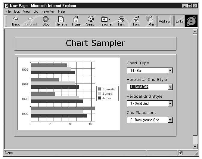
Figure 9.9 shows the Chart project, which demonstrates several of the properties of the Chart control. The Chart1 example is simple, but it lets you experiment with the various properties of the control we discussed so far.
Figure 9.9 : The Chart document lets you adjust many of the parameters of a graph.
The layout of Figure 9.9 contains a Chart control and four drop-down List controls. Each list contains all the settings for a specific property. The first list controls the type of the graph, the second and third lists control the style of the grid, and the last list controls whether the grid will be drawn in front of or behind the graph. Drop down each list, select a setting, and see how it affects the graph.
Start the ActiveX Control Pad application and create a new layout. To place the Chart control on it, you must add its icon to the toolbox. The Chart control is called Chart Object in the Insert ActiveX control dialog box. Once the Chart control has been placed on the layout, the following definition is inserted in the ALX file. (You can copy this definition and paste it in your own projects.)
<OBJECT ID="iechart1"

         CLASSID="CLSID:FC25B780-75BE-11CF-8B01-444553540000"

		 STYLE="TOP:58pt;LEFT:25pt;WIDTH:256pt;HEIGHT:182pt;ZINDEX:0;"

CODEBASE="http://activex.microsoft.com/controls/iexplorer/iechart.ocx#Version=4,70,0,

1161">

            <PARAM NAME="_ExtentX" VALUE="9022">

            <PARAM NAME="_ExtentY" VALUE="6429">

            <PARAM NAME="Rows" VALUE="4">

            <PARAM NAME="Columns" VALUE="3">

            <PARAM NAME="ChartType" VALUE="8">

            <PARAM NAME="Data[0][0]" VALUE="9">

            <PARAM NAME="Data[0][1]" VALUE="10">

            <PARAM NAME="Data[0][2]" VALUE="11">

            <PARAM NAME="Data[1][0]" VALUE="7">

            <PARAM NAME="Data[1][1]" VALUE="11">

            <PARAM NAME="Data[1][2]" VALUE="12">

            <PARAM NAME="Data[2][0]" VALUE="6">

            <PARAM NAME="Data[2][1]" VALUE="12">

            <PARAM NAME="Data[2][2]" VALUE="13">

            <PARAM NAME="Data[3][0]" VALUE="11">

            <PARAM NAME="Data[3][1]" VALUE="13">

            <PARAM NAME="Data[3][2]" VALUE="14">

            <PARAM NAME="HorizontalAxis" VALUE="0">

            <PARAM NAME="VerticalAxis" VALUE="0">

            <PARAM NAME="hgridStyle" VALUE="0">

            <PARAM NAME="vgridStyle" VALUE="0">

            <PARAM NAME="ColorScheme" VALUE="0">

            <PARAM NAME="BackStyle" VALUE="1">

            <PARAM NAME="Scale" VALUE="100">

            <PARAM NAME="DisplayLegend" VALUE="1">

            <PARAM NAME="BackColor" VALUE="16777215">

            <PARAM NAME="ForeColor" VALUE="32768">

        </OBJECT>
Notice that except for a few standard properties, this definition includes sample data points. The Data array is where all data points are stored. You can edit this definition to change the data or add more data points (and datasets, if you have to). The first index corresponds to the Rows property and the second index to the Columns property.
When the layout is loaded, it populates the drop-down lists and assigns legends to the chart's rows and columns via the RowName and ColumnName property. The actual code of the application, which changes the graph's properties, is quite simple. It picks the property number from the list and assigns it to the appropriate property. The Change event of the first ComboBox control signals that the user has changed the graph's type. Here is the event handler for the event:
Sub ComboBox1_Change()

    IEChart1.ChartType=CInt(left(ComboBox1.Text,2))

End Sub
Because the Text property of the ComboBox control begins with the setting for the ChartType property, the program isolates this value, converts it to an integer value, and assigns it to the ChartType property of the Chart control.
The complete listing of the Chart project is shown in Listing 9.5.
Listing 9.5. The Chart project.
 1: <HTML>

 2: <HEAD>

 3:     <SCRIPT LANGUAGE="VBScript">

 4: <!--

 5: Sub ComboBox1_Change()

 6: IEChart1.ChartType=CInt(left(ComboBox1.Text,2))

 7: end sub

 8:

 9: Sub ComboBox2_Change()

10: IEChart1.HGridStyle=CInt(left(ComboBox2.Text,2))

11: End Sub

12:

13: Sub ComboBox3_Change()

14: IEChart1.VGridStyle=CInt(left(ComboBox3.Text,1))

15: End Sub

16:

17: Sub ComboBox4_Change()

18: IEChart1.GridPlacement=CInt(left(ComboBox4.Text,1))

19: end sub

20:

21: Sub Layout1_OnLoad()

22: ComboBox1.AddItem "0 - Pie"

23: ComboBox1.AddItem "2 - Point"

24: ComboBox1.AddItem "5 - Line"

25: ComboBox1.AddItem "8 - Area"

26: ComboBox1.AddItem "11 - Column"

27: ComboBox1.AddItem "14 - Bar"

28: ComboBox1.Text= "8 - Area"

29: ComboBox2.AddItem "0 - No Grid"

30: ComboBox2.AddItem "1 - Solid Grid"

31: ComboBox2.AddItem "2 - Bold Grid"

32: ComboBox2.AddItem "3 - Dotted Grid"

33: ComboBox2.AddItem "4 - Bold Dotted Grid"

34: ComboBox2.Text= "0 - No Grid"

35: ComboBox3.AddItem "0 - No Grid"

36: ComboBox3.AddItem "1 - Solid Grid"

37: ComboBox3.AddItem "2 - Bold Grid"

38: ComboBox3.AddItem "3 - Dotted Grid"

39: ComboBox3.AddItem "4 - Bold Dotted Grid"

40: ComboBox3.Text= "0 - No Grid"

41: ComboBox4.AddItem "0 - Background Grid"

42: ComboBox4.AddItem "1 - Foreground Grid"

43:

44: IEchart1.RowIndex = 0

45: IEchart1.RowName = "1996"

46: IEchart1.RowIndex = 1

47: IEchart1.RowName = "1997"

48: IEchart1.RowIndex = 2

49: IEchart1.RowName = "1998"

50: IEchart1.RowIndex = 3

51: IEchart1.RowName = "1999"

52:

53: IEchart1.ColumnIndex = 0

54: IEchart1.ColumnName = "Domestic"

55: IEchart1.ColumnIndex = 1

56: IEchart1.ColumnName = "Europe"

57: IEchart1.ColumnIndex = 2

58: IEchart1.ColumnName = "Japan"

59:

60: end sub

61: -->

62:     </SCRIPT>

63: </HEAD>

64: <BODY>

65: <CENTER>

66:     <DIV ID="Layout1" STYLE="LAYOUT:FIXED;WIDTH:428pt;HEIGHT:300pt;">

67:         <OBJECT ID="iechart1"

68:          CLASSID="CLSID:FC25B780-75BE-11CF-8B01-444553540000"

             STYLE="TOP:58pt;LEFT:25pt;WIDTH:256pt;HEIGHT:182pt;ZINDEX:0;">

69:             <PARAM NAME="_ExtentX" VALUE="9022">

70:             <PARAM NAME="_ExtentY" VALUE="6429">

71:             <PARAM NAME="Rows" VALUE="4">

72:             <PARAM NAME="Columns" VALUE="3">

73:             <PARAM NAME="ChartType" VALUE="8">

74:             <PARAM NAME="Data[0][0]" VALUE="9">

75:             <PARAM NAME="Data[0][1]" VALUE="10">

76:             <PARAM NAME="Data[0][2]" VALUE="11">

77:             <PARAM NAME="Data[1][0]" VALUE="7">

78:             <PARAM NAME="Data[1][1]" VALUE="11">

79:             <PARAM NAME="Data[1][2]" VALUE="12">

80:             <PARAM NAME="Data[2][0]" VALUE="6">

81:             <PARAM NAME="Data[2][1]" VALUE="12">

82:             <PARAM NAME="Data[2][2]" VALUE="13">

83:             <PARAM NAME="Data[3][0]" VALUE="16">

84:             <PARAM NAME="Data[3][1]" VALUE="13">

85:             <PARAM NAME="Data[3][2]" VALUE="14">

86:             <PARAM NAME="HorizontalAxis" VALUE="0">

87:             <PARAM NAME="VerticalAxis" VALUE="0">

88:             <PARAM NAME="hgridStyle" VALUE="0">

89:             <PARAM NAME="vgridStyle" VALUE="0">

90:             <PARAM NAME="ColorScheme" VALUE="0">

91:             <PARAM NAME="BackStyle" VALUE="1">

92:             <PARAM NAME="Scale" VALUE="100">

93:             <PARAM NAME="DisplayLegend" VALUE="0">

94:             <PARAM NAME="BackColor" VALUE="16777215">

95:             <PARAM NAME="ForeColor" VALUE="32768">

96:         </OBJECT>

97:         <OBJECT ID="ComboBox1"

98:          CLASSID="CLSID:8BD21D30-EC42-11CE-9E0D-00AA006002f3"

              STYLE="TOP:83pt;LEFT:297pt;WIDTH:116pt;HEIGHT:17pt;TABINDEX:0;

              ZINDEX:1;">

99:             <PARAM NAME="VariousPropertyBits" VALUE="746604571">

100:             <PARAM NAME="DisplayStyle" VALUE="7">

101:             <PARAM NAME="Size" VALUE="4092;600">

102:             <PARAM NAME="MatchEntry" VALUE="1">

103:             <PARAM NAME="ShowDropButtonWhen" VALUE="2">

104:             <PARAM NAME="FontCharSet" VALUE="0">

105:             <PARAM NAME="FontPitchAndFamily" VALUE="2">

106:             <PARAM NAME="FontWeight" VALUE="0">

107:         </OBJECT>

108:         <OBJECT ID="ComboBox2"

109:          CLASSID="CLSID:8BD21D30-EC42-11CE-9E0D-00AA006002f3"

              STYLE="TOP:124pt;LEFT:297pt;WIDTH:116pt;HEIGHT:17pt;TABINDEX:1;

              ZINDEX:2;">

110:             <PARAM NAME="VariousPropertyBits" VALUE="746604571">

111:             <PARAM NAME="DisplayStyle" VALUE="7">

112:             <PARAM NAME="Size" VALUE="4092;600">

113:             <PARAM NAME="MatchEntry" VALUE="1">

114:             <PARAM NAME="ShowDropButtonWhen" VALUE="2">

115:             <PARAM NAME="FontCharSet" VALUE="0">

116:             <PARAM NAME="FontPitchAndFamily" VALUE="2">

117:             <PARAM NAME="FontWeight" VALUE="0">

118:         </OBJECT>

119:         <OBJECT ID="ComboBox3"

120:          CLASSID="CLSID:8BD21D30-EC42-11CE-9E0D-00AA006002f3"

              STYLE="TOP:165pt;LEFT:297pt;WIDTH:116pt;HEIGHT:17pt;TABINDEX:3;

              ZINDEX:3;">

121:             <PARAM NAME="VariousPropertyBits" VALUE="746604571">

122:             <PARAM NAME="DisplayStyle" VALUE="7">

123:             <PARAM NAME="Size" VALUE="4092;600">

124:             <PARAM NAME="MatchEntry" VALUE="1">

125:             <PARAM NAME="ShowDropButtonWhen" VALUE="2">

126:             <PARAM NAME="FontCharSet" VALUE="0">

127:             <PARAM NAME="FontPitchAndFamily" VALUE="2">

128:             <PARAM NAME="FontWeight" VALUE="0">

129:         </OBJECT>

130:         <OBJECT ID="ComboBox4"

131:          CLASSID="CLSID:8BD21D30-EC42-11CE-9E0D-00AA006002f3"

              STYLE="TOP:206pt;LEFT:297pt;WIDTH:116pt;HEIGHT:17pt;TABINDEX:2;

              ZINDEX:4;">

132:             <PARAM NAME="VariousPropertyBits" VALUE="746604571">

133:             <PARAM NAME="DisplayStyle" VALUE="7">

134:             <PARAM NAME="Size" VALUE="4092;600">

135:             <PARAM NAME="MatchEntry" VALUE="1">

136:             <PARAM NAME="ShowDropButtonWhen" VALUE="2">

137:             <PARAM NAME="FontCharSet" VALUE="0">

138:             <PARAM NAME="FontPitchAndFamily" VALUE="2">

139:             <PARAM NAME="FontWeight" VALUE="0">

140:         </OBJECT>

141:         <OBJECT ID="Label1"

142:          CLASSID="CLSID:978C9E23-D4B0-11CE-Bf2D-00AA003f40D0"

              STYLE="TOP:66pt;LEFT:297pt;WIDTH:99pt;HEIGHT:17pt;ZINDEX:5;">

143:             <PARAM NAME="Caption" VALUE="Chart Type">

144:             <PARAM NAME="Size" VALUE="3493;600">

145:             <PARAM NAME="FontName" VALUE="Verdana">

146:             <PARAM NAME="FontHeight" VALUE="200">

147:             <PARAM NAME="FontCharSet" VALUE="0">

148:             <PARAM NAME="FontPitchAndFamily" VALUE="2">

149:             <PARAM NAME="FontWeight" VALUE="0">

150:         </OBJECT>

151:         <OBJECT ID="Label2"

152:          CLASSID="CLSID:978C9E23-D4B0-11CE-Bf2D-00AA003f40D0"

              STYLE="TOP:107pt;LEFT:297pt;WIDTH:116pt;HEIGHT:17pt;ZINDEX:6;">

153:             <PARAM NAME="Caption" VALUE="Horizontal Grid Style">

154:             <PARAM NAME="Size" VALUE="4092;600">

155:             <PARAM NAME="FontName" VALUE="Verdana">

156:             <PARAM NAME="FontHeight" VALUE="200">

157:             <PARAM NAME="FontCharSet" VALUE="0">

158:             <PARAM NAME="FontPitchAndFamily" VALUE="2">

159:             <PARAM NAME="FontWeight" VALUE="0">

160:         </OBJECT>

161:         <OBJECT ID="Label3"

162:          CLASSID="CLSID:978C9E23-D4B0-11CE-Bf2D-00AA003f40D0"

              STYLE="TOP:149pt;LEFT:297pt;WIDTH:99pt;HEIGHT:17pt;ZINDEX:7;">

163:             <PARAM NAME="Caption" VALUE="Vertical Grid Style">

164:             <PARAM NAME="Size" VALUE="3493;600">

165:             <PARAM NAME="FontName" VALUE="Verdana">

166:             <PARAM NAME="FontHeight" VALUE="200">

167:             <PARAM NAME="FontCharSet" VALUE="0">

168:             <PARAM NAME="FontPitchAndFamily" VALUE="2">

169:             <PARAM NAME="FontWeight" VALUE="0">

170:         </OBJECT>

171:         <OBJECT ID="Label4"

172:          CLASSID="CLSID:978C9E23-D4B0-11CE-Bf2D-00AA003f40D0"

              STYLE="TOP:190pt;LEFT:297pt;WIDTH:99pt;HEIGHT:17pt;ZINDEX:8;">

173:             <PARAM NAME="Caption" VALUE="Grid Placement">

174:             <PARAM NAME="Size" VALUE="3493;600">

175:             <PARAM NAME="FontName" VALUE="Verdana">

176:             <PARAM NAME="FontHeight" VALUE="200">

177:             <PARAM NAME="FontCharSet" VALUE="0">

178:             <PARAM NAME="FontPitchAndFamily" VALUE="2">

179:             <PARAM NAME="FontWeight" VALUE="0">

180:         </OBJECT>

181:         <OBJECT ID="Label5"

182:          CLASSID="CLSID:978C9E23-D4B0-11CE-Bf2D-00AA003f40D0"

              STYLE="TOP:8pt;LEFT:17pt;WIDTH:404pt;HEIGHT:33pt;ZINDEX:9;">

183:             <PARAM NAME="Caption" VALUE="Chart Sampler">

184:             <PARAM NAME="Size" VALUE="14252;1164">

185:             <PARAM NAME="SpecialEffect" VALUE="1">

186:             <PARAM NAME="FontName" VALUE="Verdana">

187:             <PARAM NAME="FontHeight" VALUE="400">

188:             <PARAM NAME="FontCharSet" VALUE="0">

189:             <PARAM NAME="FontPitchAndFamily" VALUE="2">

190:             <PARAM NAME="ParagraphAlign" VALUE="3">

191:             <PARAM NAME="FontWeight" VALUE="0">

192:         </OBJECT>

193:         <OBJECT ID="Image1"

194:          CLASSID="CLSID:D4A97620-8E8F-11CF-93CD-00AA00C08FDF"

              STYLE="TOP:50pt;LEFT:17pt;WIDTH:404pt;HEIGHT:206pt;ZINDEX:10;">

195:             <PARAM NAME="BorderStyle" VALUE="0">

196:             <PARAM NAME="SizeMode" VALUE="3">

197:             <PARAM NAME="SpecialEffect" VALUE="1">

198:             <PARAM NAME="Size" VALUE="14252;7267">

199:             <PARAM NAME="PictureAlignment" VALUE="0">

200:             <PARAM NAME="VariousPropertyBits" VALUE="19">

201:         </OBJECT>

202:     </DIV>

203: </BODY>

204: </HTML>
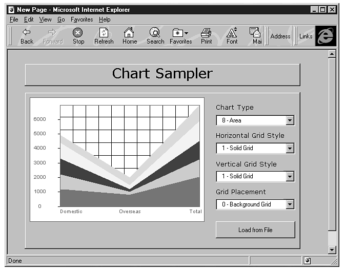
Figure 9.10 shows the ChartURL document, which is a variation on the Chart document. This time we've added a command button that causes the Chart control to read its data and settings from a local file. The file with the data and settings is called CHARTDATA.TXT, and it contains the sample data of the section titled "Supplying Data Over the Internet." When the user clicks this command button, the Chart control reads the data from the CHARTDATA file and updates the graph accordingly. The code behind the Load from File button simply assigns a value to the Chart control's URL property:
Figure 9.10 : The ChartURL document can read its data and settings from a local file or a URL.
Sub ComboBox1_Change()

IEChart1.ChartType=CInt(left(ComboBox1.Text,2))

End Sub
On the CD you will find the CHARTDATA.TXT file, and you can experiment with it. If you can automate the generation of similar files, you can post graphs with live data on the Web. For example, you can write an application that retrieves numeric data from a database and prepares a file with the information needed by the Chart control to graph the data, including the headings. And as you probably know, it takes much less space to store a few dozen numbers than it takes to store the image of the graph that corresponds to these data.
The Chart control is the last of the new ActiveX controls we are going to cover in this book. If you are using some visual programming tools in the Windows environment, you have realized that the ActiveX controls are nothing more than the regular OLE controls that make up the Windows user interface. You are probably wondering whether you should attempt to use the OLE controls already installed on your system. Most of the OLE controls can be used, and we'll look at a few of them in the last part of the book. However, they are not ActiveX controls and the viewers will get a warning every time they open a page that contains old OLE controls (implemented in OCX files). You can use the existing OLE controls on your pages in an intranet environment, and you are going to find interesting examples in the last section of this book.
The ActiveX controls released by Microsoft after the release of Internet Explorer 3.0 and the ActiveX Control Pad are posted at Microsoft's ActiveX Component Gallery at www. microsoft.com/activex/controls. The ActiveX Gallery is the site to visit when you need an ActiveX control for your projects. You will find there a list of all available ActiveX controls from Microsoft and other companies, descriptions of the controls, and the actual controls. Microsoft's ActiveX controls are free, but most of the other ActiveX controls aren't-and you should read the documentation and distribution notes before you download and use them.